My blue kitchen (aka why test pots exist) (and, consequently, why you should use them)
So I decided the other day that I couldn’t handle these dark/dreary/oh-my-god-who-seriously-paints-their-walls-these-colours? walls any more. With Baby on the way (only nine weeks to go till my due date) (ack!), I had sworn off painting for the next little bit (even though some say you can absolutely paint while preggers) (however I’m super sensitive to smells right now, so painting just didn’t seem to be in the cards for me.) Based on a recommendation from a co-worker (hi Laura!) I brought someone in to paint my living room, dining room, and (yay!) kitchen. It took her less than five hours to paint all three rooms. FIVE HOURS! I was (and still am) in painting-land awe. I’m not sure how she did it (seriously, what she accomplished in five hours would have taken me several weekends!) (maybe I’m just a rather pokey painter?), but suffice it to say that the house feels like a totally new house now. The rooms feel bigger and lighter and cheerier. The ceilings seem so much higher. And I am one mighty happy momma-to-be.
However, let me break in on this little newly painted room love-fest with a bit of a confession: my kitchen was supposed to be gray. A nice, light, slightly bluish airy fairly neutral gray colour.
The Coles Notes version of the story? I got blue.
Like, really blue.
Grumble.
What I was hoping for? A slightly brighter lighter version of the same colour that adorned my happy little 1940s kitchen at our last house. That kitchen was painted in Benjamin Moore’s Stonington Gray, and I loved it. Loooooved it.
Our current kitchen, in our old mauve house, gets far less natural light than our previous sunny little kitchen did. And it’s less open and needed brightening up a bit. So my seemingly obvious solution was to confidently (ie “ruthlessly skipping the whole test-pot phase of painting”) go one paint chip lighter on the same paint-swatch card thingy from my previously adored Stonington Gray colour. Seemed foolproof enough, I thought. And, even when I held the paint chip up in various places around my kitchen, my newly decided upon colour (Wickham Gray) appeared to be a light gray with a teeny tiny smidgen of blue-y green-y muddy undertones mixed in for a bit of wall colour pizazz.
The real-life post-painting result? Apparently Wickham Gray turns blue in my kitchen.
Like, very very blue.
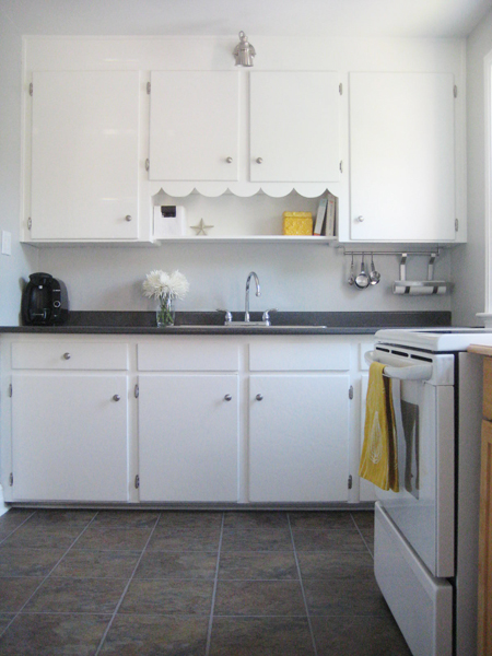
Here’s where we started (all gold-y and dark and such):
And here’s where we are now. Blue blue blue.
Yep. Definitely blue. Super ginormous sigh.
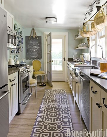
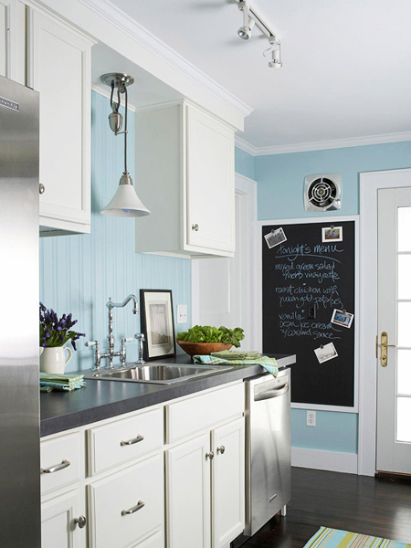
Don’t get me wrong! There are lots of lovely blue kitchens out in the world. In fact, my Pinterest Kitchens board features several blue-hued kitchens that I’ve admired for a while. There’s this one, from House Beautiful (although I searched the House Beautiful site and couldn’t find a link directly to this particular image – sorry!):
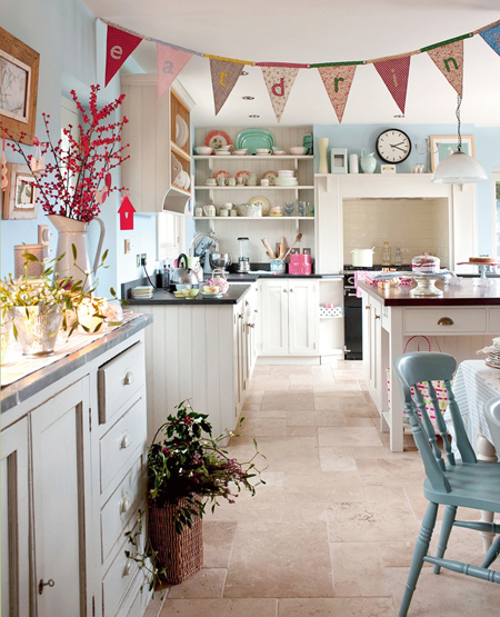
And this super lovely kitchen featured on the Better Homes and Gardens website…
And, my favourite (pretty!), this cheery blue kitchen courtesy of… um, Pinterest source unknown. (I hate those source unknown sorta Pins, don’t you?) (If this is your kitchen, a: I want to move into your house please! and b: let me know!)
So see? I’m not at all against blue kitchens. In fact, I think blue is so fresh and pretty in a kitchen!
But… it’s not what I had planned for my kitchen. And against my currently cream coloured upper cabinets and brown-tiled backsplash and countertops the blue looks a bit… off.
I’m going to live with it for a bit. And maybe (with a little tweaking and accessorizing and such) it’ll grow on me! With Baby on the (ever nearing) (ack!) horizon, and my painting budget tapped for the time being, blue is definitely, if nothing else, better than the muddy gold colour that was there before. And, when I someday get around to painting the kitchen cabinets a whiter crisper shade of white (Benjamin Moore’s Snowfall White, my all-time favourite trim and cupboard colour, to be be exact), I think the blue might actually look quite spectacular.
But, for now… meh. At least it’s not gold.
Leave a comment
Brightening up a rather dark little kitchen (sad-looking semblance of a valence: be gone!) (next: let’s talk lighting)
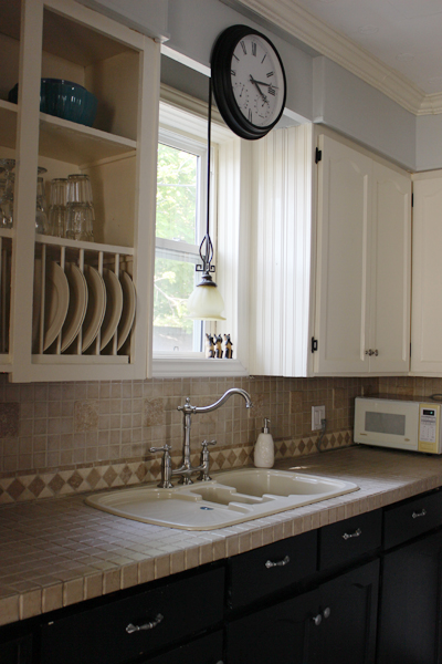
Despite that I really love bright and sunny kitchens, the kitchen at the old mauve house is neither bright nor sunny. The kitchen window is north-facing (meaning it never catches any real sunlight) and our (inherited) wall colour is rather drab and dark (but kitchen-painting is a ways down on our list of required renos at the moment, so drab and dark will sadly stay put until “paint kitchen” comes up in the renovating queue.)
One thing that has helped increase the kitchen brightness-factor a tad? Removing THIS…

Yep. That awkward repurposed-window-but-half-valence-thingy came down recently. Not entirely because we wanted to take it down. But rather because it needed to move in order to access the window so that we could thoroughly weatherproof (since our kitchen window is definitely drafty and quite a pane.) (Get it? Pane? Pain?) (Groan… K. Carrying on…)
Initially, Sweetie didn’t like the kitchen window sans the odd-looking-not-really-a-valence, but I asked him to live with it for a while. The result? The look has grown on us both. Much more light floods into the kitchen now, and the window just looks less… odd.

Our new problem? The light over the sink. I’ve never been a huge fan of this light (or of any of the lights in this house, truth be told) (once budget permits, they’re allll getting a good swapping.) However without the quasi-valence in place, the light definitely looks odd and hangs too far down. And the yellow-hued shade makes it a wee more traditional than I’d prefer. And it’s honestly just not us.

After a little online big box store searching, I’ve narrowed the new over-the-sink light options down to a few contenders.
My absolute fave? This one from Lowes…

Pretty, no? I adore this light. To get all technical, it’s the Allen + Roth 12-in Bronze Edison-Style Pendant Light with Clear Shade. And it’s LOVELY. The chain makes the light feel… (searching for the correct words…) (let’s go with…) airy-er than it would if the light was hanging from dark solid rods. And the shape is vintage-ey, but not old-looking. It’s modern, but antique-ish.
Does that all even make sense? Likely not.
Regardless, I love this fixture and desperately want this for my kitchen. There are a couple slight hiccups, however. It’s quite large at 12 inches in diameter. I searched all over Internet-land to see whether Allen & Roth make a slightly smaller version (the dreaded “mini-pendant”, if you will) and, sadly, they do not. Secondly, 75% of the reviews for this fixture have mentioned that the amount of light it casts (with it’s maximum 60W Edison bulb) isn’t particularly great for task lighting (and doing dishes and cleaning vegetables and the other mundane things that I do around the kitchen sink definitely seem to be task-lighting sort of tasks.) Could I outfit this light with a normal run-of-the-mill clear incandescent bulb and have it look just as pretty? Maybe? I’m not sure. But it’s also the most expensive light of the lot I’m considering. At $128 it’s quite beyond my “lovely little light in the kitchen window” budget.
But I love it. A whole lot. So it’s staying on my list.
Much smaller, and also available from the good folk at Allen + Roth via Lowes is this one…

Sweetie likes this one better than the first, and, from a cost standpoint it’s mucho cheapo-er (at only $49 bucks.) But there’s that whole low-wattage Edison light issue again. And it’s very square. And there’s already a lot of squareness in my kitchen. I think I’m gravitating more toward a little spherical illumination.
Which lead me to THIS light…

Which is pretty. SO pretty! I squealed just a wee bit when I stumbled across this fixture – the green glass is just so incredibly lovely and will look amazing in my kitchen one day (once all my painting projects are all finished up.) (Eventually.) The problem? (Because there’s ALWAYS a problem?) It’s only available at Lowes.com. Or at Lowes stores in the states, I’m assuming. And I am most definitely sitting here typing away from my Canadian home, with limited access to an American Lowes store. Sigh. And, with a maximum allowance for a 40W bulb, this light would be even dimmer and less kitchen-task-friendly than the others (I keep reminding myself of that – it keeps me from getting super sad that it’s unobtainable without a jaunt across the border.)
So where does this all leave me? It leaves me mighty light-less. Sorta. The existing light works for now (and until we find another far prettier one for the space.) But now that I’ve found a few almost perfect options, I want to find the one.
More lighting obsessing to follow, I’m sure. (Sorry about that.)
Leave a comment
Blue cabinetry lust (pretty pretty pretty!)
I adore Samantha Pynn. I really do. Call it a bit of a designer-crush, but I think she’s amazing, and super talented, and I love everything she does. (And, she’s a fellow Canadian to boot!)
So imagine my delight when she posted pictures of this kitchen in her regular National Post column…

And imagine all the swooning (from me) that followed shortly thereafter. That blue – it’s perfect! That marble (or a close lookalike!) countertop – how lovely. The whole kitchen screams the word “fresh!” I seriously want to cook in there.
And now I’m seriously rethinking my kitchen plans.
Our kitchen currently features cream-coloured cabinets on the uppers, with dark navy lower cabinets. I didn’t paint these (the house came like this) and while the two-toned look has grown on me, I’ve always found the combination a little dated and dark (despite that two-toned cabinets seem to be very in style right now!)

I’ve always planned to repaint both the uppers and lower cupboards in a crisp off-white, Benjamin Moore’s Snowfall White, to be exact. We painted our last kitchen’s cupboards this colour, and it was the perfect bright white, with just a hint of creaminess to take away any overt starkness. It was lovely, and made me very very happy.

But now I’m changing my mind just a little. The upper cabinets will still get a good-sized dose of Snowfall White, of course (since the existing cream-colour is just so… dark) (if cream can be dark? I think it can…) but I’m now second-guessing my bottom-cupboard intentions. How pretty would a little electric-ish blue be? My answer? VERY.
We’ll see just how brave I’m feeling come kitchen-painting time. I’m a bit of a kitchen cupboard painting chicken, truth be told. Kitchen cupboards take a long time to paint, so it’s one of those tasks where I’ve always returned to my safety-zone hues (since I can’t imagine having to repaint all my kitchen cupboards for a second time.)
Here’s hoping that kitchen-painting time comes soon! Only 743 other projects to finish up first….
Leave a comment
The inherited island conundrum (and the lesson that not all baskets are created equal)
The day we took possession of the old mauve house, we discovered that the previous owners had left us their kitchen island. Sadly, I’m pretty sure that this wasn’t an altruistic gesture: the island is super heavy, really large, and likely would have required disassembling before moving it out of the house.
The truth: the previous owners were lazy and likely just didn’t want to be bothered with all of this.
So we inherited their island. I probably should have been rather happy about this. It was a free kitchen island afterall, and not a terrible looking one either. In fact, it really looks quite nice with the current kitchen cabinets and colour scheme (all of which will hopefully, one day soon, be changing.) However this island features a lot of open shelving. And open shelving, in my seemingly stuff-infested world, always seems to equal messy-looking.

And messy-looking makes for a rather unhappy Melissa.
And thusly began my quest to find the perfect baskets for the island. If HomeSense offered frequent visitor awards, I would have gained a bundle. There were many many HomeSense visits in my search for ideal basketdom. I bought (and returned) baskets that were too small. I bought (and returned) baskets that were too large. I pondered dark baskets, light baskets, wicker baskets and plastic baskets.
In the end, I ended up with these…

And I did a little baskety-loving kitchen happy dance! The perfect fit, the perfect colour, and (at $9.99 each) the perfect price! I had found the perfect baskets for our kitchen island! I was a very happy girl.
The problem? My local HomeSense store only had two in stock.
And so my HomeSense basket search continued. For a while. For a really long while.
Dear HomeSense peeps – I know your stores and inventory ridiculously well now. Should you ever need, you know, an adviser or ambassador, call me. We’ll talk. :)
I finally (finally!) ended up with a basket collection that looks like this:

And I’m quite pleased. The pretty little white cloth liners make the new baskets look a bit more fussy (if a basket can be fussy?) and they’re basically the same size and material as my previously purchased perfect baskets. Of course, the baskets don’t all match (which, honestly, is a bit of a bummer) but after venturing out to three different HomeSense stores numerous times to find matching mates for the previously purchased perfect baskets, I gave up and decided to go with what seemed close enough. The ladies in HomeSense were beginning to whisper whenever I’d emerge, yet again, from the basket aisle. And it was all starting to get a little silly.
Here’s the island in all its newly basket-ed glory…


It’s not bad eh? And the clutter is well-hidden. It’ll do for now. Eventually I’d love to replace the island with a more functional piece that we can converge around with barstools (yep, I desperately miss our awesome kitchen island with its super cute Ikea barstools from our little 1940s house.) And an island with better and more useful storage would definitely be preferred.
But, for now, we’ll use this one, with its newly acquired pretty little (not-quite-matching) baskets. It was free afterall. Oh, those crazy generous previous owners. (Rolling eyes implied.)
Leave a comment
The five minute project (that was three months overdue)
You know those little annoyances? You know, the type that totally gets under your skin and drives you a tad bonkers? But then, over time, you become a bit desensitized and the aforementioned sneaky little annoying annoyance somehow seamlessly becomes part of your life?
Yeah. We had one of those in our kitchen. For three long months.
Here’s what we started with…

See the mish-mash of random wires hanging from the cabinets on the right? Let’s look closer…


Ew. Yep. That, apparently, was someone’s (ill-considered) plan for under cabinet lighting. And that has been driving me crazy since the day we moved into this house. And yet, I’d become somewhat (insanely) immune to the wire-y mess.
I finally came to my senses over the holidays and realized that enough was enough. Because, really, would YOU plug all that in? Nope. Me neither. So I summoned Sweetie. And Sweetie started pulling. And it all came down in one fell swoop. All in all, the random-and-ugly-under-cabinet-lighting-removal project took 60 seconds. Maybe. Probably less. (Plus a few minutes during which I gathered up all the nails and such that went flying when Sweetie started his under cabinet lighting destruction.)
And see? All pretty now. :)

(Well sorta. I still have cabinets to paint. And walls to paint. And countertops to swap. And a floor to take up. And that beige plastic sink should really go away too.)
But at least I’m random kitchen wire free. Baby steps. :)
Leave a comment