The stairwell saga, the end! (the not so dramatic reveal)
Our stairwell painting project is definitely not a wow-er. I wish it was – I put a lot of work into that silly little dark stairwell! Sadly, it pretty much looks the same as it did before, just better and cleaner and neater. Wanna see? Let’s consider this my not-so-big reveal…
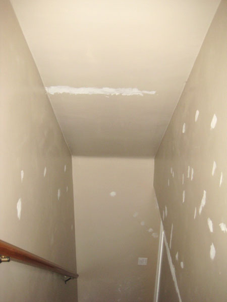
Here’s where we started…
(See all those patches? Yep. Our stairwell was just that disasterous.)
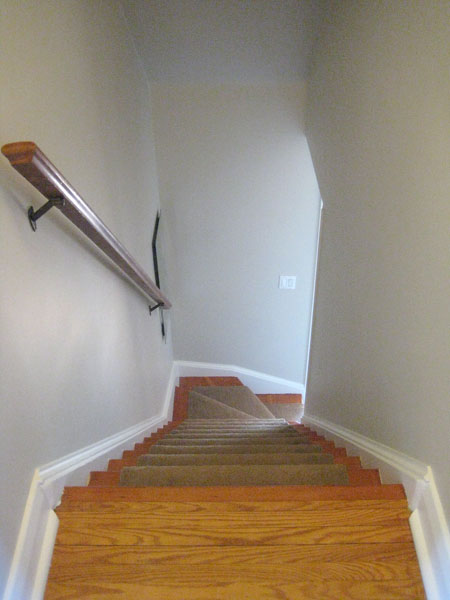
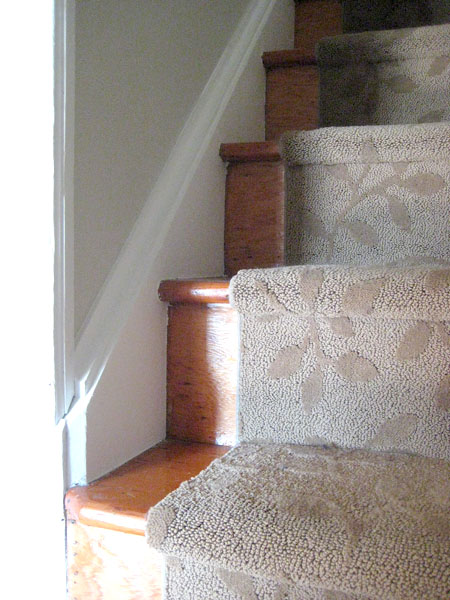
Fast forward a couple of months and a lot of paint (BM Edgecomb Gray on the walls, and Snowfall White on the stringers, trim and doors) and here’s what that same little stairwell looks like now…
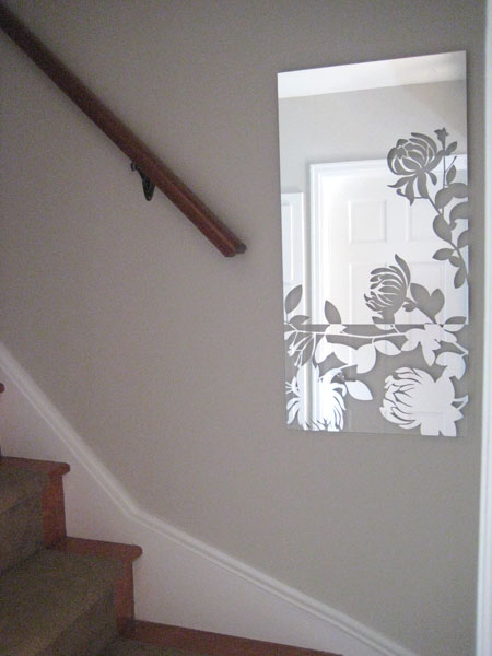
One of my favourite improvements is the mirror at the bottom of the stairs. It’s called Melissa (yep – that’s half the reason why I bought it!) and I found it on clearance at Sears a while back (the other reason why I grabbed it up!) Rona still sells this same mirror at full price (see here), so I’m quite proud of my lovely little bargain. :) It’s a dark, windowless little stairwell and this just seems to brighten the landing up a bit (plus I just think it’s pretty!)
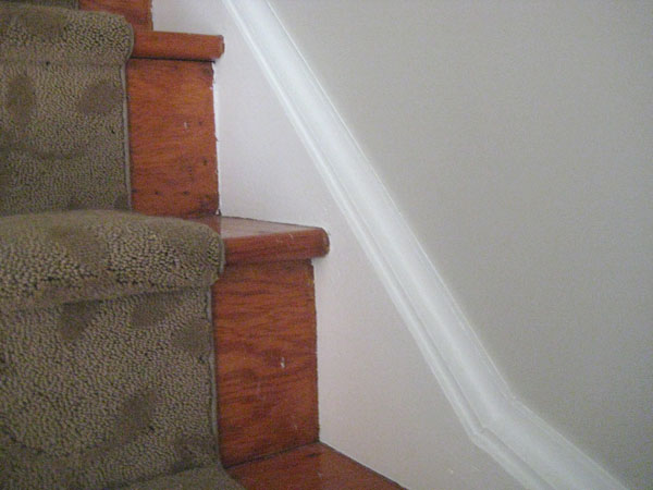
Oooh! And see those lovely stringers near the bottom of the pic? They weren’t always so lovely. That loveliness is the result of a whole lot of filler (there was a huge gap between the stringers and the wall originally that yours truly fixed up with loads of caulking), careful (crazy time consuming!) taping (click here for pics of the groovy green tape stripes I had going for a while) and a lick of paint.
Just looks so much cleaner now. :)
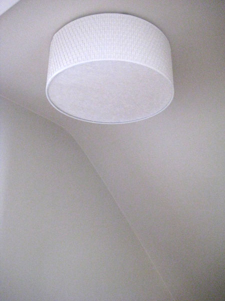
The boob light at the top of the stairs has been replaced by Ikea’s amazing Alang…
(Alang is indeed a-lovely, non?)
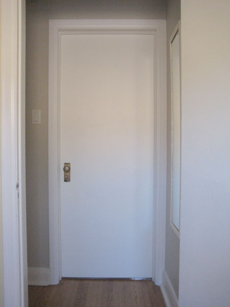
And I painted both the doors to the upstairs bedrooms. They were originally wood-grain and coated in what appeared to be a gazillion layers of 1940s varnish. The white is way better (if you ask me!)
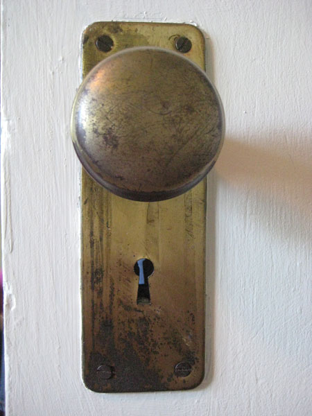
I heart our doorknobs. They’re old and aged and imperfectly perfect.
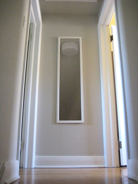
Lastly we added a mirror at the top of the stairs. Afterall, one must make sure she’s presentable before greeting her public. ;)
And poof! The stairwell is done. Ish. I’d like to eventually replace the thick brown (leaf-patterned) runner with something fun or striped or something like that, but for now it’s in good shape so despite that it’s brown (did I mention that it’s brown? Yep. It’s brown…) it’s staying, for a while at least. And I’d like to add something to that wall at the very bottom of the stairs (a pic from our wedding [almost 4 years ago] perhaps? We should really start printing those at some point…) but that’s not an urgent stairwell upgrade at the moment either.
For now, it’s better! If you didn’t know I’d put weeks (and weeks and weeks) of weekend-work into that little dark stairwell, you’d just think that it’s a fresh clean stairwell. But it’s the projects that you don’t notice that add the most value, I think. At least I hope. :)
Leave a comment
Could the next project in line please stand up (yes, that would be you, purple sunroom)
First admission: our sunroom isn’t really purple. I’m pretty sure it’s supposed to be gray. But at certain points in the day (ie: about 75% of the time) the walls have a definite lavender look. I’m not against lavender, per se. Lavender can be really really pretty in some spaces (I’ve threatened to paint our bedroom lavender more than once, in fact!) (Sweetie says no.) But gray (when gray is intended) should indeed be gray. Purple-ly gray has always looked like a mistint to me. Even if it’s perfectly intentional. At least in our sunroom it does. It drives me a little bonkers.
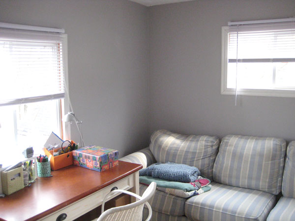
Second admission: our sunroom isn’t really a sunroom. Or maybe it is. I guess it depends on how strict you are with the definition of sunroom. Our sunroom is an addition one of the (many) previous owners of this house tacked onto the back of our home. It has three windows, which makes it sunroom-like, I suppose. But the windows aren’t really large enough to be truly sunroom-esque. It’s a strange little room really. I think it was constructed as an attempt to add more square footage to the house (which it does.) Unfortunately, it’s a long narrow room, so while it adds MORE space, it’s not entirely USEFUL space. Right now it mostly functions as our back entryway. Let’s call it a mudroom sporting a miscellaneous couch, a desk, and my piano. (Because every mudroom needs its own piano, of course!) I’m hoping a quickie facelift will make it prettier (if not more functional?) (Prettiness leads to function, right?)
Third admission: I would much rather be working on our kitchen floor than painting our sunroom right now. But, I’m still making the official decision on what to do with the floor (yep – I’m hopelessly floor-fickle) so in the meantime, the sunroom’s number has been pulled!
All that out in the open, could I interest you in some befores? Just so you can see where I’m starting? Here you are. :)
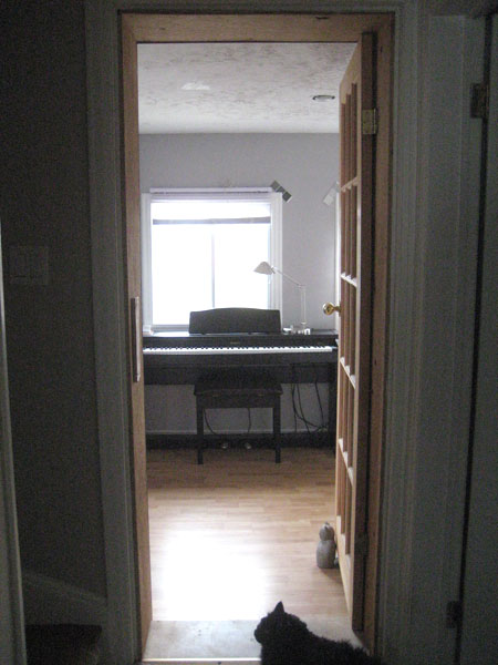
Here’s the view into the sunroom from our main hallway. And a cat.
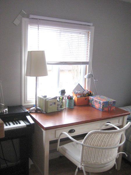
Next to the piano (like, one centimetre away), is a really cluttered (soon to be relocated) desk…
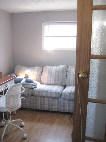
…and next to the desk, squished onto the side wall, is the comfiest couch ever. EVER. (Jacob agrees.) Which is why it’s back there. I can’t bear to part with it, even though we don’t have anywhere for it really (except the sunroom.) Come over and take a sit on it for a sec. You’ll understand.
Something that drives me a little crazy about the sunroom? Check out the blinds. Specifically where they’re mounted…
Yep. All the blinds in the room are mounted above the windows. It’s not pretty. I can’t wait to tear those down.
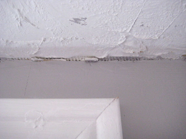
Oooh! And let me show you the ceiling for a sec. :) Patching began a couple weeks ago with caulking the seam where the walls meet the ceiling alllll around the room. Why? Look…
Yep. Whoever finished this room didn’t really excel at taping/mudding. (Although, that said, neither do I LOL.) You can see a steady band of mesh tape (unmudded) alllll around the perimetre of the room. (Or at least you could until I got my caulking gun out!)
The good news? Once this room is painted, the entire main floor will be done. Done! Hooray! Then it’s on to the bedrooms. And the basement. And the front porch. (Someday I’ll buy a house that comes pre-painted.) (I hope.) (Ooooh! And a dishwasher! I’d really like a house that comes with a dishwasher please!) (Unrelated, of course, but very very true.)
Leave a comment
Who’s the big fish in the kitchen? (I am! I am!)
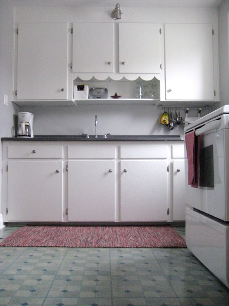
Hello! Sooooo… I’m flip flopping around here like a perch in the woods. As explanatory background information, let’s take a look at my existing kitchen for just a sec, k?
Ah. There she is. In all her ugly-floored glory.
Remember this post where I ooooohed and aaaaahed about how much I looooove butchers’ block countertops? Yep. Me too.
But then, THEN I discovered inexpensive easily-installed hickory-look Allure flooring. Which led me to thinking (in THIS post) that maybe a black countertop could be in my future, a la my inspiration image (since, in my head at least, wood-look floors plus a wood countertop just seemed a little too… woody.)
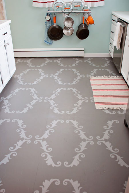
But yesterday, I flopped. Or flipped. Or flip flopped. Whatever. I changed my mind (let’s go with that!) yet again. You see, I found a post about painted plywood floors. Yeppers. And after just a few seconds with my buddies at Pinterest, I’d found a plethora of painted plywood prettiness.
Need proof? Lookie here…
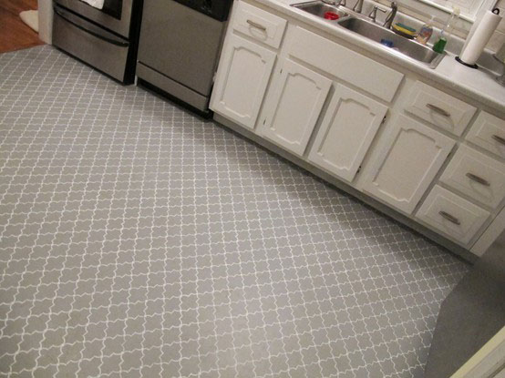
Painted and stencilled plywood from Creek Bed Threads. Sweetie and I could totally do this. Love!!!
Or there’s this one too (from smart the folk at Back to Domestics.) Also painted plywood. Also stencilled. Also fantastic!
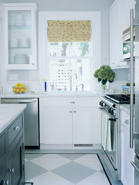
These are actual hardwood floors, I think (not plywood) (brave souls!) but I looooove the gray and cream checkerboard pattern (from Better Homes and Gardens)…
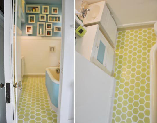
Oooooh. And I adore this honeycomb patterned painted floor from Apartment Therapy…
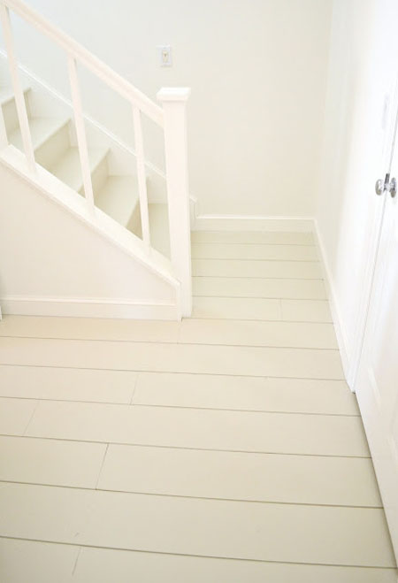
And just look (omg LOOK!) at this simple and lovely painted plank plywood floor from Frugal Farmhouse Design…
Swoon, eh?
So I brought this all up with Sweetie (who, being a boy, is indeed a big fan of plywood) and after a brief chat and a few pics, he’s on board. It’d be even cheaper than the inexpensive Allure hickory-look flooring I’d found. And, well, despite that the Allure flooring claims to be easy-peasy to put down (and I’ve read many testimonials agreeing with this) my experience with installing it at our last house was neither easy nor peasy at all. Once it was down, it was awesome. But getting it all down with the seams snug and everything stuck together with the uber sticky glue strips while cats were circling helping the whole time? Bad combo. So painted plywood is my new plan, even if just temporarily (ie: a few years) until we can afford nicer flooring for the kitchen (at which point we’ll have a nice sturdy plywood subfloor to lay everything on!) The perfect plan? I think so! :)
And you know what this all means, right? If we go with the plywood floors, my butchers’ block countertops are back in. At least for now. Unless I change my mind again. Which could happen. Maybe. Or maybe not. We’ll see. (Earlier perch reference? Yup. That’s me.)
Leave a comment
Microwave Risotto (so easy! so good!)
Have I told you yet about my most favourite recipe ever? No? Oh! Let’s chat, k? :)
I heart risotto. A lot. But I hate putting a lot of effort into food (which, sadly, risotto generally demands.) The solution? Microwave Risotto. Like, made entirely in the microwave. Really. This is the ultimate (ridiculously!) simple and (amazingly!) delicious comfort food. We eat it as a main course. We eat it as a side dish. I’ve brought it to work on potluck day. I’ve made this for company. I have this cold for lunch the day-after. It is SO GOOD.
I’m not sure of the exact origin of this recipe (if it’s yours, please tell me!) but I’ve been making this for years. It came through one of those email recipe chain letters (way back in pre-Pinterest times) – you know, those emails where some friend would add your name to some list and forward it to a bunch of other friends, and you then were expected to email a recipe to 5 people (who you probably didn’t know) under the promise that, like, a hundred-ish people would then send you a recipe within seven days. Remember those emails? Yeah. I didn’t really like those emails either. This is the only recipe I think I ever received from one of those recipe chain letters. Luckily for me, it’s fantastic. :)
I’m pretty sure the original microwave risotto recipe included mushrooms, not green peppers. But, well, I think mushrooms are squishy, so I use green peps instead. :) I’ve also substituted a couple cups of frozen broccoli/cauliflower (thawed), and that’s yummy too. Or I’ve added corn. Or I’ve added asparagus. This is a pretty casual recipe (if a recipe can be casual?) so I generally just use what I have on hand. It’s pretty hard to screw this up!
Microwave Risotto
INGREDIENTS
1-2 tbsp butter
Half an onion, chopped
1 large green pepper, washed (of course), seeded and chopped
2 cloves of garlic (or 1 tsp of the pre-chopped-in-oil stuff)
1 cup arborio rice (or some other short grain rice)
2.5 cups of beef broth (I usually just use bouillon)
Grated cheese (about a cup?)
METHOD
1. Melt butter in a large bowl in microwave
2. Add onion, green pepper, and garlic to bowl. Stir to coat with melted butter. Microwave uncovered for 5 minutes.
3. Add rice and beef broth to vegetables in bowl. Stir. Microwave uncovered for 25 minutes, stirring once midway.
4. Add cheese. Stir.
5. Eat. Enjoy. Marvel at how simple that all was. :)
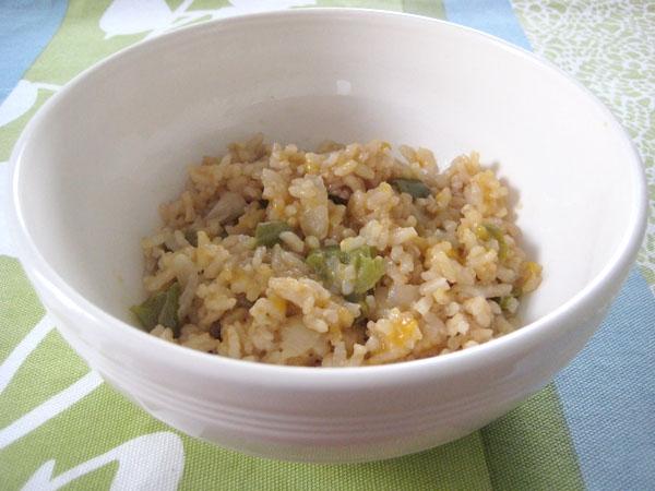
And, when you’re done, this is what it looks like, all risotto-ed up…
In case it doesn’t look like there’s much in my bowl… ummmmm, yeeeeah. You’re right. I didn’t remember to take pics until the next day and this is all that was left from the night before. Ooops. So yep! It’s JUST that tasty. On the well-known comfort food scale of 1 to 10, this is definitely a 10.5. Maybe even an 11. It’s like happiness in a bowl. Like a big risotto hug. Sound weird? Trust me. Try it. You’ll see. :)
Leave a comment
A coffee-worthy surface indeed (the tale of a $15 coffeetable)
Permission to indulge in a “look what I did!” moment? Thank you! :)
The living room in our last house was a lot larger than our living room now. And so our living room furniture has never really seemed to fit in our new space here. The culprit? Our ginormous Ikea Lack coffetable. While amazingly functional, it was just far too large for our room.
And so began the search for a new place to rest my coffee. :)
Then, one day, while scouring the local Kijiji-pages (er, website) I found a listing for a rather beat-up looking glass-topped coffeetable. Price? $15. My reaction? Sold!
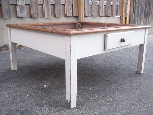
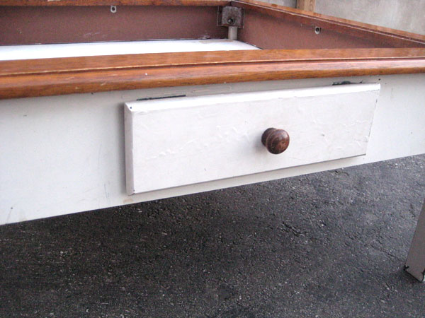
Here’s what the beast looked like when I picked ‘er up.
She was scratched. She was dented. She had random patches of forest green peeking out from under her white exterior. She was a sad looking coffeetable indeed.
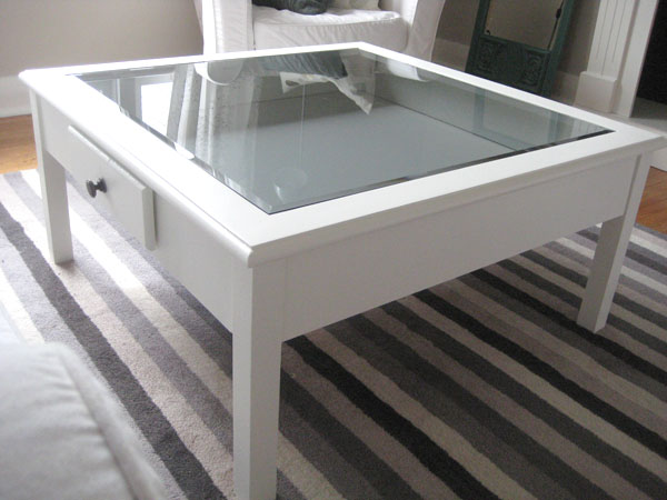
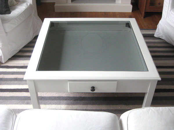
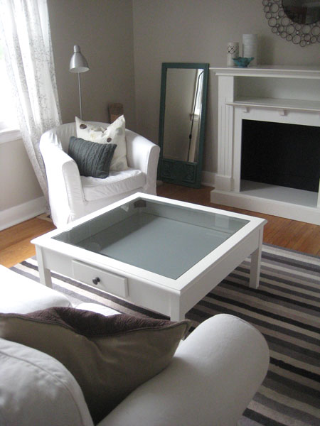
So I pulled out my primer (BullsEye in the blue can is my go-to primer for everything – it rocks) and my Snowfall White paint (all the trim in my house is painted BM Snowfall White, so I seem to always have some on hand) and one weekend later (following the accepted furniture painting rules: sand, prime, paint, admire), I now have a much prettier place to rest my coffee. :)
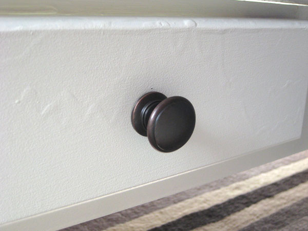
I switched out the old pull (it was wood, it was icky) on the (fake) drawer for an inexpensive ORB pull I picked up at Rona. Much better. :)
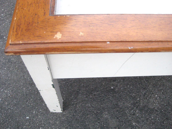
Some of the drips from the previous owner’s (rather abysmal) painting job still show through (even though I sanded the dickens out of the table before priming it) but I’ve decided that they add character. And, really, unless you’re taking a ridiculously closeup picture of my pretty new pull, you don’t really notice the drips in person. :)
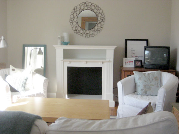
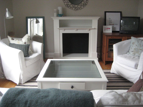
Sadly, in all honesty, I’m not 100% sure (after alllllll that) that this is the right coffee table for our space. While our Ikea table was too long, this one is too… square. And also too big. Again. Sigh. It too seems to take over the entire living room.
And I’m already missing the handy-dandy storage shelf that was under my large Lack Ikea table – it always came to the rescue whenever I needed to quickly move things (remotes, my laptop, random bills, my copy of Blogging for Dummies) out of sight.
And, well, I’m also sort of wishing I would have jumped (just a wee bit) outside of my paint-it-white-and-it’ll-be-alright comfort zone and painted the table dark (since EVERYTHING in our living room is white now. I’m all for uniformity, but this might be a little much.)
BUT, it’s BETTER. For now. At least until I decide if it’ll become a permanent fixture in our room, or if it’s hitting the selling-block once again, or getting another (sigh) coat of paint, this time in deep charcoal or something snazzy like that. Or maybe I’ll just give in and get a larger living room (unlikely, but it could happen!) I’ll letcha know what I decide. :)
Leave a comment

