Despite that I really love bright and sunny kitchens, the kitchen at the old mauve house is neither bright nor sunny. The kitchen window is north-facing (meaning it never catches any real sunlight) and our (inherited) wall colour is rather drab and dark (but kitchen-painting is a ways down on our list of required renos at the moment, so drab and dark will sadly stay put until “paint kitchen” comes up in the renovating queue.)
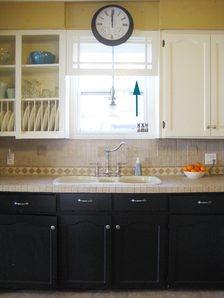
One thing that has helped increase the kitchen brightness-factor a tad? Removing THIS…
Yep. That awkward repurposed-window-but-half-valence-thingy came down recently. Not entirely because we wanted to take it down. But rather because it needed to move in order to access the window so that we could thoroughly weatherproof (since our kitchen window is definitely drafty and quite a pane.) (Get it? Pane? Pain?) (Groan… K. Carrying on…)
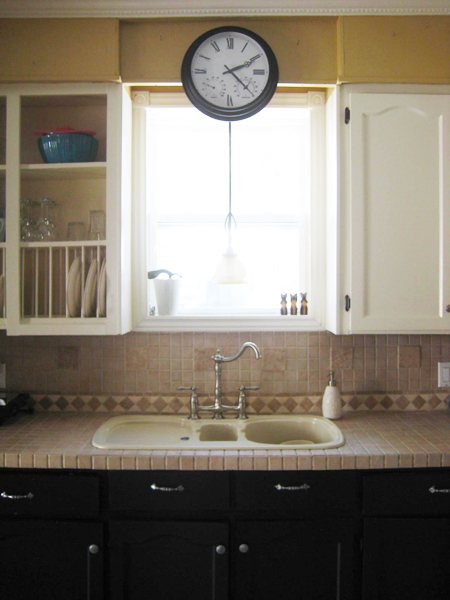
Initially, Sweetie didn’t like the kitchen window sans the odd-looking-not-really-a-valence, but I asked him to live with it for a while. The result? The look has grown on us both. Much more light floods into the kitchen now, and the window just looks less… odd.
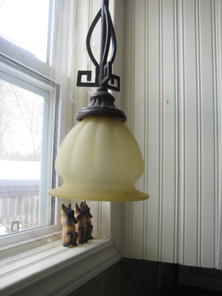
Our new problem? The light over the sink. I’ve never been a huge fan of this light (or of any of the lights in this house, truth be told) (once budget permits, they’re allll getting a good swapping.) However without the quasi-valence in place, the light definitely looks odd and hangs too far down. And the yellow-hued shade makes it a wee more traditional than I’d prefer. And it’s honestly just not us.
After a little online big box store searching, I’ve narrowed the new over-the-sink light options down to a few contenders.
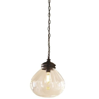
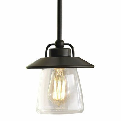
My absolute fave? This one from Lowes…
Pretty, no? I adore this light. To get all technical, it’s the Allen + Roth 12-in Bronze Edison-Style Pendant Light with Clear Shade. And it’s LOVELY. The chain makes the light feel… (searching for the correct words…) (let’s go with…) airy-er than it would if the light was hanging from dark solid rods. And the shape is vintage-ey, but not old-looking. It’s modern, but antique-ish.
Does that all even make sense? Likely not.
Regardless, I love this fixture and desperately want this for my kitchen. There are a couple slight hiccups, however. It’s quite large at 12 inches in diameter. I searched all over Internet-land to see whether Allen & Roth make a slightly smaller version (the dreaded “mini-pendant”, if you will) and, sadly, they do not. Secondly, 75% of the reviews for this fixture have mentioned that the amount of light it casts (with it’s maximum 60W Edison bulb) isn’t particularly great for task lighting (and doing dishes and cleaning vegetables and the other mundane things that I do around the kitchen sink definitely seem to be task-lighting sort of tasks.) Could I outfit this light with a normal run-of-the-mill clear incandescent bulb and have it look just as pretty? Maybe? I’m not sure. But it’s also the most expensive light of the lot I’m considering. At $128 it’s quite beyond my “lovely little light in the kitchen window” budget.
But I love it. A whole lot. So it’s staying on my list.
Much smaller, and also available from the good folk at Allen + Roth via Lowes is this one…
Sweetie likes this one better than the first, and, from a cost standpoint it’s mucho cheapo-er (at only $49 bucks.) But there’s that whole low-wattage Edison light issue again. And it’s very square. And there’s already a lot of squareness in my kitchen. I think I’m gravitating more toward a little spherical illumination.
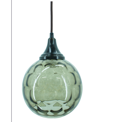
Which lead me to THIS light…
Which is pretty. SO pretty! I squealed just a wee bit when I stumbled across this fixture – the green glass is just so incredibly lovely and will look amazing in my kitchen one day (once all my painting projects are all finished up.) (Eventually.) The problem? (Because there’s ALWAYS a problem?) It’s only available at Lowes.com. Or at Lowes stores in the states, I’m assuming. And I am most definitely sitting here typing away from my Canadian home, with limited access to an American Lowes store. Sigh. And, with a maximum allowance for a 40W bulb, this light would be even dimmer and less kitchen-task-friendly than the others (I keep reminding myself of that – it keeps me from getting super sad that it’s unobtainable without a jaunt across the border.)
So where does this all leave me? It leaves me mighty light-less. Sorta. The existing light works for now (and until we find another far prettier one for the space.) But now that I’ve found a few almost perfect options, I want to find the one.
More lighting obsessing to follow, I’m sure. (Sorry about that.)

I’m glad you’re blogging again more regularly! :)
How about using cfls? You could use a 100 or 120 watt equivalent without going near the fixture max. They have enclosed cfl bulbs with less of the swirly look.
That could work! I didn’t realize that cfls had advanced so far (I’m definitely not a fan of the swirly-bulb cfl look LOL.) I might have to check those out – thanks for the tip!