I think I need a map (on my wall, that is) (and not in case I get lost in my own house) (although that has happened…)
I miss maps. Sigh. Don’t get me wrong – GPS seriously rocks (especially for those of us who are directionally challenged even at the best of times.) But there’s something so comforting about pulling out a map that’s all soft and worn at the creases from being opened and lovingly refolded many many times. The challenge in identifying both where you are now, and where you’d like to go, choosing the most straightforward (or leisurely, depending on your plans) route to get you from point A to B, and then seeing it all laid out there on paper in front of you. The crinkling as you readjust the map just a little – it’s far more soothing than the harsh GPS voice (who is that lady anyway?) who tells you rather forcefully “turn right” and then haughtily scolds you for having to recalculate your journey.
Yep. GPS certainly makes life easier, but given the choice (and, well, a co-pilot to drive while I hold the map and navigate) I’ll take a map any day. :)
So, then, is it any wonder that I yearn for maps on my walls? Maps are nostalgic. They remind me of gradeschool and the smell of classrooms and erasers. They remind me of roadtrips – we had a well-worn map of Ontario in the car at all times growing up (there were two sides to that map: the Southwestern Ontario side, and the “everything else up there” side that never ever got referenced during our trips.) They remind me of the pride in being able to identify the places we’d travelled to, and the excitement of planning out new journeys.
GPS? You rock. But maps? Maps are the bomb.
(Do people still say “the bomb”?) (Meh. I’m sticking with that. Anyway…)
Where would I put said map? On what has affectionately become known as my “star wall” (aka the wall where I randomly and temporarily hung a green star, for lack of anything else to put there at the time.) (Um, like, a year ago.) The same wall where I’ve also pondered adding a gallery wall in the past. But a map? Hanging one large map would be so much easier than coordinating multiple images in multiple frames (and don’t even get me started on the challenge of keeping everything aligned and straight… All that nitpickyness could indeed become a wee bit much for perfectionist moi.)
Here’s the picture that originally got my map-loving-ness all in a frenzy (courtesy of the amazing folk over at Restored Style):
Lovely eh?! The map is so well coordinated and blends in so well with everything else that it’s no longer a map – it’s art.
And don’t even get me started on all the mappage available online! Here are a couple I’m considering (both from etsy, of course)…
This one from Here & There Shop is super simple, and super duper cute.
I imagine our map would have a little dotted line connecting the village of Ailsa Craig (where Sweetie and I got married in a pretty little white chapel) to France and England (where we honeymooned.) :)
Or this one (from English Muffin Shop) is fun and cheery…
…I think it’s meant for a child’s room, but I absolutely adore the colours. It’d look rather nice in our living room, I think!
I might also scour our local antique shops for an actual vintage map (since a map seems like something that an antique store would have, no?) Really, I’m sure there are a gazillion (give or take a few, of course) different shops (both online and onstreet) where I could find a lovely little map for our living room. And we could, in fact, simply frame an actual map (which would be the obvious and simple approach!) (And there are some rather pretty maps out there.) Yes, the problem may not be where to find myself a lovely map, but instead, which one to hang. :)
In the meantime, the truth is pretty obvious. While GPS may indeed make my life a bit easier, a map will likely look way better on my wall. :)
Leave a comment
Birds of a feather sit on fake fireplace mantels together (alternate and equally cheesy title: hi hi birdies!) (groan, I know)
Look! Look what I got!
Don’t see them? K! Let’s look a little closer…
Yep! That’s right. Perched atop of beloved Molly Ringwald’s Getting the Pretty Back (Dear Molly: you rock btw!) are my two new cheerful ceramic (porcelain? Not sure about that one) little birds. I heart them! They were only 3 bucks each at Bouclair, and I don’t know why I love them so much… I just do.
I figure the larger bird represents Sweetie, and the smaller one is me. If you want to get all philosophical about it.
Sigh. Avian adorableness. :)
That’s all! Just thought I’d share my most recent (and potentially most adorable) little purchase. To clarify, I don’t really have a bird thing, or a ceramic (porcelain?) animals thing. But these two little beauties make me happy! Apparently I’m rather easily won over by the cheap, cheerful, and chirpy. :)
Leave a comment
Shut the front drapes! (What not to hang in your front windows) (Somewhere, far far away, Stacey and Clinton are cringing)
So the curtains in our front window have been driving me a wee bit bonkers for a while now (since we hung them up almost two years ago when we moved into this house, in fact.) Why? Despite being super cute (I love the pretty little pattern!) (the curtains are from Ikea btw – they’re Ikea’s Hedda Blad) they’re very… light and airy. Ie: they look a bit like we’ve hung sheets in our windows when closed. Which, having lived in student housing for quite a while during my University years, I can attest from experience is never a classy look.
They’re very sweet curtains and I really do like them, but because they’re rather sheer and cotton and white, they DO indeed resemble sheets just a bit. Which, unfortunately, isn’t at all the look I’m going for.
So what did I do? I went to Ikea, of course. :) I buy pretty much all of my curtains at Ikea since…
a) they’re inexpensive (so if the kitties play hide and seek behind the curtains, which they often do, and the curtains become riddled with claw marks, I don’t stress) (because who wants to stress over curtains, anyway?)
b) they’re LONG. It’s not so much of an issue at this house (our ceilings here seem to be a pretty standard height) but with super high ceilings at our last humble abode, I became obsessed with having long curtains. I’d rather my drapes be too long than too flood-ready
c) they’re NICE – I love Ikea’s drapery department (plus there’s always the fun of hiding in the sample drapes and scaring the crapolla out of your Sweetie when he walks by :)
After a rather whirlwind trip to Ikea (they were scheduled to close about 30 minutes after we arrived, so Sweetie helped keep me focused on moving straight into the drapery department, despite that what I really wanted to do was wander off and browse) (I heart Ikea) we walked out with the natural-coloured Ritva drapes. They’re hidden-tab-topped. They’re hearty-looking. They’re both cheap and cheerful. And they’re not at all sheet-like. I rather like them. As does Jacob.
The Ritva curtains have a bit of a linen-ish look to them, which keeps them from looking particularly sheet-like…
Erik rather likes the new curtains too. Kitten approval is very important in decorating matters, you know. :)
All in all, I’m quite happy with our new Ritva curtains! From a decorating-risk standpoint, they’re about a 2 on the 1-10 scale (with 10 being chartreuse paisly, and 1 being one of those plain white vinyl pull-down blinds) but I’m ok with that. They’ll do for now. :)
PS – sending a big huge congratulations out to my little brother and his new wife who were married last Thursday! So happy for you! So happy for me (I’ve finally got that sister I’ve wanted since I was little and realized that a gross and stinky brother [since all brothers are both gross and stinky when you're little] was all I was ever going to get.) Lots of love to you both!
Leave a comment
Next project? Gallery wall! (The most recent addition to my ever-growing to do list)
I seem to be alllll over the place with projects lately. I may, in fact, have decorating-ADD. There’s my very unfinished (due to newly adopted cat occupation) sunroom project. And my bedroom? It still needs paint (although the walls are all patched now, so she’s all ready to go!) (once I, um, decide on a colour…) So, while we’re in project-limbo for the moment with those two tasks, let’s just move right along to the next item on my list, shall we? :)
And what would that be? I think I need a gallery wall. Actually, I know I need a gallery wall. You see, there’s a big empty wall (temporarily being quasi-under-filled by a rather random green star) that’s begging me for frames. Just look…
Or, more precisely…
(For the record, I’m not sure why the walls look positively peachy in that second picture. That’s a little odd… I promise – they’re most definitely a lovely shade of Edgecomb Gray griege.)
I didn’t notice the abysmal blankness so much when the living room was in its previous configuration. But now that it’s all (awesomely!) rearranged, you see that wall from the couch (where we most often sit in the living room) and the walls are seriously starting to plead with me for substance. And, never one to say no to a wall, I’ll obviously oblige.
Sadly, I’m not one of those people who can ingeniously lay out frames of several sizes/shapes and – poof! – have the whole shebang look brilliant once up on the wall. Truth be told, this sort of approach kinda stresses me out (although it looks lovely when other people do it!) (Yet another example of things I love in other people’s homes! LOL.) Nope. I crave simplicity, a) because I’m too lazy to be bothered with anything more complex than straight lines and identical sizes and b) I have a plan in my head, and it looks just like this (via the good chaps at decorpad)…
Please note the chairs (oh! Look. I have the same Ikea Ektorp Tullsta white slipcovered chairs.) Please notice the configuration (side table between the two chairs? Why, yes. I have that too!) And do you see that wall colour? (Benjamin Moore Revere Pewter, you say? Golly, my walls are the next shade lighter on that same paint card. What a coincidence!) Yep. This may as well be in my living room. (Minus the pink tulips. I’d actually really love some pink tulips please.) Yes, if there was ever a sign that a gallery wall was meant to be in my little living room, I think this would be a big neon flashing florescent yellow one. (This also might be a sign that I should paint my little green side table too.) (I’ll add that to the list.)
For this project, I’ll obviously need a trip to Ikea (yay!) From what I’ve read so far (and, yes, gallery-wall research is super important) the Ribba frames work particularly well for gallery walls.
And then, the big question? What to include in those frames. The obvious answer would be pictures of the cats. Of course. :) And cats may indeed end up in a few of the frames. Cats, and perhaps a few pictures from our wedding – it makes me a wee bit sad that we haven’t put up any pictures from our wedding yet. (Um, almost four years later…)
So yep! That’s the next project in queue. To officially begin whenever we make it to Ikea next. Which could be a ways off still (although I’m always looking for an Ikea-excuse!) Regardless, it’s good to plan ahead, no? “Glorious gallery wall”, you are officially on my to do list. :)
(And little green sidetable? Consider yourself due for a paint job shortly too. Blame decorpad for that one. :)
Leave a comment
The carpet is stripier from the other side of the room (Ha. Get it? Grass is greener? Carpet stripier?) (Yep. I’m a dork. See? This is what happens when I have a big fat migraine)
First off, MANY MANY MANY apologies for my absence this week. It was a migraine week, and when I have a migraine (especially a multi-day migraine) (ugh) I’m only marginally-functional (with lots of emphasis on the “marginally” part.) The migraine-inducing culprit? My guess: the weather. While it’s absolutely fan-mazing-tastic that – poof! – over the past week it’s suddenly become summer (thank you Mother Nature!), my noggin paid the price, methinks. That said, I’m all better now (knocking on wood), so I’m baaa-aack. :)
Secondly… look at my living room!
I took my own advice (from THIS post) and decided the living room looks better/bigger when it’s more open (without the couch cutting across the room.) And indeed it does! I actually squealed once Sweetie and I had everything moved around (for, like, the the seventh time) (it took a couple attempts to get things just right) (it’s a good thing Sweetie loves me!)
And Jacob is pretty darn happy with the new arrangement too. He has the hugest pillow ever (aka: the couch), right next to our big front window. I’m predicting that I’ll find a prominent orange-cat ass-groove in that top cushion very very shortly.
Hope everyone has a happy and sunny Victoria Day Weekend!
Leave a comment
Going back in time, Wayne’s World style (a glance back at our living room before)
Have I ever showed you the befores of our living room? No? I didn’t think so. I’m thinking I may have skipped that step entirely (bad blogger Joy, very very bad!) In my defense, I was just so excited to show off our new faux fireplace, I went straight to the grand finale and totally skipped the prelude. But let’s make up for that now, k? :)
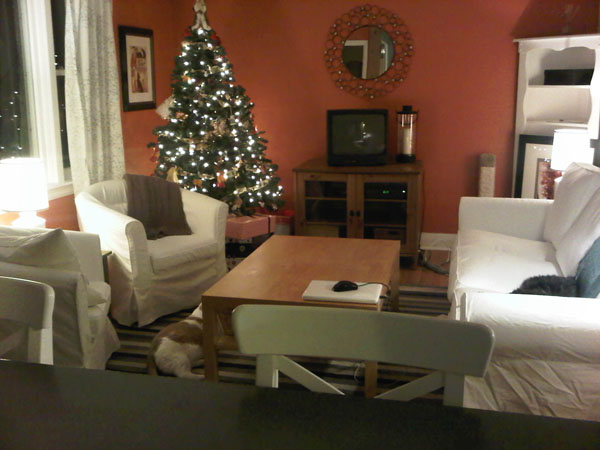
Let’s travel waaay back in time to October 2010. (Insert Wayne and Garth doing their squiggly doodle-oodle-oo… doodle-oodle-oo… flashback thing.) (I tried to find that clip via Youtube btw, just to give you a visual, but alas, normally-dependable Youtube failed me this morning.) (If you find that clip somewhere, please let me know!) Because the house was an absolute disaster for the first few months we lived here (I’m definitely not one of those people who moves in and immediately has everything unpacked. My friend Jess is. Oh how I envy her!) (we still have un-unpacked boxes in the basement, in fact… shhhh… don’t tell…) I don’t have many pics from the living room’s orange days. But here’s one I did find from Christmas right after we moved in…
…ah Christmas. :) Happy sigh.
(Aside: that picture kinda makes me want to rearrange our furniture – I rather liked our living room like this. Hmmm…) (See what happens when you venture into the past? You earn a fun furniture rearranging session!)
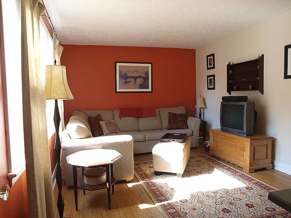
And here’s a (rather sterile-looking) shot from the original house listing…
While the orange wasn’t terrible, per se, it just wasn’t me. At all. I like orange (quite a lot actually!) but just not on my own walls. On your walls though? Awesome! :)
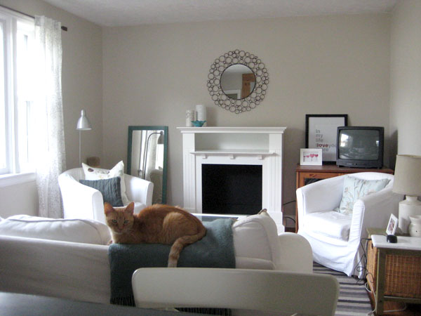
So that’s when I got my paint on. Needless to say, it took a good couple coats of primer to dull our glowing pumpkin walls. But a wee bit of Edgecomb Gray paint later, and I think it was all worth it.
(Please ignore the messy laptop and cords on the little green side table… Let’s call this an au naturel image, taken this morning, sans any staging k?) :)
So there you go! Just a quick little prequel post to show you where my living room all started. It still has a ways to go (SOMETHING needs to go in the far left corner, but I’m still not sure what), but it’s a far calmer space now than it was when we moved in (screaming-orange walls aren’t especially soothing.) Jacob agrees.
Now please excuse me while I go rearrange my furniture. Again.
Leave a comment


