Ack. Nightmarish, eh? Yup. Absolutely terrifying.
And since “make closet pretty” wasn’t first and foremost (or even seventh and semi-important) on my big ol’ home reno to do list, it stayed that way for the past ten months. Empty. Ugly. Mocking me. Daring me to step inside (which I would never ever ever do due to the aforementioned scariness factor.)
So where were all of our clothes? In the nursery closet of course. (See where this is leading?) But, with Baby on the way in a few short weeks (yep, you guessed it), it was time to clear out that closet. Meaning that it was also time for us to face the scariness once and for all and make our bedroom closet a much more hospitable, much less horror movie-esque little place.
So what did I do?
I painted it.
And by that I mean that I really quickly and lazily painted it, using leftover Edgecomb Gray paint that I already had on hand. Did I remove the wallpaper from the walls? Nope. Did I sand down the drywall compound patching job that Sweetie did (since originally there were plaster cracks on the back wall of the closet that made it look even more terrifying?) Nope. Did I prime or prep or do anything to make the ugly innards of my closet more humane-looking? Nope. I just slapped some paint on those closet walls and called it a day.
And it didn’t turn out so bad. Behold the after…
I even tossed a quick coat of paint on the baseboards. Same colour as the walls. We’re not talking anything fancy here (it is a closet, afterall.)
Yep. A quick coat of paint and suddenly the closet ain’t so scary any more.
(I mean, I wouldn’t want to hang out and read a book in there, of course, but it’s way better.)
So there. That’s my scary-closet-turned-not-quite-as-scary-due-to-Baby’s-impending-arrival story for you. Since I’m guessing that Baby will need its own closet.
You know, for cute little onesies and pretty dresses (if Baby is a girl) or tiny overalls (if this wiggly little belly-mover is a boy) and stuff. :)
]]>
Oh Florence. You rock, and I adore you (despite your rather dark music videos.) (Seriously: the voodoo parts in that video really creep me out…)
But moving right along…
Random creepiness aside (sorry about all that), what else do I adore? Our new living room ceiling light! Remember our old light?
Aka the heavy-looking, ill-placed, not-at-all us, noggin-knocker (since Sweetie bonked his head off of it no fewer than about a gazillion times?) Gone. Gone! And replaced by something much much lovelier (and melon-safe). Specifically, this:
It was cheap. It is cheerful. It just seems to fit in our living room. It makes me very happy.
And did I mention it was cheap? It was only $44.97 from my favourite folks over at Home Depot. It’s the Hampton Bay 2-Light Oil Rubbed Bronze Glenburn Semi-Flush Drum, to be exact. On the website, it looks like this…
…and I think it fits perfectly in our space. So perfectly that I actually bought a second one to replace the light at the top of our stairs. (Don’t even get me started on the light that’s currently up there – that’s a whole other story for a whole other post. Let’s suffice it to say that the existing light is quite the monstrosity. Sort of gothic. Sort of antique-y. Exceedingly ugly.)
For now I’m quite pleased with this small (but significant!) improvement.
Next, on to other, much needed living room improvements. Like, um, colour? The dark mossy green is starting to get under my skin. A lot. It’s so dark, it’s very dreary, and it’s just not us. And, after the winter we’ve had around here (could it be that spring has finally – fiiiinalllly – almost arrived?) I think I need a little more lightness-and-airyness in my life (and a lot less drab-and-darkness.)
Yep, coming soon to a living room near me? A little bit of Edgecomb Gray! Like in our last house (because I liked it just that much.) I think. Unless I change my mind. Which I tend to do a lot. I’ll keep you posted. :)
]]>
But I’m thinking it’s nearly time to face this fear and address the empty wall space around my fireplace. A space that drives me a little bonkers. And now that the Christmas tree is down (it finally – FINALLY! – came down last weekend) it’s especially obvious that there’s a big gaping hole in my living room loveliness.
Yep. I’m ready to tackle the vacant (and rather sad-looking) space around old not-at-all smokey.
The corner to the left of the (faux) fireplace is particularly lonely looking. Even Sweetie exclaimed (once the tree was all packed away and the merriness banished to the attic for the next eleven months): “You’re going to put something else there, aren’t you?”
And if Sweetie (aka Mr “Oh… What’s that? You say you painted the kitchen fuchsia? I didn’t notice…”) recognizes that something isn’t quite right, something obviously must not be right.
My dilemma? What to decorate the void with. Given my fear of putting stuff on walls, I’ve been doing a lot of research on empty corner filling (since I’m a tad OCD and indecisive and generally nervous about any sort of wall-marring commitment.) A quick discussion with the lovely folk over at Pinterest (they’re exceedingly helpful over there, btw!) left me with the following suggestions…
Wall-filling strategy #1: Framed… somethings. For the record, I’m in love with this room (holy moly that’s some gorgeous tealness!) from Emily Henderson…
But what, exactly, would I put in the frames? Prints? Art? Pictures of the cats? And should I go with white frames? Dark wood frames? Metallic? Sigh.
Or I could fill the space with plates perhaps (aka “Wall-filling strategy #2.”) Just look (look!!!) at this stunning wall of pretty plates from Larissa over at mmmcrafts…
Lovely eh? I adore this idea. Although my supply of decorative plates is a little low at the moment. And planning out which-plate-goes-where seems like the sort of thing that could drive an already somewhat strange girl completely batty.
I could scatter some pretty ceiling medallions across my wall. I’ve admired Dave and Joi’s medallion-adorned wall for a long long while now…
Love love love their living room!
Or I could embrace the emptiness… This room, from my all-time most favourite designer ever Samantha Pynn (hi Sam! You rock!), makes me think that my living room void isn’t really a void afterall. Perhaps I just need to add a lovely lamp (oooh! And a chandelier!)…
I’m not sure. What I AM sure of is that something needs to happen. To spice things up a little. You know, shake it to the right (if you know that you feel fine.)
(And yep. I just quoted Spice Girls. Random? Yes. Scary? Agreed.)
Anyhow, this debate obviously isn’t over. I’ll be taping templates of some sort to my walls shortly, I’m sure. And then the inevitable (and ongoing) template rearranging will begin. And likely more Pinterest-ing too.
Being an indecisive commitment-phobe is a lot of work.
But yes! Those are my quasi plans to date. Hopefully the next time I chat about my living room walls there will be stuff strategically mounted on them.
Or, if nothing else, print/medallion/tapestry-sized paper templates.
]]>
Secondly… look at my living room!
I took my own advice (from THIS post) and decided the living room looks better/bigger when it’s more open (without the couch cutting across the room.) And indeed it does! I actually squealed once Sweetie and I had everything moved around (for, like, the the seventh time) (it took a couple attempts to get things just right) (it’s a good thing Sweetie loves me!)
And Jacob is pretty darn happy with the new arrangement too. He has the hugest pillow ever (aka: the couch), right next to our big front window. I’m predicting that I’ll find a prominent orange-cat ass-groove in that top cushion very very shortly.
Hope everyone has a happy and sunny Victoria Day Weekend!
]]>
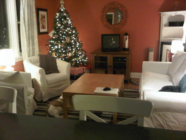
Let’s travel waaay back in time to October 2010. (Insert Wayne and Garth doing their squiggly doodle-oodle-oo… doodle-oodle-oo… flashback thing.) (I tried to find that clip via Youtube btw, just to give you a visual, but alas, normally-dependable Youtube failed me this morning.) (If you find that clip somewhere, please let me know!) Because the house was an absolute disaster for the first few months we lived here (I’m definitely not one of those people who moves in and immediately has everything unpacked. My friend Jess is. Oh how I envy her!) (we still have un-unpacked boxes in the basement, in fact… shhhh… don’t tell…) I don’t have many pics from the living room’s orange days. But here’s one I did find from Christmas right after we moved in…
…ah Christmas. :) Happy sigh.
(Aside: that picture kinda makes me want to rearrange our furniture – I rather liked our living room like this. Hmmm…) (See what happens when you venture into the past? You earn a fun furniture rearranging session!)
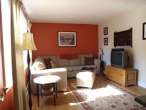
And here’s a (rather sterile-looking) shot from the original house listing…
While the orange wasn’t terrible, per se, it just wasn’t me. At all. I like orange (quite a lot actually!) but just not on my own walls. On your walls though? Awesome! :)
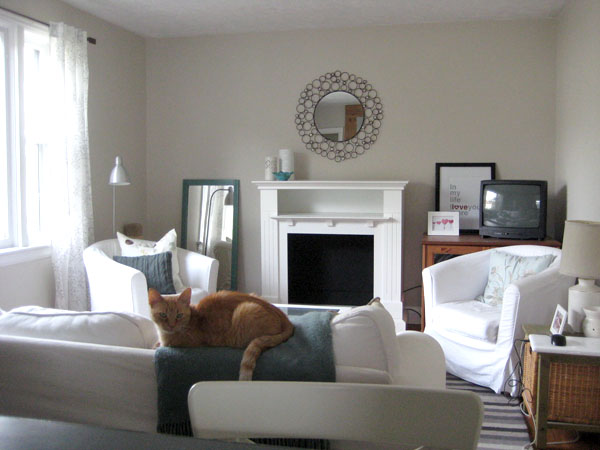
So that’s when I got my paint on. Needless to say, it took a good couple coats of primer to dull our glowing pumpkin walls. But a wee bit of Edgecomb Gray paint later, and I think it was all worth it.
(Please ignore the messy laptop and cords on the little green side table… Let’s call this an au naturel image, taken this morning, sans any staging k?) :)
So there you go! Just a quick little prequel post to show you where my living room all started. It still has a ways to go (SOMETHING needs to go in the far left corner, but I’m still not sure what), but it’s a far calmer space now than it was when we moved in (screaming-orange walls aren’t especially soothing.) Jacob agrees.
Now please excuse me while I go rearrange my furniture. Again.
]]>
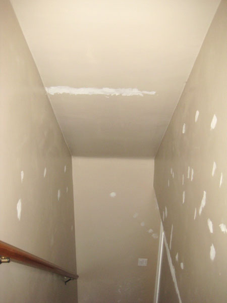
Here’s where we started…
(See all those patches? Yep. Our stairwell was just that disasterous.)
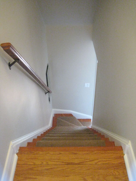
Fast forward a couple of months and a lot of paint (BM Edgecomb Gray on the walls, and Snowfall White on the stringers, trim and doors) and here’s what that same little stairwell looks like now…
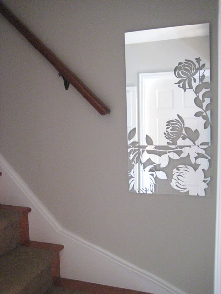
One of my favourite improvements is the mirror at the bottom of the stairs. It’s called Melissa (yep – that’s half the reason why I bought it!) and I found it on clearance at Sears a while back (the other reason why I grabbed it up!) Rona still sells this same mirror at full price (see here), so I’m quite proud of my lovely little bargain. :) It’s a dark, windowless little stairwell and this just seems to brighten the landing up a bit (plus I just think it’s pretty!)
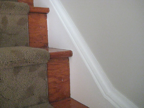
Oooh! And see those lovely stringers near the bottom of the pic? They weren’t always so lovely. That loveliness is the result of a whole lot of filler (there was a huge gap between the stringers and the wall originally that yours truly fixed up with loads of caulking), careful (crazy time consuming!) taping (click here for pics of the groovy green tape stripes I had going for a while) and a lick of paint.
Just looks so much cleaner now. :)
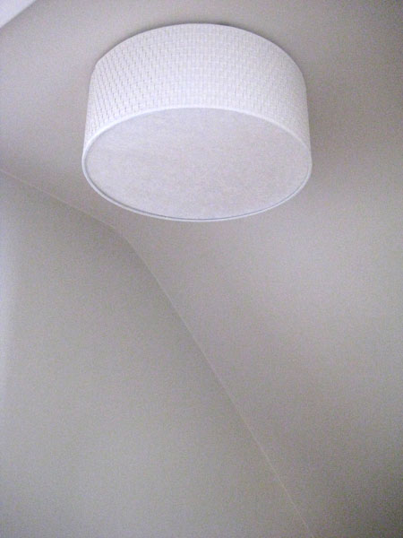
The boob light at the top of the stairs has been replaced by Ikea’s amazing Alang…
(Alang is indeed a-lovely, non?)
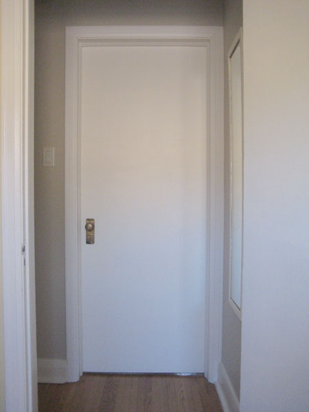
And I painted both the doors to the upstairs bedrooms. They were originally wood-grain and coated in what appeared to be a gazillion layers of 1940s varnish. The white is way better (if you ask me!)
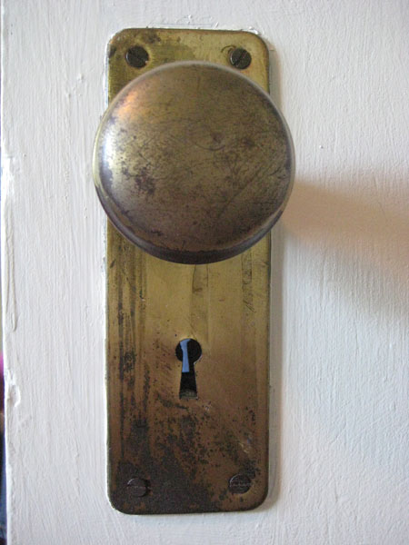
I heart our doorknobs. They’re old and aged and imperfectly perfect.
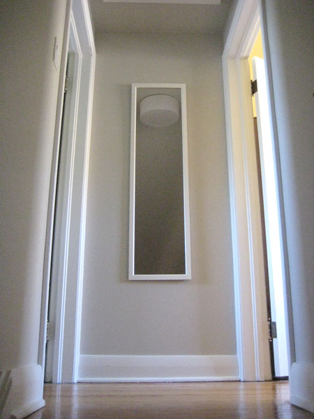
Lastly we added a mirror at the top of the stairs. Afterall, one must make sure she’s presentable before greeting her public. ;)
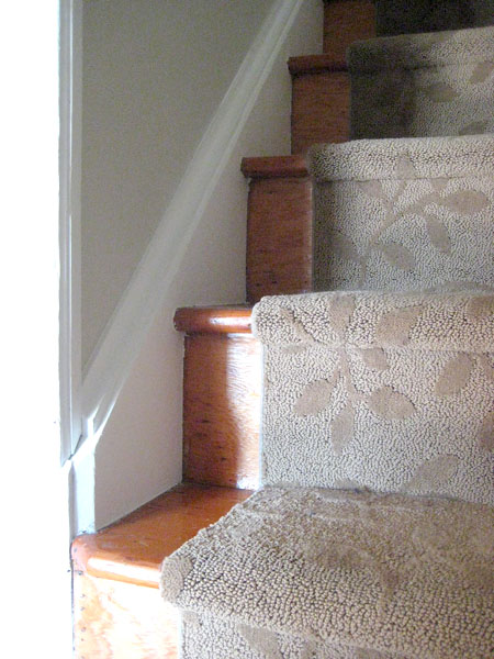
And poof! The stairwell is done. Ish. I’d like to eventually replace the thick brown (leaf-patterned) runner with something fun or striped or something like that, but for now it’s in good shape so despite that it’s brown (did I mention that it’s brown? Yep. It’s brown…) it’s staying, for a while at least. And I’d like to add something to that wall at the very bottom of the stairs (a pic from our wedding [almost 4 years ago] perhaps? We should really start printing those at some point…) but that’s not an urgent stairwell upgrade at the moment either.
For now, it’s better! If you didn’t know I’d put weeks (and weeks and weeks) of weekend-work into that little dark stairwell, you’d just think that it’s a fresh clean stairwell. But it’s the projects that you don’t notice that add the most value, I think. At least I hope. :)
]]>
Drab and dreary eh? And the television practically hollers, “Look at me! I’m the tv! And not even a nice compact flatscreen telly either. No siree bob. I’m a big ol’ box of a beast. And I’m all you’re going to notice when you walk into the living room. Ha. So there.”
(My television is obviously a wee bit of a snobby show-off.)
Here’s what our living room looks like now that we’ve given it a little faux-fireplace love… :)
Sooo much better eh? I’m quite pleased. :) Obviously we still need to accessorize. I just quickly added the white/teal accessories to the left corner of the mantel (cuz it looked really sad without) and Sweetie put the mirror up last weekend, and that’s as far as we’ve gotten so far (btw, that mirror is apparently rather busy traveling around our house! You may remember it as my happy little above-stove mirror from this post. I suppose that means that it’s versatile. Or that I need to buy another large-ish-sized round mirror. Although Sweetie says we have far too many mirrors in this house already. Boys are rather silly like that. But I digress…)
The fireplace hole (technical term) still needs filling up with something (I’m just not sure with what yet.) And I need to find another horizontal surface on which to perch the television. I just moved our existing tv-cabinet to the right and called it a day, but really it’s too large/deep (and, well, too pine.) A pretty little old white-painted dresser would be a lovely replacement, though, no? :)
Lastly? (Well, doubtful that it’ll be a “lastly” sort of thing, but in the foreseeable future…) We also need to either mount that mirror to the left of the mantel to the wall (hmmm… maybe Sweetie has a point on that too-many-mirrors thing…) (nah…) or stack a few images vertically on the wall or something. Same thing for the right side above the telly (I just plopped a few prints [courtesy of Etsy sellers honeytree and AldariArt] around the tv, trying to cleverly camouflage the big black box. It’s semi-effective?)
BUT, all-in-all, the living room avec faux-fireplace is BETTER. And, honestly, I can’t tell you how excited I am to be able to hang our stockings from something other than either a) the television cabinet or b) the window moulding (true story) next Christmas. Only 8 months-ish to go! (I don’t think I’ve ever been so excited for Christmas!) (It’s amazing what a lovely faux-fireplace can do! :)
]]>I fought him on this, and won. :) I do most of the cooking, and our house is quasi-open from the kitchen to the living room, and I wanted the option of having tv noise in the background while cooking/doing dishes/puttering around the kitchen.
But, he was right. We’ve rearranged our living room a couple of times, and still the focal point of the room is the tv, surrounded by a big blank wall.
Not pretty eh? The room looks… unfinished. And a little silly. And very tv-centric. Even if the cats don’t seem to care. I’ve pondered adding a gallery wall around the tv. I’ve tried grouping the tv with other things (oooh! Maybe a big green star will cleverly camouflage the telly!), attempting to make it stand out less. But, alas, the tv is, and has remained, the focal point in the room. :(
Enter: inspiration. While taking a random chatter-break at work one day (because it’s the only way to stay sane sometimes) Clint (friend and coworker extraordinaire) suggested putting a fireplace on the end wall of our living room. BRILLIANT. (I have rather smart friends.) A fireplace would surely become the focal point in the room. And, importantly, a fireplace would also give us a much better place to hang our stockings at Christmas (we currently hang them from the tv stand) (it’s sad, and rather pathetic, but true.) (Don’t tell.)
So, after a wee bit of searching, a fireplace I found, via the fine folk at Kijiji. :)
It’s not a functioning fireplace (in case the sparkly white insides weren’t a tip-off.) Just a mantel with a non-functioning fireplace hole (technical term.) But I love it. And I pick it up tomorrow. :)
And so, with fireplace purchase imminent, I’ve proceeded to Get My Pinterest On. Of course. Which has yeilded so many brilliant ideas for what to do with that non-functional fireplace hole.
I could fill it with pretty vases and the odd bloom…
I could get Sweetie to chop me some wood and fill it with artfully placed log-ends (as found through Brunch with Darling):
I could go simple and chic, and just add a pretty basket, like the brilliant folk at The Lettered Cottage did:
And then maybe switch things up for the seasons (so clever, and so easy!) like they did here:
Or, maybe I could go the classic route, and fill my fantastic fireplace hole with simple white pillar candles, a la Young House Love:
Or I could just rotate all of the above (and really keep the cats on their toes.) :) There are SO many different and lovely options! (Can you tell I’m excited?) (Yep – I’m super excited!) Where will the tv go now? I’m not sure. It’ll probably end up on SOMETHING in the corner behind one of the tub-chairs, receding somewhat into the background (I hope.) I’m hoping to find a little refinished dresser or something like that to use as a super cute (and non-pine) tv stand (queue additional scouring of Kijiji ads.) Or perhaps Sweetie will build me some built-in-like shelving on either side of the fireplace. Ah! So much potential for my once sad looking tv-centric living room. It makes me happy. I’ll keep you posted. :)
]]>One of the contributing factors for why I despise painting trim? I can’t paint straight. At all. I am one of those poor sad people who needs tape. Everywhere. Like, lots and lots of tape. Or else things just get really messy. So while the process of painting the trim (primer coat went on yesterday) (yuppers – I prime everything. Way less frustrating than going back afterwards to try and seal in all those mystery stains when they peek through your lovely new paint job) (and plus it’s a high adhesion primer, which works really well with my aversion to sanding) didn’t actually take that long, taping took forever. And ever. And ever.

Stringers desperate for paint - do you blame them? If you listen really closely, you can almost hear them whispering, "paaaaiint me..."

Miles and miles of green painters' tape. The subtle green stripes are kinda pretty, non?
People who can paint trim and these sorts of things sans tape amaze me. Seriously. Craig Lowe, you are my hero.
(Explanatory aside: Craig Lowe is the painter guy Mike Holmes brings in to paint post-demolition on Holmes on Homes. Sweetie calls him my boyfriend. He does indeed make me swoon just a little. Not because he’s particularly handsome [he is kinda cute though], but because that man can paint a mean room. Without tape. Sigh.) (Random reference, I know.)
While painting the stairwell, I’m figuring I should also paint the doors to the bedrooms (since they’re the original 1940s ugly stained/several-thousand-coats-of-varathane doors, and they don’t really match anything.)
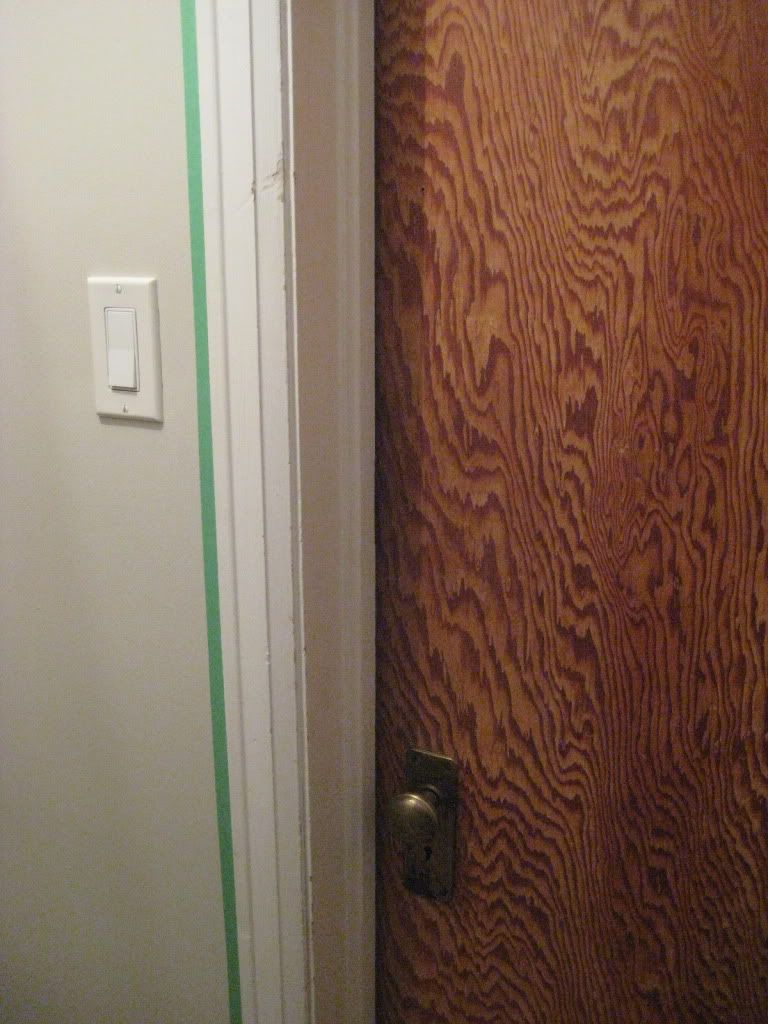
For the record, I love my doorknobs. They need some cleaning up, but old doorknobs make me happy.

I’m thinking I might eventually take them all off and give them a good coat of Oil Rubbed Bronze spraypaint (a la Sherry from YHL.) (Hi Sherry!) For now I’ll just paint around them though…
a) because I’m lazy
b) because I prefer to spraypaint outdoors and it’s, like, minus a gazillion degrees out right now
c) because I just want this stupid stairwell project overwith (and getting fancy with the doorknobs wasn’t part of the original plan for right now.)
SO there it is. Stairwell-Painting-Project Progress Report number 3. And hopefully the last one – there’s nothing like spending your weekend (or three) in a tiny little stairwell. But it may just be the nicest stairwell ever (ev-ver) when I’m done. Or so I’m telling myself.
]]>
I caulked all the baseboards to the wall. This is always my least favourite step when I’m painting a room. Caulking is gross. It’s sticky. It’s unruly. It gets all over. (So, really, this is all one big admission that I suck at caulking.) BUT, it makes such a huge difference to how things look (so, while I gripe and groan, it’s a step I never skip) (unless, by some miracle, things have already been caulked, in which case I do a little happy dance.) (Sadly, there were no happy dances spontaneously erupting yesterday.)
(Aside: I PROMISE to eventually get a better handle on this whole picture-taking thing. Darkest. Photo. Ever. And it kinda makes me a little dizzy too…)
Here’s the same stretch of baseboard after a little love from the caulking gun (and a coat of primer too)…

Pretty!
Way better eh? (Oooh. And a way better camera angle, with better lighting too. Gotta say, I’m pretty darn proud of that there shot of my baseboards.) :) Caulking the baseboards to the walls just makes everything look so much more FINISHED. I can’t believe in the 70-ish years this house has been standing, no one has ever thought to do this.
Once all the gaps were all tidied up, I primed everything. I probably didn’t need to – I’m doubting that the paint on the walls was oil-based or anything like that. But I’ve learned through experience that priming over everything, as much as I hate the additional step, ensures that there will be no surprises (nothing is more annoying than having a mystery stain that you didn’t notice pre-painting suddenly seep through your new pretty paint job), and it just seals anything, um, weird the previous owners did in (there are all sorts of strange marks on my walls. Not so sure what most of them are. Don’t really want to know.) PLUS, with all the patching I did, priming kinda became a mandatory step. :(
So that’s how I’ve spent my weekend so far! Here’s the stairwell to date, all primed-up and anxiously waiting for a coat of lovely greigy Edgecomb Gray…

If a stairwell could look excited about paint, I'm pretty sure this is how it'd look.
Progress makes me happy. :)
]]>


