A bit about my kitchen (and badgers) (and big 80s hair)
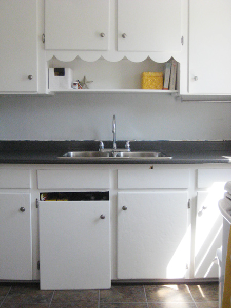
So it was only a matter of time before I started nattering on about my kitchen. You knew it, I knew it… it was inevitable, really. Kitchens are my thing. I don’t know why. I’m not an especially good cook (although I excel at brownie making, and I can whip up a mean batch of soup when I put my mind to it.)
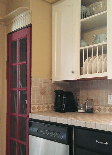
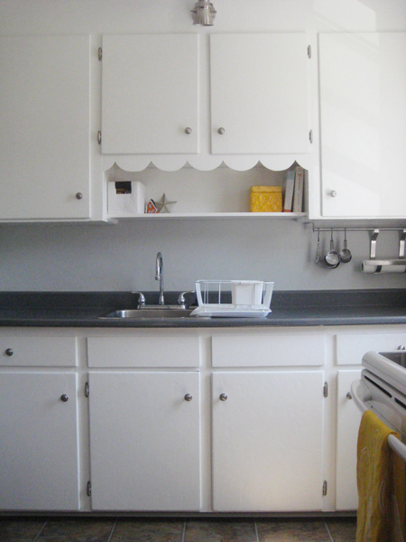
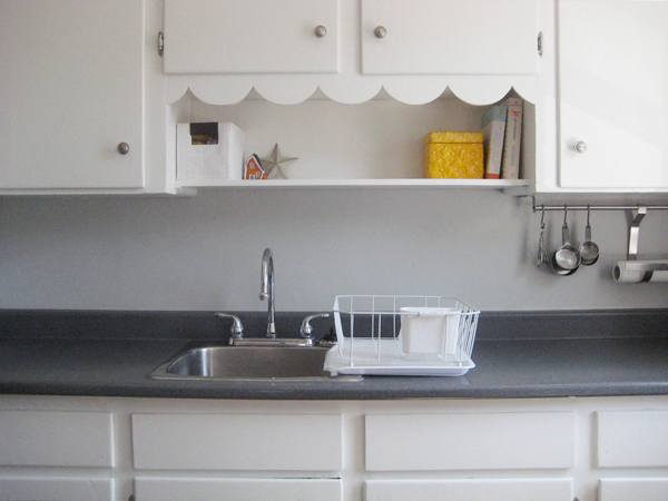
This time, I don’t hate my kitchen. Really. I pinky swear. Yes, there are many MANY areas that desperately need improvement (since squishy floors are a tad annoying) but all in all my kitchen features a fair bit of awesomeness. I love the layout. I love the window over my kitchen sink (my first window-adorned kitchen sink ever.) I love my dishwasher (I feel truly grown-up now that I can mechanically clean my cutlery.) I adore my beadboard walls (nothing screams “super cute farmhouse in a tiny little rural community” like a wee bit of beadboard here and there.) And I’m even growing to love my tiled countertops (trivets for hot stuff? Heck no. We don’t need no stinking trivets!)
(The rather random movie reference above is from UHF btw, and involves badgers, not trivets. But the overall message is the same.)
Here’s what I’ve got…
See? Not terrible. Perhaps even sorta cute.
What needs improving? Despite my overall quasi-happiness about my kitchen, sadly, there is a lot that should change.
There are the aforementioned squishy floors. Apparently, when you add layer upon layer of linoleum and laminate and such to a floor (without ever reinforcing said floor, or, you know, removing a layer or two of the existing flooring along the way) the result is a certain amount of squish. How do we know we’re dealing with a lot of layers? Check this out.
Yep. That’s right. Due to the (obviously) lacking transition strip from the dining room into the kitchen, we can see the many (many!) layers of flooring that make up our kitchen floor. That represents at least 25 years of flooring, I’m guessing. Those layers? They’re all going away.
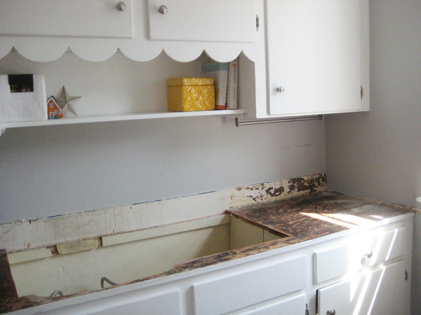
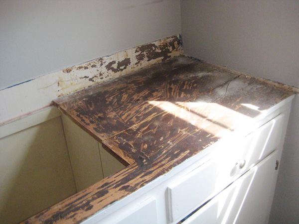
And then there are the countertops. Yes, I know. I just said that I like them. And I do. Sorta. But I can’t seem to shake that feeling that they’re never ever fully and totally clean. And, if we remove the countertops, we could also remove the odd, plastic, cream coloured sink.
That sink might be the deciding factor. It’s a little… strange. (Although I LOVE my faucet! Swoon!)
Then there’s the colour. Admittedly, the colour isn’t awful or obnoxious or anything like that. But it’s very… gold. And it’s just not ME. I like pretty, peaceful-coloured kitchens. Like my bluey-gray-ish Stonington Gray kitchen at our little 1940s house. Or the lovely and fresh mint-coloured kitchens that I’ve been most recently happily lusting over.
Yes. I have future projects. Lots and lots of future kitchen projects.
But first, I must finish unpacking. And pre-winter gardening. And the living room should really take painting priority (since there are no fewer than a gazillion nail holes in the walls and the paint colour there is rather putrid dark-ish mossy green.) Sigh. Yep, I’m guessing my kitchen may not have its hot date with a can of paint until sometime around next April. And it’ll be quite a while before we complete our other kitchen projects too.
Until then, I’ll remain ever joyous about our dishwasher. And window. And countertops. Sorta.
And, just in case you’ve never seen the movie UHF (complete with big 80s hair, a whole lot of silliness, and a little Weird Al Yankovic too) here’s a short clip about badgers…
Yes, it’s absolutely ridiculous, but it’s such a funny movie. :)
Happy Monday!
Leave a comment
Admissions of a mint-loving maniac (and plans for my next purdy little kitchen)
Admission #1: I am obsessed with teal/mint/teal-ish-mint/teal-y-blue-ey-mint/anything in that whole awesome and spectacular colour family at the moment.
Admission #2: I have ginormous plans to either…
a) paint my kitchen cupboards with the fabulous above mentioned teal/mint/somewhat teal-tinted-mint-based hue (if I’m feeling particularly adventurous and brave – painting kitchen cupboards takes A WHOLE LOT of work, so it’s quite a crazy project and not at all for the colour-fearing commitment-phobe)
OR
b) paint my kitchen walls teal/mint/teal-y-mint should I chicken out of my bold kitchen cupboard painting plans and opt for the more low-risk option.
Admission #3: I don’t yet own the aforementioned kitchen with its not yet painted cupboards and/or walls but I will very very shortly – only FOUR weeks (plus a few days) to go! Until then, in true (likely predictable) Melissa fashion, I will obsess endlessly and scour Pinterest for loveliness. (I’m a little lot OCD like that.)
So, in lieu of actually having an actual real-life kitchen to paint at present (holy moly I can’t wait to have to have my own little kitchen again!) and in light of the fact that I’m a little obsessed with paint colours at the moment, here are a few of my favourite marvellous quasi-teal/mint/absolutely lovely kitchens…
Triangle Honeymoon (whose site seems to be down at the moment) (which makes me super sad – there’s a whole lot of awesomeness there!) painted their kitchen in Glidden’s Gentle Tide…
Looks so perfect with the butcher’s block countertops, no?
And take a look at Brenda over at Cottage4C’s (bravely!) painted kitchen cupboards…
The colour (Sherwin Williams Rain) is a tad more blue-ish than minty-ish, and I love it. So pretty!
Our little loo at the last house was painted in Benjamin Moore’s Woodlawn Blue, but I think it’d be super pretty in a kitchen with white accents and such (like this one from Darryl Carter)…
Lastly (but most definitely not leastly) is this teal/green/slightly-minty-I-suppose (but definitely lovely!) kitchen courtesy of House of Turquoise…
Oh, swoon. I absolutely adore this kitchen! So much so that I think we should see another pic (don’t you?)
(I’m still swooning over here.) The colour is so fantastically cheery, but not obnoxiously so (since, well, I can only stand so much cheeriness pre-coffee in the morning.) And with pretty yellow accents it just looks so… fresh. Like a cucumber I suppose. Or a big head of iceberg lettuce. Both of which, appropriately enough, belong in a kitchen. So perhaps Kensington Green belongs in my kitchen…
And perhaps I should make a salad.
(As soon as I officially own my kitchen that is.) (Only four weeks plus five days to go!)
Leave a comment
Skipping ahead a little (and obsessing just a wee bit about a kitchen I don’t yet own)
Who’s already planning out her next kitchen?
Yep. That would be me. Crazy, insane, kitchen-loving me.
Don’t get me wrong – we haven’t yet bought a house. We’re still trying to decide between a couple of nearly-perfect properties that we’ve seen, while desperately hoping that a really-perfect property appears in the meantime and before we make an offer elsewhere. We’ve seen quite a few houses at this point. There’s been a bit of good, a lot of bad, and oodles of ugly.
And, the common ugly element with each house we’ve seen? The kitchen.
Yep, that’s right. Nearly every house we’ve seen has had what I like to affectionately refer to as a “scary kitchen.” Be it because of filth, or due to wear and tear, or even just really really unsuccessful decorating attempts (for the record, mac-tac is not a good or lasting solution for hiding outdated countertops), I’ve seen a tonne of awful kitchens during our house-hunting rounds.
So, as a kitchen pick-me-up, let’s look at a few of my most recent lust-worthy Pinterest finds, k? To cleanse my kitchen-looking palate, if you will. To erase (or at least quasi-quash) the memories of all the bad that we’ve recently seen.
First, I’d like to officially declare my love for (fellow Canadian!) Sarah Richardson’s super pretty white and gray (with a wee bit of blue thrown in too!) kitchen…
See that ceiling? Oh sighhhh. I’d like that exact ceiling in my (next, yet to be purchased) kitchen, if you please.
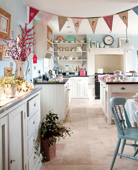
And then there’s this one that apparently (according to Pinterest!) originates from a blog out of Sweden (I think!) called Allt i Hemmet (although I couldn’t find this actual image on their blog… I’m sure it’s likely there somewhere though!)
I think I need a bunting-draped kitchen of my own. So fun eh? I love. :)
There’s also this lovely mint specimen from Home Ideas Mag…
How absurdly pretty are those mint-painted cupboards? Quite unexpected. And quite awesome.
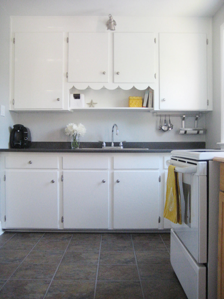
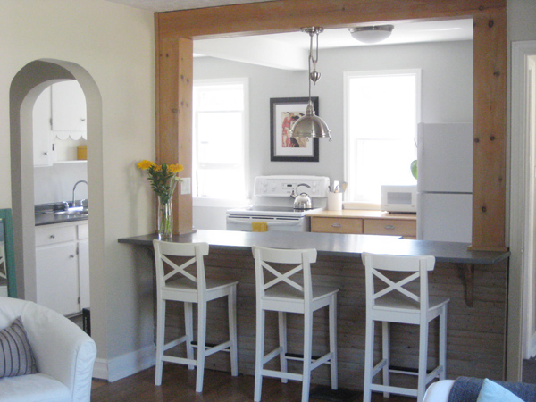
Lastly, there’s this one…
Yep. My own poor abandoned little 1940′s kitchen. Oh how I miss it. There was a whole lot of angst and nail biting and obsessing and hours upon hours of Pinterest-searches and Canadian Style At Home-reading and HGTV-watching that went into that tiny (but super functional!) kitchen. And when it was finished, I was so pleased. Oh how I miss that pretty little space. [Ginormous sigh.]
So those are my most recent kitchen-lust-worthy finds. It’s rather hard to make plans for your own kitchen prior to actually purchasing said kitchen, but I’m definitely doing my best (and, honestly, I really can’t help myself!) Here’s hoping that I have a new kitchen of my own (that I can obsess about for real-sies) very very shortly.
Leave a comment
Memories… light the corners of my fridge… (one last kitchen post)
I’m going to miss my kitchen. A lot. Yep, that’s right – we haven’t yet sold our house and I’m already getting all nostalgic for the room that caused me so much grief and cost me so many hours while I lusted over other people’s kitchens on Pinterest and planned and researched and obsessed.
But I now love my cute little kitchen. The floors are no longer blue. The countertop is all sparkly and clean, and I finally got my double sink. I adore the Stonington Gray-painted walls, and my fresh clean-looking Snowfall White cabinets. Plus all the other little things I did to make our kitchen feel like “us.” I worked hard to make it pretty! It’s now my happy place – many batches of brownies and cookies and other yummy things (made for the people I love) have emerged from this room. And it’s where Sweetie and I convene each night after work, discussing our days while sitting across from one another at the island.
Let’s reminisce just a little, k?
Here’s where we started (image courtesy of the original house listing, not me!) with an ugly and rather greasy chair rail, ridiculous light fixtures, dirty cream coloured cabinets, strange gray trim, and a blue peel and stick floor…
Sweetie removed the rather random chair rail, and I painted the dickens out of my wee kitchen and we swapped out all the hardware and the obnoxious light fixtures, leaving us with this…
…which we lived with for quite a while (while I crazily stalked other people’s kitchens and planned and planned and planned some more.)
Then – happy day! – I laid a new kitchen floor. Best. Day. Ever.
…and then (then!) we added new countertops and the fancy new double sink. Leaving us with our current happy (and pretty!) little kitchen…
Happy sigh. :)
If we were planning to stay in the house longer, I would have put in a backsplash, probably in marble of some sort. I’ve always adored FrecklesChick‘s lovely little kitchen, and I think a similar tile backsplash would have looked snazzy here.
But perhaps we’ll save all that for the next house. :) While I’m hoping that our next kitchen won’t be quite as disasterous as this one was when we moved in, we tend to buy houses with ugly kitchens. It seems to be our (not at all intentional) “thing.”
So, just to recap (because I love a good Grand Finale!), this…
…became this…
…and this…
…turned into this…
Better eh? I’d say that’s definite progress. Here’s hoping the next family who lives in this house loves this little kitchen as much as I do!
And here’s looking forward to having a new kitchen to obsess about and pretty-up at our next home, wherever that may be. Although I could really do without a blue floor this time. (Just saying.)
Leave a comment
A short-ish tale about an ill-fated kitchen counter replacement project (spoiler alert: they all lived happily ever after) (more or less)
Hi. My name is Melissa, and I suck at carpentry. Give me a paintbrush? I’ll rock those walls. Hand me a ginormous piece of countertop and tell me to make it fit between two kitchen walls (while somehow bypassing a rather stupidly-placed windowsill?) I go a little batty. And cry a bit. And curse a lot.
It’s not pretty.
We installed our new laminate countertop last weekend. It was a rather traumatic endeavor. Don’t worry – Sweetie and I are ok, we’re still married, and we still have all of our fingers and toes. But my kitchen?
Sigh.
Let’s start from the beginning, k?
Here’s the before…
And look…
Yep! That’s my dish rack. Bet you’ve never seen that in any of my kitchen pics eh? That’s because I normally hide it away before taking any pictures of my kitchen. Nothing screams “Look! We have a single sink and no dishwasher!” like a big ol’ white dish rack. But because I was documenting our final single-sink day, I thought I’d leave the dish rack sitting out. Just once. :)
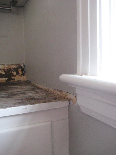
As soon as I was done snapping some final BEFORE pics (because I’m a little insane like that) Sweetie started tearing things apart while I ran out to Home Depot (for the third time in 24 hours) for yet another somethingmerother that we needed. When I returned, the old countertop was gone, and the kitchen looked like this…
Ack eh? Ack indeed.
We then grabbed the new slab of countertop. It seemed like a pretty simple concept: remove old countertop, add new countertop, enjoy new countertop. Unfortunately, despite some very careful measuring and re-measuring pre-new-countertop order, the new top didn’t fit. At all. We wiggled it, we tried turning it, we attempted some fancy coordinated countertop maneuvering. It was a definite no-go. Our mistake: little 1940s houses don’t have square walls. They also have window ledges that I’m convinced were specifically installed to thwart countertop replacement projects.
So out came the circular saw.
We employed the less-is-more strategy with the saw (since despite having the power to easily make the countertop shorter, it’d be super a fancy trick to make it longer again if we took too much off.) Cut number one was still too long. Cut number two was closer. And with each cut we’d haul the slab of laminate through the house into the back yard, then lug the ever so slightly shorter slab back in, all the while trying desperately not to chip the corners and edges.
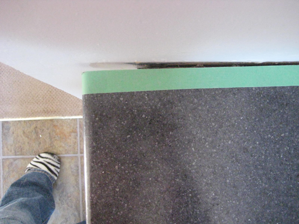
Then came cut number three. It fit! But it fit a little too well.
(Those are my snazzy zebra print slippers btw. Cute eh? They were part of a Christmas gift basket from my very lovely and amazing friend Jess who blogs over at Little Townhome Love. And, coincidentally, whose birthday is today! HAPPY BIRTHDAY JESS! Love you!) (And our walls, for the record, are not purple. All that purple-ishness is likely reflecting off of my very pink hoodie.) (Note to self: always remove pink hoodie before taking pictures for blog.)
(But I digress…)
Yep. Once we finally cut enough off to fit the countertop into place beyond the evil too-long window ledge and the stubborn 1940s-carpentry-gone-awry bowed out wall, I was left with a ginormous gap at the most often used and most easily viewed end of the countertop.
I cried. It’s true.
So out came Sweetie’s belt sander.
You see, we couldn’t just leave it like this. There was no way to fill in that gap with caulking (my normal go-to fix-all solution.) So Sweetie decided that we’d sand down the high spot on the countertop to make it fit more flush with the bowed out wall. This meant that the gap on the other side would get even larger, but the other side of the countertop, being the less often used and less obvious side, could handle it.
The risk paid off. Hooray for power tools. Hooray for Sweetie. :)
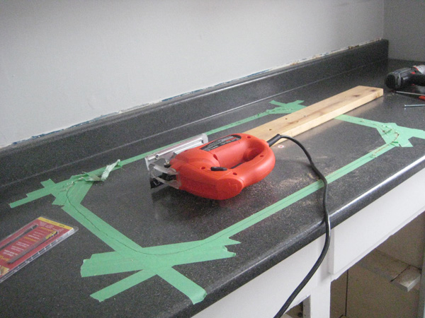
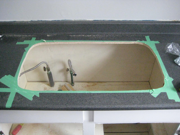
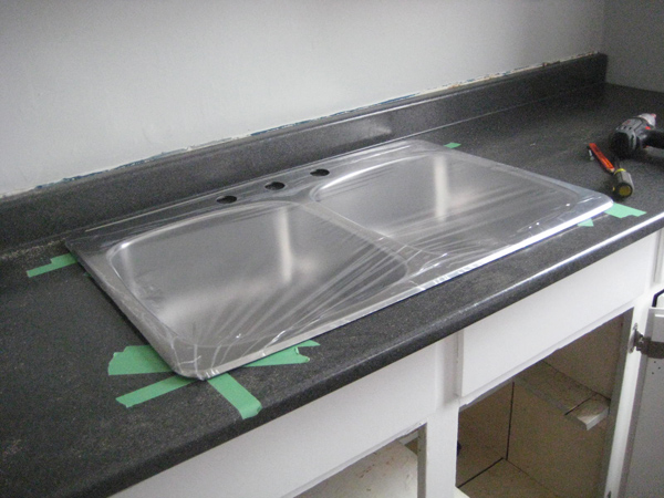
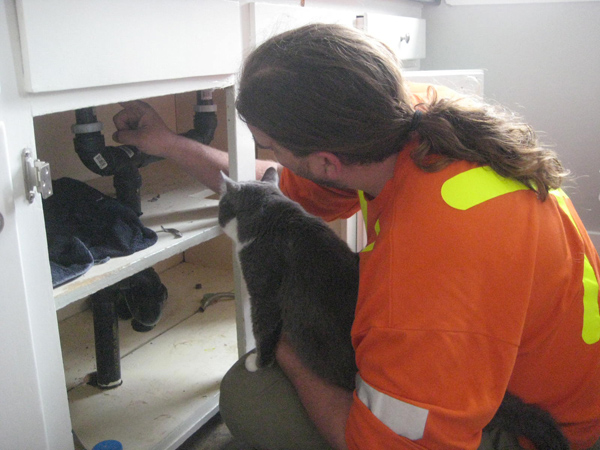
A full day of plumbing fun followed. I’ll spare you the grizzly details. There was swearing and cursing and a whole lot of water coming from places it should not. Suffice it to say that Sweetie is definitely an electrician – a plumber he will never be. The Coles Notes visual version looks like this…
Irwin even got a bit of a plumbing lesson. For the record, cats sorta suck at plumbing.
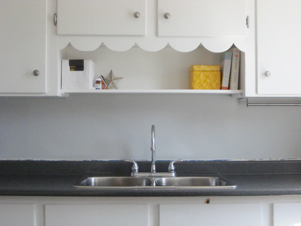
But, after everything was cleaned up and sealed and leak-tested and shined up, we had this…
Pretty eh? New countertop. New double sink. Who needs a dish rack? For the first time in two and a half years, not me. :)
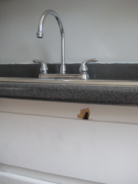
I still have a gazillion touch ups to do (we took some rather good-sized chunks out of the wall while trying to wiggle the new countertop into place, and the old countertop definitely sat lower than this one so I’ve got to do a bit of painting above the backsplash.) Oh, and see that big hole under the sink?
That’s where we had a bit of an oopsie with a big drill bit (patching definitely required there too.) And a cabinet door randomly fell off at some point during this whole experiment…
…so that should probably go back on eventually too.
But the countertop is in! Yay! And it’s awesome. And I’m a very happy girl.
The moral of this tale? Unless you’re a skilled carpenter, have walls that are perfectly square, or are just really really lucky when it comes to these sorts of DIY things, hire someone for countertop replacement. Really. I didn’t at all enjoy this project, and I’m still not 100% thrilled with the end result. But it’s done. And hopefully prospective home buyers just won’t look too closely at our workmanship.
And they all lived happily ever after. The end. Ish. :)
Leave a comment


