But now I think I’m done.
Not because there aren’t a gazillion things I could be doing. (Dear neighbours: please please please disregard our front flowerbeds. I promise to be a far better gardener next summer.) (And dear dustbunnies: please stop multiplying so quickly in the corners.) But because I just don’t have the energy right now.
It’s a super hard thing for me to admit. I’m definitely feeling a little defeated.
That said, I had two joyously productive moments yesterday: I finished a couple of tiny little projects. And I’m quite proud.
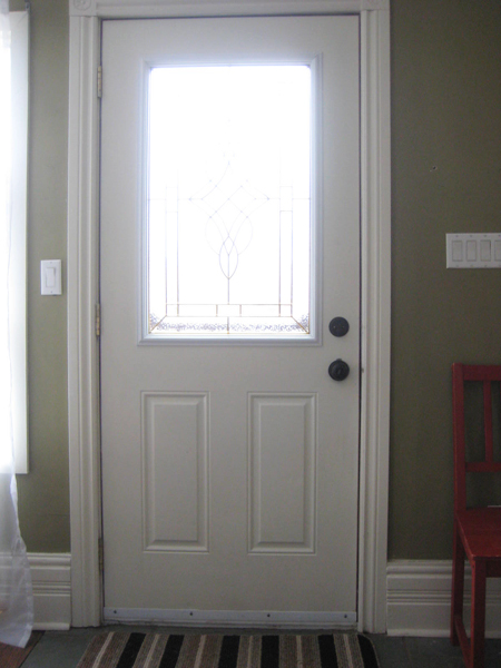
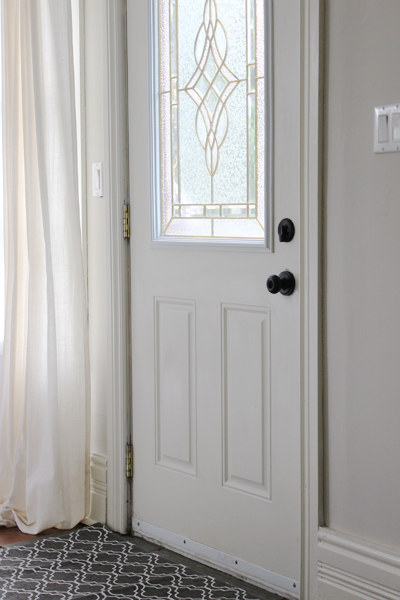
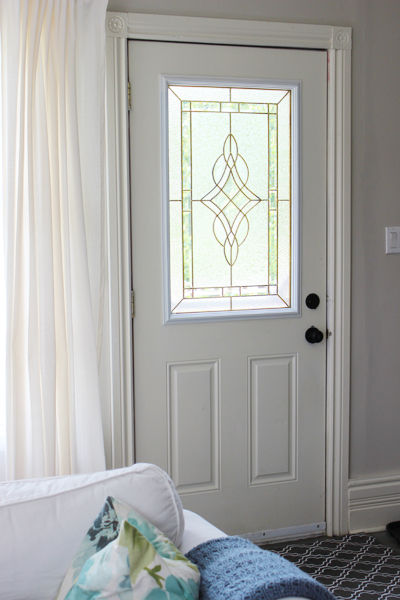
First, I swapped out the front entryway doormat for a new one I picked up at HomeSense (oh how I love HomeSense!) a few days ago. I went from this stripey snore-fest…
(Obviously file footage, since I’ve since painted those super ugly green walls!)
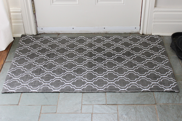
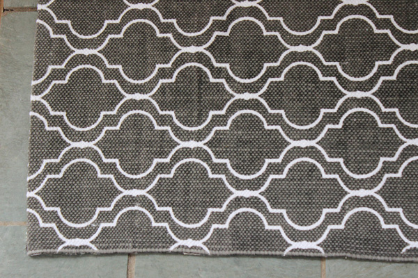
…to this…
Admittedly, it’s not a massive change, but it makes me happy to think that any post-baby visitors will have a much nicer mat to land upon when they walk through my front door.
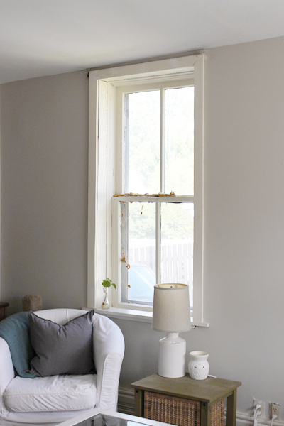
Project number two involved dressing a long-naked window in our living room. When we moved in, the previous owners had left some rather hideous and dirty-looking blinds on this window (which I promptly removed.) I was left with this…
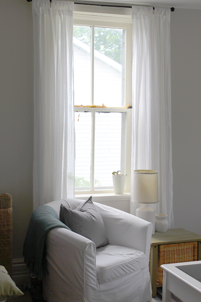
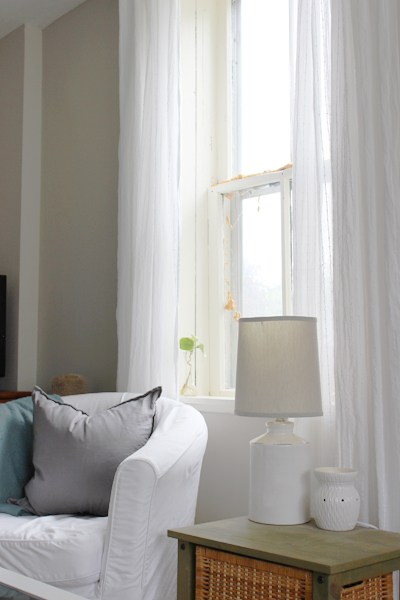
Unfortunately, and rather oddly, this window frame is positioned unusually high – it almost reaches the ceiling (I’m guessing that at some point someone dropped the ceiling in this room to run new, non-knob-and-tube wiring through the house since other ceilings on the main floor are a good foot taller.) As a result, I’ve hummed and hawed over what to do with this window for several months now. Yesterday, I had Sweetie hang a curtain rod right at ceiling height. And yesterday, I finally added curtains to this window.
And today, I am very happy with the result. The curtains (which are Ikea’s lovely Matilda panels, btw) don’t hide the ugliness of the window itself (see all that stuff on the window? Spray foam. Between the panes of glass. Yup, some not-so-bright but likely well-meaning previous home owner decided that this would be a good solution to winter draftiness.) (For the record, spray foam between the window panes is never ever a good – or, at least, nice looking – solution to draftiness.) But the curtains do make the window look better (which this soon-to-be momma is content with for now, until we find a way to disassemble the window and scrape out the offending foam.)
So there. Those are my two most recent tiny little accomplishments at the old mauve house. Significant? Not particularly. But I at least feel like I’m still making some progress, despite that my body is most definitely slowing down.
Now, if you’ll please excuse me for a moment (or two), this momma-to-be desperately needs a nap. :)
]]>
And while I despise the ridiculously cold snowy winter we’ve had this year, I despise my current window coverings even more. The previous home owners (being the insane awesome people that they are!) left us a plethora of flood-ready bright white sparkly-swirl sheers for our windows. An intended act of generosity? Perhaps. But regardless of motive, the result is the same: the curtains are making me a crazy person.
Enter: Ikea. Yep. My beloved and dependable go-to for window coverings. Their curtains are cheap. They’re very cheerful. They come in really long lengths (for those of us who prefer to set our curtain rods a tad higher than the average population.) And their curtains come in pairs (which seems to be a bit of a rarity anymore.) (But really, how many people only need one curtain?) (Cough, cough, rip off, ehem…) During an Ikea trip about a month ago I purchased no fewer than six (much needed) new drapery sets along with the accompanying curtain rods and hardware and doodads and such. After a second Ikea trip a few days later (because a certain someone with a wee bit of baby brain forgot a few crucial curtain rod components…) we finally got everything up last weekend.
Here’s my front living room window before (with its icky swirly silver sheers all aglow):
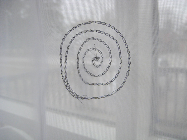
(Here’s a closeup of the sheers’ sparkly swirls, just in case you’re interested. Snazzy, eh?)
And here’s the after, featuring my all-time favourite front window drapes (Ikea’s Ritva) and a set of soft-ivory sheers (Ikea’s Teresia).
I’m a happy girl! But why did we get another pair of sheers? The glass panes in this window are no longer sealed properly (one of the hazards of buying a fixer-upper with archaic windows) so there’s condensation and dust between the panes and this window always appears dirty from the street (despite that – I promise! – it’s very very clean!) The sheers help mask that a bit, which means we’ll likely be sheer-people until we replace that entire front window (which, sadly, will be a very expensive venture) (which, also sadly, means it’s pretty far down on our list of priorities right now.)
The Ritvas are waaay too long right now (I’m all for little drapery puddles, but this is a little silly) and will likely require shortening. Tip I’ve learned? Wash and dry Ikea drapes a couple of times before shortening them. They sometimes shrink. A lot. Whenever they’ve accumulated enough kitty fur to require a trip through the laundry (which, sadly, will likely be soon) I’ll get around to making them a bit shorter. For now, however, I’m just happy that they’re not sparkly. Or swirly. Or bright white.
Next up? Here’s the before of my dining room window…
Apparently the previous owners weren’t bothered by the too-short panels (or, um, lack of baseboards) but I think the windows look much lovelier now that they’re dressed with a few Borghild panels from Ikea…
And we added the same curtains to this previously un-adorned window at the end of our dining room too. Here it is pre-curtaining…
…and here’s the much improved after…
All of which makes me a very happy girl. :)
The last set of the six sets of curtains I purchased is earmarked for the baby’s room (should we ever get around to starting the nursery) (hello? Ambition? You should probably kick in about now…) If they don’t end up used in the nursery, we’ll hang them in our bedroom (since a certain black kitten has pretty much destroyed our bedroom drapes.) (He thinks bedroom curtain-clawing is a really fun pastime.) (Particularly at 5am.) (It’s a good thing he’s cute.)
And now, for your viewing pleasure (and a little post-title clarity), here’s a little Drapery Safety Dance from Men Without Hats…
…because, well, it’s really, really weird, but so fun. :)
]]>
Yep. That happened this weekend. I was so sad.
Luckily, I have another trip to Ikea planned for the not-so-distant future (since baby needs a dresser/change table for his or her little room, and handsome Hemnes seems to fit the bill) so we’ll pick up the remaining (and sadly missed) drapery hardware bits during that dresser-buying mission. In the meantime, however, my bay window looks rather naked. (Although the cats are pretty happy with the curtain-less and completely unobstructed view – cats don’t really understand, or care for, drapery.)
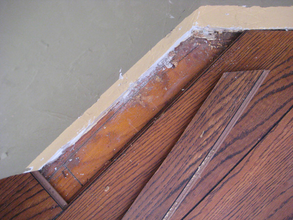
But the weekend wasn’t entirely filled with drapery doom and gloom! While staring (woefully) at my naked dining room windows, I noticed that a piece of our (quite shoddily installed) laminate flooring had at some point come loose.
So I gave it a wee wiggle. And it moved. And, in fact, it came completely out. And look (look!) what I found underneath…
Yep. That, there, is hardwood. Not original-to-the-house beautiful 100 year old wide-plank-holy-awesomeness-pine-or-mahogany-or-something-equally-amazing hardwood, of course, but hardwood nonetheless.
I did a little happy dance. In front of my naked big bay windows. At the exact same moment that my neighbour walked by with his dog, of course. (I’m pretty sure the neighbours think we’re a bit odd.)
So our newest question? How far does the flooring extend? Is there hardwood under all of the laminate flooring in our living room/dining room? Or only under part? With the house being quite old (and without knowing what the original floorplan here looked like) the laminate could very well be hiding big ugly scars from walls that were removed and additions that were additioned over the years. Afterall, why else would you cover hardwood flooring with laminate? If it’s simply scratched up, hardwood can be refinished. And I’m not at all afraid of a few scratches. We’ve had this sort of narrow-plank hardwood flooring in both of our previous homes, and age-related scratches and dings just add a little character (if you ask me.) They scream “This house was well-loved in past years by families blessed with excited children and lively dinner parties.” If we reveal an expanse of hardwood underneath the laminate, regardless of the shape it’s in, I’ll be one happy girl.
Now, the hard part. Finding the courage to start ripping all of the existing flooring up. It’s one of those jobs that once started, can’t be stopped. It’s also one of those jobs that’ll require a really quickly executed Plan B if it turns out that the flooring underneath isn’t usable for some reason.
Maybe we’ll save that for another (much braver) day. In the meantime, I’m leaving that one small piece of laminate flooring pulled up as a reminder that something really amazing could be hiding underneath all the ugliness. Afterall, it was that same hope of hidden beauty that convinced us to buy our old mauve house in the first place. :)
]]>
(Although all this might also just mean I’ve hit the “nesting” phase of pregnancy. Does nesting feel a bit like uncontrollable and obsessive spring cleaning? If so, consider me a momma bird eagerly vacuuming her happy little nest.)
First it was my loo: after months of cursing over our overflowing (and not particularly pretty) bathroom cabinet, I finally tidied it up last week. I ruthlessly threw out any old or outdated cosmetics and prescriptions, and then made it a bit more organized (and way more user-friendly) using some random baskets (courtesy of Bouclair) that I already had kicking around. The result? A much less chaotic and cluttered little cabinet that is not only far prettier from the inside…
…but looks way nicer from the outside too.
(I’m not a huge fan of these clear-ish frosted doors, btw. These doors may eventually fall victim to a little DIY-ing. Because, really, why would anyone want a semi-obscured glimpse at the inside our medicine cabinet? The same medicine cabinet that, while tidy right now, will inevitably end up looking disheveled within a few weeks I’m sure.) (It makes me super sad to type that, but, really, I’m a realist about these sorts of things.)
Organizing this tiny little utilitarian cabinet probably took less than half an hour, but it made me feel about a gazillion pounds lighter. Like stripping away a big bulky winter coat. And mitts. And scarf. And a super static-y winter toque that makes your hair all flooffy (techincal term) but you defiantly wear it anyway because, seriously, if you didn’t, your ears might actually fall off from the cold. Good hair days be damned.
(Have I mentioned how much I dislike winter? I really dislike winter.)
Next, I turned to my couch (which, btw, is overdue for its quarterly date with our washing machine. Don’t look too closely.)
After months of looking at the same dark brown (and, admittedly, very boring) throw pillows, I turned to the brilliant, pillow-scouting buyers at HomeSense with a great deal of pillow-related optimism.
They did not let me down. I found these…
And I think my exact words at the time were “Oooooh. You’re pretty.” Does anyone else talk to decorative objects while out shopping? I most certainly do. It helps me to bond with the blankets, and create rapport with rugs. In this particular case, I got a little complimentary with the cushions. They didn’t mind. And now they’re sitting happily on my couch, looking all spring-ish, like this…
And, they almost match the spring placemats I pulled out of winter storage…
It’s textile fate. It was meant to be. :)
And, speaking of textiles, and continuing in my must-organize-and-improve-the-house-in-celebration-of-that-one-lonely-and-cold-looking-robin theme, I then went a little crazy at Ikea. I purchased no fewer than six (six!) new sets of drapes for our living room/dining room (and all of the required curtain rods/brackets/fancy pieces to accompany said curtains too.)
Pictures of all this drapery actually hanging are still in progress (since, well, Baby decided I needed a day off from all this craziness and urged me to take a very long nap yesterday afternoon) but believe you me: it’ll be one epic and super happy day when the new curtains go up. (Because the sparkly white sheers must go.) (Immediately.) You just wait!
So that’s the story of spring coming to our little mauve-coloured house. At least so far. There’s lots more cleaning and organizing and nursery-decorating and probably another trip to Ikea looming (yay! I heart Ikea so much), but for now I’m happy with the progress made to date.
Now, please excuse me while I go play with my new, non-stark-white, living room drapes. Whee!
]]>
Oh Florence. You rock, and I adore you (despite your rather dark music videos.) (Seriously: the voodoo parts in that video really creep me out…)
But moving right along…
Random creepiness aside (sorry about all that), what else do I adore? Our new living room ceiling light! Remember our old light?
Aka the heavy-looking, ill-placed, not-at-all us, noggin-knocker (since Sweetie bonked his head off of it no fewer than about a gazillion times?) Gone. Gone! And replaced by something much much lovelier (and melon-safe). Specifically, this:
It was cheap. It is cheerful. It just seems to fit in our living room. It makes me very happy.
And did I mention it was cheap? It was only $44.97 from my favourite folks over at Home Depot. It’s the Hampton Bay 2-Light Oil Rubbed Bronze Glenburn Semi-Flush Drum, to be exact. On the website, it looks like this…
…and I think it fits perfectly in our space. So perfectly that I actually bought a second one to replace the light at the top of our stairs. (Don’t even get me started on the light that’s currently up there – that’s a whole other story for a whole other post. Let’s suffice it to say that the existing light is quite the monstrosity. Sort of gothic. Sort of antique-y. Exceedingly ugly.)
For now I’m quite pleased with this small (but significant!) improvement.
Next, on to other, much needed living room improvements. Like, um, colour? The dark mossy green is starting to get under my skin. A lot. It’s so dark, it’s very dreary, and it’s just not us. And, after the winter we’ve had around here (could it be that spring has finally – fiiiinalllly – almost arrived?) I think I need a little more lightness-and-airyness in my life (and a lot less drab-and-darkness.)
Yep, coming soon to a living room near me? A little bit of Edgecomb Gray! Like in our last house (because I liked it just that much.) I think. Unless I change my mind. Which I tend to do a lot. I’ll keep you posted. :)
]]>
Yeah. That’s me.
And when I say that our curtains are too short, I’m not exaggerating:
Yep. We have flood-ready curtains. And no baseboards in our dining room (for some unknown reason.) (But that’s a completely different story for a completely different day.) And this picture is obviously from the day we moved in (I promise! Our house is now fully furnished. We’re not extreme minimalists!) But just look. Look at those curtains! I’m not an interior decorator, but I’m pretty sure I speak somewhat accurately and knowledgeably when I say: that’s not how you hang curtains.
Ugh.
In our little 1940s home (oh, how I miss our little 1940s home!) we hung Ikea’s Ritva curtains in the front window. And they looked lovely (and apparently lulled a very cute orange cat – who we miss very much – to sleep on our sofa the day I took this picture.)
My only criticism of those Ritva curtains? They were wrinkly. Like, mucho messy wrinkly. They were definitely not wash-and-wear sorta curtains. Nope! A whole lot of ironing went into making sure that anxiety-inducing wrinkly-frumpiness was kept at bay.
So is pulling out my iron each time I wash my Ritvas a deal breaker? I really really do hate ironing. A lot. A whole lot. But, as much as I hate ironing, I do truly love Ritva. The curtains have a linen-y texture that makes them seem far more expensive than they really are (since Ikea drapes are as delightfully cheap as they are cheerful.) And Ikea’s long-length curtain panels will definitely be appreciated in this old mauve house, since our dining room ceiling height is quite high (Sweetie says 9-ish feet, but it seems way higher to me.)
Oh Ritva, you sneaky devil. You really do have a hold on me. You may be once again forcing me to dust off my iron. But you’re worth it.
Queue forthcoming curtain-collecting Ikea trip. Woo! I heart Ikea. :)
]]>
I know: it’s not terrible. And, truth be told, it’d likely look absolutely lovely in somebody else’s home! But it’s just not me. And Sweetie keeps whacking his head off of it (which probably means it’s definitely just not him, either.)
I’ve been struggling for the past couple of weeks with what to put in its place. Its replacement can’t be a flush mount fixture – there’s a really pretty ceiling medallion that surrounds the light, so something flush would look sorta silly. But I also haven’t yet found a semi-flush mount light that I love.
Which means I’ve been looking at pendant lights.
Sounds counter-intuitive, I know. Sweetie keeps whacking his head off of our living room light, so I’m considering purchasing a pendant? What? But many pendants can be pretty easily shortened to create semi-flush mount fixtures. Which is what I did in our bedroom at our little 1940s house. And that’s likely what I’ll do here!
Here are the lights that I’m considering so far…
This one (from Uberhaus at Rona) is sorta flying saucer shaped, but in a rather lovely, rustic kind of way. (Can a flying saucer be rustic? I say yes!) And it’s the least expensive of the bunch (only $44!) And I think it’s pretty. :)
And then there’s the similarly natural-looking (but way less alien vessel-shaped) Boja pendant from Ikea…
At $79, she’s a bit more pricey than the Uberhaus option, but I rather like her mushroom-cap shape (despite that I hate mushrooms) (mushrooms are squishy) (although I rather doubt that this pendant is squishy.)
Winning the “Prettiest pendant in consideration” award (if I was having a pretty-pendant competition) is this one from Home Depot…
Oh swoon… How pretty! How sweet! How… um, feminine… Yeah, I don’t know if Sweetie will go for it. But I love this light nonetheless. (Although it’s on the high end of our budget at $149.98.) (Plus tax.) (Of course.)
The winner, however, might be this one (from Hampton Bay’s Moravian Star Collection)…
Yes, it’s predictable – stars. I love stars. At least this means I’m consistent? And I couldn’t help but be inspired by Young House Love’s entryway pendant…
Lovely! And I think a star pendant could look equally amazing in our little living room.
Yep, I’m pretty sure I’ll be making the trek out to our nearest Home Depot store to take a closer look at (and maybe even – gasp! – purchase!) that super starry light this week.
Because Sweetie’s head can’t take too many more bruises.
And because I’m a bit of a sucker for a pretty little star light. :)
]]>
It’s a little (er, a lot) much.
There’s a pretty good chance that at least one of the fireplaces will eventually be moving out of our old mauve house. Hell, we may even get rid of two. Because, really, who needs SEVERAL (non-functioning) fireplaces in a (well-heated via furnace) home? Not us, says I!
The big problem with having so many fireplaces? Having to decorate so many fireplaces. Mantel primping is an artform. An artform that one can either excel at, or go mad attempting to perfect. There’s the necessary accumulation of decorative items needed to adorn the mantels – decorating four mantels will indeed require a lot of stuff. Then there’s the seasonal-decorating dilemma (fantastically fall-er-izing four faux fireplaces could be a rather time consuming project.) And, most importantly, there’s the fireplace overkill factor. One faux fireplace in a rather small little three-bedroom home? Awesome! Two fireplaces? Wow – lucky me! But four fireplaces? Four? Really? That’s a little much methinks.
Yep. One or two must go.
However, all four fireplaces will likely stay firmly in place until we’ve lived in the house for a little bit, at least. Which means I’ve gone on a Pinterest expedition to find inspiration for fireplace dressing (since the acquisition of four fireplaces obviously requires a whole lot of inspiration.) My favourites?
This chalkboard-adorned mantel idea from Mom4Real is pretty fantastic, and could easily be switched up for the seasons.
I’m thinking it could be a lot of fun for the guestroom fireplace. If the guestroom fireplace makes the final faux fireplace cut, that is. :)
And how fun is this mantel from Wit and Whistle…
The Danger Zombies sign? That’s a whole lot of awesomeness.
And globes, maps and galoshes? I love globes and maps and galoshes!
This map-a-licious mantel is courtesy of the lovely folk over at Gather and Build.
However this one, from Style at Home, is my absolute fave. Not necessarily because I like the fireplace (although I do!) But because I’m obsessed with everything about this living room. Love love love!
But, I’m guessing (just call it a hunch) that at least one of my four (FOUR!) fireplaces will end up looking a little like this…
Yup. Like our old faux fireplace. Because I loved it. And because I miss it. LOTS.
So there you have it. My Pinterest-derived fireplace mantel inspiration. Because I need lots of inspiration. Because I’ll be the proud owner of a lot of faux fireplaces very very shortly. In a mere four days, in fact.
Can’t wait. :)
]]>
More precisely, I’d like a shiny new cover for our (currently white) Ikea Ektorp sofa. The Byvik Multicolour cover would be lovely please.
The same Byvik Multicolour cover that Ikea no longer offers. Of course. At least here in Canada, and maybe in the U.S. too. Although (after a quick consultation with my friends over at Google) it appears that they might still sell it overseas. Am I the only person in North America who craves a little pink patterned prettiness? It’s possible.
That said, Sweetie would likely disapprove of all this. He has patiently accepted all of the pretty things I’ve brought (subtly) into our house to date. A feminine print here. An embroidered throw cushion there. My tactic is to slowly introduce items – blend them in with the existing pieces, if you will – until they look natural and he slowly adapts and begins to believe that they’ve always been part of our decor.
It’s the interior design equivalent of the frog-in-the-hot-water-versus-the-frog-in-the-slowly-heated-water experiment, really. Too much all at once and Sweetie would likely flee and run away to live in our garage. But discreetly introduce all the prettiness over time and he’ll settle right in like a happy little floral-loving amphibian.
Sneaky, eh?
But a big pink flowery couch might be tricky to discreetly introduce. Sweetie isn’t always particularly observant, but a brightly patterned sofa is kind of hard to ignore.
Then again, there’s always the “but patterns stay clean looking longer” justification, and he can’t deny me that. Sweetie is a construction electrician, which means he comes home from work exceedingly dirty almost every night. A patterned sofa cover would make any dirt far less noticeable. And dirt is a topic that Sweetie can appreciate and understand (and it’s far more convincing than the “but it’s pretty and I like it” argument.)
Yeah. Maybe I’ll lead with that. :)
]]>
There’s too much white going on in our living room.
There. It’s out. I’ve said it and I feel much better now. Thank you!
Please don’t get me wrong – I adore my white Ektorp sofa. It’s been insanely easy to keep clean given that I have an electrician hubby who comes home rather dirty from construction-ish job sites each day. And it’s valiantly held its own against our fur family of three who shed uncontrollably and occasionally decide that the sofa is an appropriate place to drop the odd hairball (despite that I’ve asked them several times to head toward the ugly kitchen linoleum whenever they feel queasy.) (Unfortunately cats don’t seem to understand the washability factor of solid surfaces vs fabric.)
But yes, my living room needs a little ooomph. A little less shabby, a little less chic, if you will, with a little more cozy and a lot more colour blended in. Because right now we’re hanging out in blahs-ville. And we’re looking a little anemic. And I’m in need of a big ol’ change.
I should have seen this coming. My absolute favourite Ikea living room set up is this one (which doesn’t have a source attached to it, but given that absolutely EVERYTHING in this room appears to be from Ikea, I’m pretty sure this is an image courtesy of the good folk under the big blue and yellow sign…)
There’s still a lot of white happening in that room, but the white is so nicely balanced by the darker elements (the black and white cushions, darker drapes, the black side table and bookcase) plus a little colour too. :)
Contrast all that with my current living room…
(Insert sad muted trombone womp-womp here.) White sofa, white chairs, white fireplace, white drapes, white coffeetable, greige walls, beige lamps, light-coloured cushions… Yawn. I’m bored. You?
So, with our Ikea trip for bedroom textiles still looming, here’s what I have planned….
1. We’re going to swap out the curtains. I need new curtains for the bedroom, so the white curtains currently decorating our living room will be heading upstairs to their new bedroom-y home and I’m hoping to find nice gray replacement curtains for down here. Maybe even another pair of Ikea Ritva curtains (but this time in gray):
2. I may do the unthinkable and get black slipcovers for our two white Ikea Tullsta chairs. Maybe. I’m not 100% sold on this idea yet (black seems so… dark), but those two little Tullsta chairs seem to get furrier and dirtier than our couch (despite that we sit on them far less) and I’ve never been a huge fan of white on those two chairs anyway. They look… cheap or something to me. (I’m not sure why.) And plus, I found this image of a sweet little black Tullsta chair from site House to Home and realized that black might be a nice change…
Truth be told, I’d rather slipcover them in gray than black, but the Tullsta slipcover options are a wee bit limited (so black it might be!)
3. Last, but not least, I’d really like new pillows and throws in various grays to match our area rug, since nothing actually matches our area rug right now – a fact that I didn’t realize until I read this rather brilliant post about choosing cushions for your sofa from Centsational Girl (thank you Centsational Girl!) Here’s an example I found from Varrell Home Designs that demonstrates CG’s theory that your cushions should match your rug to some extent – they have a navy rug, and they’ve incorporated navy and blue in some of the cushions. And, as a result, it all looks rather lovely together!
So those are my goals for now. New drapes, possibly new Tullsta slipcovers, and definitely a few new cushions. It’s my plan of attack. And I’m quite excited to start attacking.
And, afterwards, I’m pretty sure I’ll wonder why I didn’t think of this earlier.
]]>
