Blue cabinetry lust (pretty pretty pretty!)
I adore Samantha Pynn. I really do. Call it a bit of a designer-crush, but I think she’s amazing, and super talented, and I love everything she does. (And, she’s a fellow Canadian to boot!)
So imagine my delight when she posted pictures of this kitchen in her regular National Post column…
And imagine all the swooning (from me) that followed shortly thereafter. That blue – it’s perfect! That marble (or a close lookalike!) countertop – how lovely. The whole kitchen screams the word “fresh!” I seriously want to cook in there.
And now I’m seriously rethinking my kitchen plans.
Our kitchen currently features cream-coloured cabinets on the uppers, with dark navy lower cabinets. I didn’t paint these (the house came like this) and while the two-toned look has grown on me, I’ve always found the combination a little dated and dark (despite that two-toned cabinets seem to be very in style right now!)
I’ve always planned to repaint both the uppers and lower cupboards in a crisp off-white, Benjamin Moore’s Snowfall White, to be exact. We painted our last kitchen’s cupboards this colour, and it was the perfect bright white, with just a hint of creaminess to take away any overt starkness. It was lovely, and made me very very happy.
But now I’m changing my mind just a little. The upper cabinets will still get a good-sized dose of Snowfall White, of course (since the existing cream-colour is just so… dark) (if cream can be dark? I think it can…) but I’m now second-guessing my bottom-cupboard intentions. How pretty would a little electric-ish blue be? My answer? VERY.
We’ll see just how brave I’m feeling come kitchen-painting time. I’m a bit of a kitchen cupboard painting chicken, truth be told. Kitchen cupboards take a long time to paint, so it’s one of those tasks where I’ve always returned to my safety-zone hues (since I can’t imagine having to repaint all my kitchen cupboards for a second time.)
Here’s hoping that kitchen-painting time comes soon! Only 743 other projects to finish up first….
Leave a comment
Memories… light the corners of my fridge… (one last kitchen post)
I’m going to miss my kitchen. A lot. Yep, that’s right – we haven’t yet sold our house and I’m already getting all nostalgic for the room that caused me so much grief and cost me so many hours while I lusted over other people’s kitchens on Pinterest and planned and researched and obsessed.
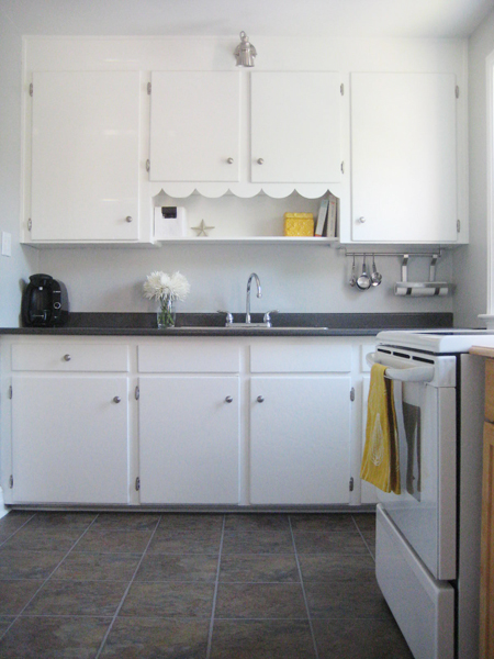
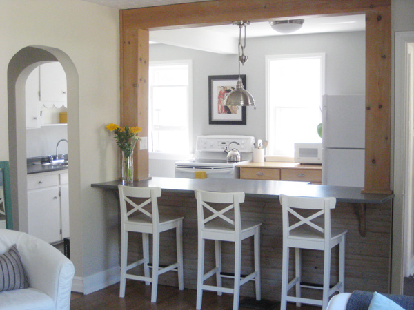
But I now love my cute little kitchen. The floors are no longer blue. The countertop is all sparkly and clean, and I finally got my double sink. I adore the Stonington Gray-painted walls, and my fresh clean-looking Snowfall White cabinets. Plus all the other little things I did to make our kitchen feel like “us.” I worked hard to make it pretty! It’s now my happy place – many batches of brownies and cookies and other yummy things (made for the people I love) have emerged from this room. And it’s where Sweetie and I convene each night after work, discussing our days while sitting across from one another at the island.
Let’s reminisce just a little, k?
Here’s where we started (image courtesy of the original house listing, not me!) with an ugly and rather greasy chair rail, ridiculous light fixtures, dirty cream coloured cabinets, strange gray trim, and a blue peel and stick floor…
Sweetie removed the rather random chair rail, and I painted the dickens out of my wee kitchen and we swapped out all the hardware and the obnoxious light fixtures, leaving us with this…
…which we lived with for quite a while (while I crazily stalked other people’s kitchens and planned and planned and planned some more.)
Then – happy day! – I laid a new kitchen floor. Best. Day. Ever.
…and then (then!) we added new countertops and the fancy new double sink. Leaving us with our current happy (and pretty!) little kitchen…
Happy sigh. :)
If we were planning to stay in the house longer, I would have put in a backsplash, probably in marble of some sort. I’ve always adored FrecklesChick‘s lovely little kitchen, and I think a similar tile backsplash would have looked snazzy here.
But perhaps we’ll save all that for the next house. :) While I’m hoping that our next kitchen won’t be quite as disasterous as this one was when we moved in, we tend to buy houses with ugly kitchens. It seems to be our (not at all intentional) “thing.”
So, just to recap (because I love a good Grand Finale!), this…
…became this…
…and this…
…turned into this…
Better eh? I’d say that’s definite progress. Here’s hoping the next family who lives in this house loves this little kitchen as much as I do!
And here’s looking forward to having a new kitchen to obsess about and pretty-up at our next home, wherever that may be. Although I could really do without a blue floor this time. (Just saying.)
Leave a comment
Our dining room (some befores, some afters, and a whole lot of pine)
So, I’ve likely referenced my dining room, like, a gazillion times in previous posts (ok, well, maybe not a gazillion, per se. Maybe twice. But that’s still lots!) but I’ve never actually posted anything about my dining room. It’s like the Polkaroo of my house. The Mr Snuffleupagus of our abode. Today, my friends, that changes.
(Did I just build it up a little too much? Crap. K. This had better be good…)
When we bought this house just over 2 years ago, the dining room was ugly. It was so un-pretty, in fact, that the sellers’ listing agent hadn’t even bothered posting pictures of the dining room in the house-listing.
The walls were white, but not a nice clean white – they hadn’t been painted in years and looked dirty and dingy and worn.
(And yes, those are gold drapes. They came with the house. Fancy eh?)
The trim… um… it was brown. But not “nicely stained in a lovely wood finish” brown (which is the really good kind of brown!) Nope. All the baseboards and trim had been painted dark brown (in a glossy finish, of course.) It was gross.
And don’t even get me started on the light above the dining room table… Ummm… here. Just look.
AGH! I know. What IS that? Yep. We were the crazy people who bought the house with THAT light in the dining room.
We’re brave, brave souls, Sweetie and me.
BUT! Here’s our dining room now…
The walls are painted Benjamin Moore’s Gossamer Blue, and all the trim, baseboards, the closet door and ceiling were repainted Snowfall White. For the record, it takes many many coats of white paint to cover up dark brown glossy baseboards.
We found the refinished dining room chairs on Kijiji (I adore Kijiji!) And the table is an old Ikea table (I don’t think they carry it anymore) purchased from a local Ebay seller shortly after Sweetie and I bought our first house. It’s not the prettiest table in the world (I think the most appropriate term would be “well-loved”), but it works. :)
And Jacob says it makes a rather good kitty fort.
The dining room light was a Home Depot find. It was cheap. It is cheerful. :)
The bowl of balls on the table is just that: a bowl of balls. (But it’s a pretty bowl, containing pretty balls, of course.)
Admittedly, there’s A LOT (like, a WHOLE lot) more pine in this room than I’d like. It almost has a “country-cottage” feel to it (and I’m not really a country-cottage kinda gal.) Some day I’ll get around to painting the Leksvik china cabinet and bookcase. But until then, they’re functional and not overly offensive-looking at least (and, given that they were both also Kijiji scores, they hardly cost us anything, so I can’t really complain…)
The bookcase holds odds and ends. The lower shelves contain my Scentsy stuff (I obviously need a better place to store all that.) The higher (ie: more visable) shelves hold more practical things (cookbooks, reference books, my lampe berger, random pretty things…) And yes, that is indeed a Mozart teapot on top (just in case you were curious!)
But the most important item in the room? The little red chair by the window. It gets a lot of use.
All in all, I’m pretty happy with the progress to date! It’s definitely a cheery little room, and the colour is one of my faves (I love turquoise. Or teal. Or seafoam. Whatever you prefer to call it.) :) Finding somethingmerother to put on the walls is my next project. And I’d like to replace the closet doorknob too (it’s still gold, and even though I’ve heard that gold is “back”, it isn’t really “back” in my house.) (Just sayin’.)
But yes! The dining room is house-listing feature-photo suitable now. Not that we’re planning to sell our house in the immediate future, mind you. There’s still lots more painting to be done! (Sigh…) But if we WERE to list the house, it would now be acceptable to post pictures of the dining room in the listing, I think.
Dear dining room: you are no longer a Snuffleupagus. Oh, no. Consider yourself the Grover of our little 1940′s house. You’re a little odd, and you still need some work, but overall you’re pretty darn cute. :)
Leave a comment
Sunroom update (add a few curtain panels and – poof! – coziness ensues!)
Have I mentioned yet how pleased I am with how our sunroom has turned out? Just in case I haven’t: I’m very very pleased! As in proud mama pleased. Like my sunroom just got a shiny gold star for being awesome and I’m starting up the mixer to make it a big ol’ batch of congratulations cookies.
Or something like that.
Just as a reminder, here’s where the sunroom started…
It was a rather unfortunate shade of purple-ish gray, cluttered, and basically had become a dumping ground for stuff we didn’t currently have a location for elsewhere in the house.
Yep. It was one of THOSE rooms.
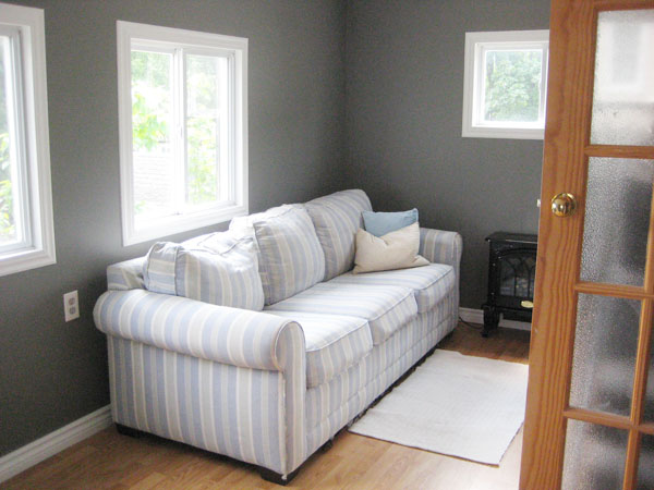
So, of course, I painted. EVERYTHING. The ceiling, the walls (BM Chelsea Gray), all the trim (in my beloved go-to trim colour: BM Snowfall White.) The only items that have not yet been painted to-date are the closet and back entry-way doors (and that’s coming shortly too.) When I finished painting, here’s what the room looked like…
Was I happy? OUI! But something was still missing.
Cue: curtains. Free Ikea Lenda curtains, in fact! Hand-me-downs from friends who were purging (like, years ago) that I’ve been holding on to ever since, knowing that eventually I’d have a use for them. And I did!
Here’s my newly painted sunroom, avec les curtains…
Eeee! The room now makes me so happy! It’s cozy. It’s organized. It might now be my favourite room in the house (and it’s not yet even finished!)
And I even repurposed the poor little piano stool that was usurped from kitchen-stooldom by my beloved vintage yellow barstool I inherited from my parents. It makes quite the nice little side-table!
What’s left to do? Door and closet painting, as I mentioned. I’d also love to find a cheap and cheerful slipcover for the sofa (since, while it’s the most comfortable sofa ever, it definitely isn’t the prettiest.) Art needs to go up on the walls, of course. And I’d love to get a more substantial rug for the floor too.
But for now, I’m happy. So happy, in fact, that I often just stand in the room and look around and smile. It creeps the cats out a bit, but I can’t help it. My sunroom makes me smile. :)
Leave a comment
Sunroom progress to-date (a little less purple plus a lot more organized equals one happy little sunroom)
I mentioned a looooong while back that I was ridding our sunroom of its purpleness. And then two (rather cute!) new cats came to live with us, and the sunroom became their home for a few weeks while they got to know Jacob a little. And then summer happened, and my brother’s wedding happened, and a whole lot of time has since passed and – poof! – it’s now over three months later. And, after all this time, the sunroom still isn’t quite finished… There are curtains and blinds to put up. There’s rearranging to do and doors still to be painted. There’s a not-yet-purchased slipcover to be applied to my very stripey (yet very comfy!) sofa. And I should probably put some stuff on the walls at some point too (you know, like art or a ceramic animal head of some sort or a picture of one of the cats) (the latter option, as we all know, is most likely.) But I figured, finished or not, it was about time for a quick progress update. :)
Here’s where we started (with purple-ish gray walls, oddly hung blinds, and way too much furniture and clutter)…
And here’s where we are now…
Every seam in the room has been caulked, the ceiling was painted, the walls got two coats of Benjamin Moore’s (scary and dark but awesome!) Chelsea Gray, and the trim was painted in lovely Snowfall White. And, most importantly, the room is no longer lavender-ish. Cue happy dance. :)
Here’s the other half of the room (aka my piano nook)…
The big white armoire next to the piano houses all of our bedding. Little 1940s houses don’t come equipped with much storage. Besides a small linen closet outside of the loo (where I store all of our towels) we don’t really have anywhere else for linens. Obviously, having the armoire in the sunroom isn’t ideal, but it’s close to the stairs to our second floor, so it sort of works. (And if you get chilly while playing piano, you can just reach on in and grab yourself a blanket. :)
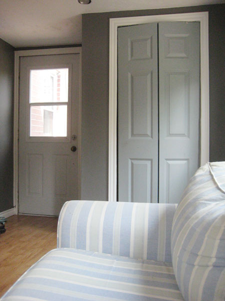
Adding to my extensive and ongoing list of “rather silly things that the previous owners did”, the past owners of this house laid the flooring in the sunroom right before listing it but didn’t bother to cut the closet door down in the process, so it’s way too long and drags across the floor and doesn’t at all close properly. Sweetie has plans to make it fit better using some sort of scary powertool (we have a system in place and it works well for us: I paint, he uses power tools) and then I’ll paint both the closet door and the inside of the back door too. I’m thinking either gray-ish teal (similar to the colour already on the closet door) or (if I’m feeling especially gutsy) maybe a light maize-y yellow. (I suddenly have a real thing for yellow. It’s very odd.)
The couch was my first ever grown-up-furniture purchase (right after we bought our first house) and even though I’m no longer a huge fan of the stripes, it remains the comfiest couch ever. :) It may eventually get slipcovered, thus preserving its comfyness (while hiding its stripyness.) But for now it’s not offensive. And it actually looks a little beachy back there and rather sunroom-esque. :)
Here’s how things look from the hallway…
(Note: The door to the back room still needs to be painted [it's on my list!], and that doorknob desperately needs to be replaced. Big gold round shiny doorknob: I dislike you lots.)
And here’s the view looking out (including two rather comatose-looking kitties who obviously think that the sunroom is awesome)…
And there! Tada! That’s my new-ish and improved-ish sunroom so far. Better eh? There’s still lots left to do (curtains, slip covering, a less obnoxious doorknob…), but I am thrilled with everything to date. Further updates will follow (shortly, I hope!) But, in the meantime, have a lovely Civic Holiday (or Simcoe Day maybe? I think I completely missed that name change somehow…) In short, have a fantastic holiday Monday. :)
Leave a comment


