So imagine my delight when she posted pictures of this kitchen in her regular National Post column…
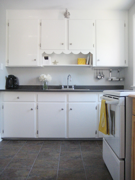
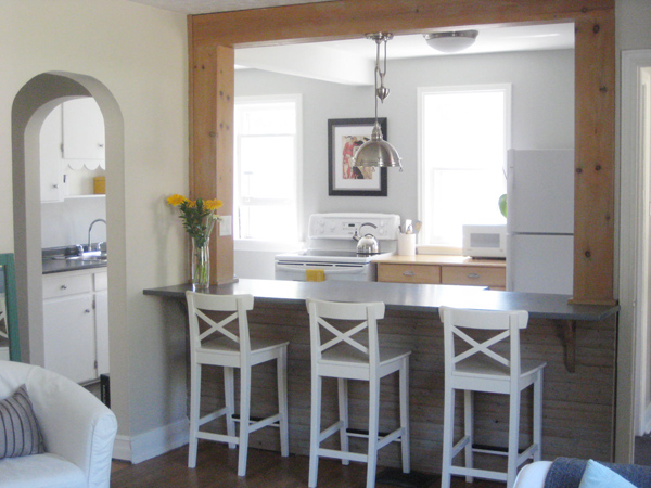
And imagine all the swooning (from me) that followed shortly thereafter. That blue – it’s perfect! That marble (or a close lookalike!) countertop – how lovely. The whole kitchen screams the word “fresh!” I seriously want to cook in there.
And now I’m seriously rethinking my kitchen plans.
Our kitchen currently features cream-coloured cabinets on the uppers, with dark navy lower cabinets. I didn’t paint these (the house came like this) and while the two-toned look has grown on me, I’ve always found the combination a little dated and dark (despite that two-toned cabinets seem to be very in style right now!)
I’ve always planned to repaint both the uppers and lower cupboards in a crisp off-white, Benjamin Moore’s Snowfall White, to be exact. We painted our last kitchen’s cupboards this colour, and it was the perfect bright white, with just a hint of creaminess to take away any overt starkness. It was lovely, and made me very very happy.
But now I’m changing my mind just a little. The upper cabinets will still get a good-sized dose of Snowfall White, of course (since the existing cream-colour is just so… dark) (if cream can be dark? I think it can…) but I’m now second-guessing my bottom-cupboard intentions. How pretty would a little electric-ish blue be? My answer? VERY.
We’ll see just how brave I’m feeling come kitchen-painting time. I’m a bit of a kitchen cupboard painting chicken, truth be told. Kitchen cupboards take a long time to paint, so it’s one of those tasks where I’ve always returned to my safety-zone hues (since I can’t imagine having to repaint all my kitchen cupboards for a second time.)
Here’s hoping that kitchen-painting time comes soon! Only 743 other projects to finish up first….
]]>
But I now love my cute little kitchen. The floors are no longer blue. The countertop is all sparkly and clean, and I finally got my double sink. I adore the Stonington Gray-painted walls, and my fresh clean-looking Snowfall White cabinets. Plus all the other little things I did to make our kitchen feel like “us.” I worked hard to make it pretty! It’s now my happy place – many batches of brownies and cookies and other yummy things (made for the people I love) have emerged from this room. And it’s where Sweetie and I convene each night after work, discussing our days while sitting across from one another at the island.
Let’s reminisce just a little, k?
Here’s where we started (image courtesy of the original house listing, not me!) with an ugly and rather greasy chair rail, ridiculous light fixtures, dirty cream coloured cabinets, strange gray trim, and a blue peel and stick floor…
Sweetie removed the rather random chair rail, and I painted the dickens out of my wee kitchen and we swapped out all the hardware and the obnoxious light fixtures, leaving us with this…
…which we lived with for quite a while (while I crazily stalked other people’s kitchens and planned and planned and planned some more.)
Then – happy day! – I laid a new kitchen floor. Best. Day. Ever.
…and then (then!) we added new countertops and the fancy new double sink. Leaving us with our current happy (and pretty!) little kitchen…
Happy sigh. :)
If we were planning to stay in the house longer, I would have put in a backsplash, probably in marble of some sort. I’ve always adored FrecklesChick‘s lovely little kitchen, and I think a similar tile backsplash would have looked snazzy here.
But perhaps we’ll save all that for the next house. :) While I’m hoping that our next kitchen won’t be quite as disasterous as this one was when we moved in, we tend to buy houses with ugly kitchens. It seems to be our (not at all intentional) “thing.”
So, just to recap (because I love a good Grand Finale!), this…
…became this…
…and this…
…turned into this…
Better eh? I’d say that’s definite progress. Here’s hoping the next family who lives in this house loves this little kitchen as much as I do!
And here’s looking forward to having a new kitchen to obsess about and pretty-up at our next home, wherever that may be. Although I could really do without a blue floor this time. (Just saying.)
]]>
(Did I just build it up a little too much? Crap. K. This had better be good…)
When we bought this house just over 2 years ago, the dining room was ugly. It was so un-pretty, in fact, that the sellers’ listing agent hadn’t even bothered posting pictures of the dining room in the house-listing.
The walls were white, but not a nice clean white – they hadn’t been painted in years and looked dirty and dingy and worn.
(And yes, those are gold drapes. They came with the house. Fancy eh?)
The trim… um… it was brown. But not “nicely stained in a lovely wood finish” brown (which is the really good kind of brown!) Nope. All the baseboards and trim had been painted dark brown (in a glossy finish, of course.) It was gross.
And don’t even get me started on the light above the dining room table… Ummm… here. Just look.
AGH! I know. What IS that? Yep. We were the crazy people who bought the house with THAT light in the dining room.
We’re brave, brave souls, Sweetie and me.
BUT! Here’s our dining room now…
The walls are painted Benjamin Moore’s Gossamer Blue, and all the trim, baseboards, the closet door and ceiling were repainted Snowfall White. For the record, it takes many many coats of white paint to cover up dark brown glossy baseboards.
We found the refinished dining room chairs on Kijiji (I adore Kijiji!) And the table is an old Ikea table (I don’t think they carry it anymore) purchased from a local Ebay seller shortly after Sweetie and I bought our first house. It’s not the prettiest table in the world (I think the most appropriate term would be “well-loved”), but it works. :)
And Jacob says it makes a rather good kitty fort.
The dining room light was a Home Depot find. It was cheap. It is cheerful. :)
The bowl of balls on the table is just that: a bowl of balls. (But it’s a pretty bowl, containing pretty balls, of course.)
Admittedly, there’s A LOT (like, a WHOLE lot) more pine in this room than I’d like. It almost has a “country-cottage” feel to it (and I’m not really a country-cottage kinda gal.) Some day I’ll get around to painting the Leksvik china cabinet and bookcase. But until then, they’re functional and not overly offensive-looking at least (and, given that they were both also Kijiji scores, they hardly cost us anything, so I can’t really complain…)
The bookcase holds odds and ends. The lower shelves contain my Scentsy stuff (I obviously need a better place to store all that.) The higher (ie: more visable) shelves hold more practical things (cookbooks, reference books, my lampe berger, random pretty things…) And yes, that is indeed a Mozart teapot on top (just in case you were curious!)
But the most important item in the room? The little red chair by the window. It gets a lot of use.
All in all, I’m pretty happy with the progress to date! It’s definitely a cheery little room, and the colour is one of my faves (I love turquoise. Or teal. Or seafoam. Whatever you prefer to call it.) :) Finding somethingmerother to put on the walls is my next project. And I’d like to replace the closet doorknob too (it’s still gold, and even though I’ve heard that gold is “back”, it isn’t really “back” in my house.) (Just sayin’.)
But yes! The dining room is house-listing feature-photo suitable now. Not that we’re planning to sell our house in the immediate future, mind you. There’s still lots more painting to be done! (Sigh…) But if we WERE to list the house, it would now be acceptable to post pictures of the dining room in the listing, I think.
Dear dining room: you are no longer a Snuffleupagus. Oh, no. Consider yourself the Grover of our little 1940′s house. You’re a little odd, and you still need some work, but overall you’re pretty darn cute. :)
]]>
Or something like that.
Just as a reminder, here’s where the sunroom started…
It was a rather unfortunate shade of purple-ish gray, cluttered, and basically had become a dumping ground for stuff we didn’t currently have a location for elsewhere in the house.
Yep. It was one of THOSE rooms.
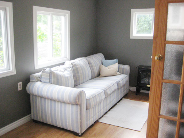
So, of course, I painted. EVERYTHING. The ceiling, the walls (BM Chelsea Gray), all the trim (in my beloved go-to trim colour: BM Snowfall White.) The only items that have not yet been painted to-date are the closet and back entry-way doors (and that’s coming shortly too.) When I finished painting, here’s what the room looked like…
Was I happy? OUI! But something was still missing.
Cue: curtains. Free Ikea Lenda curtains, in fact! Hand-me-downs from friends who were purging (like, years ago) that I’ve been holding on to ever since, knowing that eventually I’d have a use for them. And I did!
Here’s my newly painted sunroom, avec les curtains…
Eeee! The room now makes me so happy! It’s cozy. It’s organized. It might now be my favourite room in the house (and it’s not yet even finished!)
And I even repurposed the poor little piano stool that was usurped from kitchen-stooldom by my beloved vintage yellow barstool I inherited from my parents. It makes quite the nice little side-table!
What’s left to do? Door and closet painting, as I mentioned. I’d also love to find a cheap and cheerful slipcover for the sofa (since, while it’s the most comfortable sofa ever, it definitely isn’t the prettiest.) Art needs to go up on the walls, of course. And I’d love to get a more substantial rug for the floor too.
But for now, I’m happy. So happy, in fact, that I often just stand in the room and look around and smile. It creeps the cats out a bit, but I can’t help it. My sunroom makes me smile. :)
]]>
Here’s where we started (with purple-ish gray walls, oddly hung blinds, and way too much furniture and clutter)…
And here’s where we are now…
Every seam in the room has been caulked, the ceiling was painted, the walls got two coats of Benjamin Moore’s (scary and dark but awesome!) Chelsea Gray, and the trim was painted in lovely Snowfall White. And, most importantly, the room is no longer lavender-ish. Cue happy dance. :)
Here’s the other half of the room (aka my piano nook)…
The big white armoire next to the piano houses all of our bedding. Little 1940s houses don’t come equipped with much storage. Besides a small linen closet outside of the loo (where I store all of our towels) we don’t really have anywhere else for linens. Obviously, having the armoire in the sunroom isn’t ideal, but it’s close to the stairs to our second floor, so it sort of works. (And if you get chilly while playing piano, you can just reach on in and grab yourself a blanket. :)
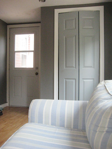
Adding to my extensive and ongoing list of “rather silly things that the previous owners did”, the past owners of this house laid the flooring in the sunroom right before listing it but didn’t bother to cut the closet door down in the process, so it’s way too long and drags across the floor and doesn’t at all close properly. Sweetie has plans to make it fit better using some sort of scary powertool (we have a system in place and it works well for us: I paint, he uses power tools) and then I’ll paint both the closet door and the inside of the back door too. I’m thinking either gray-ish teal (similar to the colour already on the closet door) or (if I’m feeling especially gutsy) maybe a light maize-y yellow. (I suddenly have a real thing for yellow. It’s very odd.)
The couch was my first ever grown-up-furniture purchase (right after we bought our first house) and even though I’m no longer a huge fan of the stripes, it remains the comfiest couch ever. :) It may eventually get slipcovered, thus preserving its comfyness (while hiding its stripyness.) But for now it’s not offensive. And it actually looks a little beachy back there and rather sunroom-esque. :)
Here’s how things look from the hallway…
(Note: The door to the back room still needs to be painted [it's on my list!], and that doorknob desperately needs to be replaced. Big gold round shiny doorknob: I dislike you lots.)
And here’s the view looking out (including two rather comatose-looking kitties who obviously think that the sunroom is awesome)…
And there! Tada! That’s my new-ish and improved-ish sunroom so far. Better eh? There’s still lots left to do (curtains, slip covering, a less obnoxious doorknob…), but I am thrilled with everything to date. Further updates will follow (shortly, I hope!) But, in the meantime, have a lovely Civic Holiday (or Simcoe Day maybe? I think I completely missed that name change somehow…) In short, have a fantastic holiday Monday. :)
]]>
a) the laundry room was dark and dreary
b) due to its apparently flammable nature, we decided the old washer might not be the safest appliance on the block
c) because our dryer was nearly as archaic as our washing machine, we figured we may as well buy an entirely new pair (my first ever new, and not just new-to-me, appliances – yay!)
d) see point a :)
The whole shebang ended up seemingly taking for-ev-ver. There were (rather expensive) decisions on new machines to be made (read about that HERE.) And then there was the sad sad moment when I noticed a scuff on top of my brand new shiny washing machine (I whined a wee bit about that HERE.) I even succumbed to some Pinterest-inspired daydreams over what my little laundryroom could look like (HERE.) And then there was painting and patching and shelf-hanging and all that fun stuff in between.
BUT, I’m happy to say she’s done. Well, done-ish. Our little laundry room doesn’t look A THING like my inspiration images (I’m blaming the smallness and lack of windows for that!) but it looks a lot better. :)
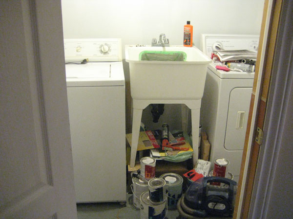
Here’s where we started (prepare yourself for overall laundry room ugliness)…
Ack, eh? Not a pleasant (little) room for doing ANYTHING, let alone something already as arduous as laundry.
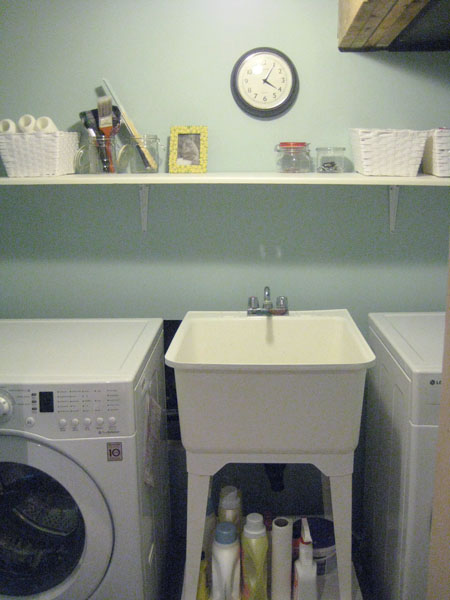
A couple coats of Benjamin Moore Gossamer Blue paint (leftover from my dining room painting project – aka free paint), a shelf, and a few other additions later (baskets! I love baskets!) and it’s a far more pleasant place to be…
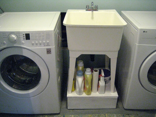
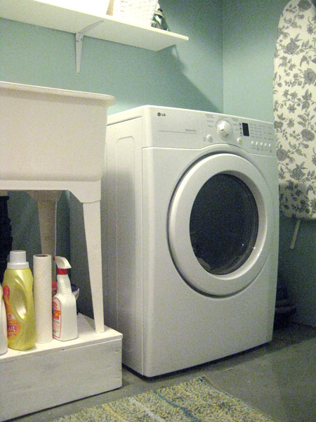
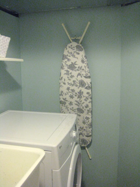
For the record, the room is TINY. In case you’re wondering why all of my laundry room pics only show a few feet of the room at a time. Without removing walls (which I’ve considered, but I don’t think Sweetie would approve) this is just the way it is! Here are a few other angles (for the really ambitious, I’m pretty sure if you cut and pasted all of these pics together, you’d get a pretty complete picture of the room!)
I painted the wooden pedestal our laundry tub is perched upon (and bolted to, we found out!) Just made things look a lot cleaner (Snowfall White paint fixes everything!)
The shelf is just a piece of knotty pine that Sweetie picked up and put a routered edge on for me (that Sweetie is pretty handy, you know!) and then I gave ‘er a good painting. It’s amazing how a little organization can make a laundry room a much friendlier place!
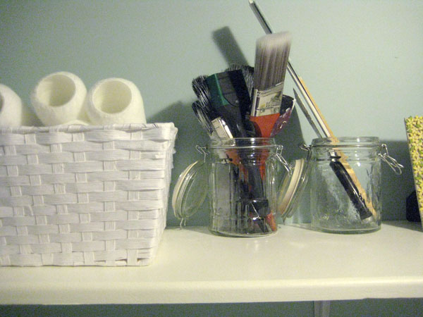
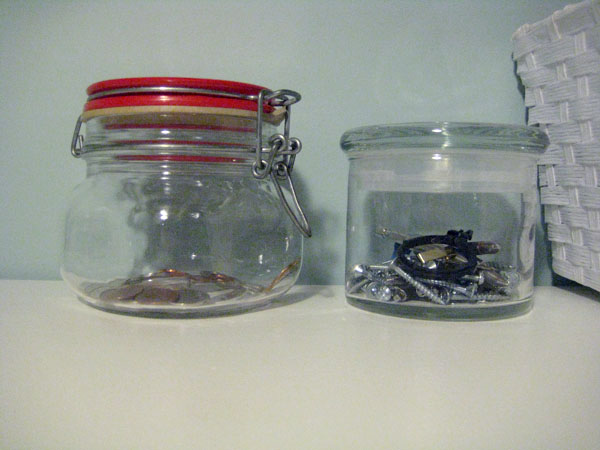
I repurposed a couple old jars (leftover from my pre-Slom-ed pantry) to hold paint brushes and that sort of thing. And the white basket holds extra roller refills quite nicely!
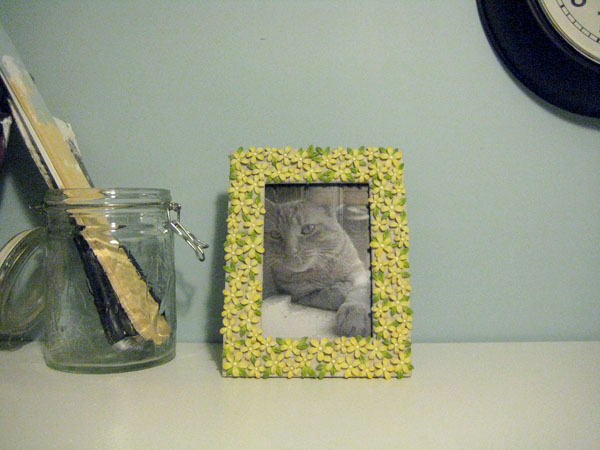
And, of course, no room in our house is complete without a picture of one of the cats. (We’re a little weird like that.) This picture was taken over 10 years ago (when Jacob was just a young lad!) with our very first ever digital camera.
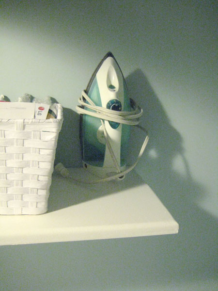
I hate ironing. A whole lot. But at least my ironing devices are nicely organized in the newly organized laundry room. It almost makes me want to iron. (OK. I’m totally fibbing. The room could be clad in marble and platinum and I’d still avoid my iron. But at least it has its own spot now. Where it will probably stay, untouched, for a really really long time.)
As the wife of an electrician who seems to collect electrical stuff throughout the day, I was constantly making little piles of marrettes and screws and other random electrical things (ie: I have no idea what they are, but I’m pretty sure Sweetie uses them for something) on the washer. Oh. And piles of change too. Because apparently electricians carry a lot of change around in their pockets. These jars (also leftover from the Slom-ification of our pantry) have meant the end of the random change/doodad piles. Thus making me a rather happy electrician’s wife!
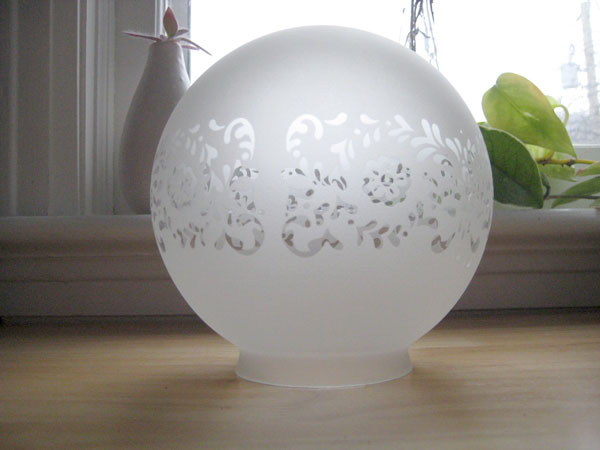
We even replaced the light in the room (er, rather, the naked hanging lightbulb) with a sweet (and inexpensive – I think the globe part was only $5) light fixture. I don’t have any pictures of the light installed in the room itself (since, well, that would involve turning off the light, which would plunge the room into darkness, which would make picture taking a bit of a challenge!) but here she is before Sweetie got all electrician-ish and got her all functioning and stuff…
(I think the design kinda looks like lace. Prettiest $5 light ever!)
And there you have it! My tiny little laundry room (divided up into many many images.) I mean, I wouldn’t want to hang out in there for HOURS, or anything like that, but it’s better at least, and (quite importantly!) neither dark, nor dreary now (such a pretty paint colour could never be dreary!) The best part (I guess, from a practical position) is that we are pretty sure this washer will operate sans fire. (Excuse me while I go knock on wood.) And it gets to do so in a cheery little room (because I’m sure that having pretty teal walls makes my washer happy too.)
Have a great weekend all!
]]>
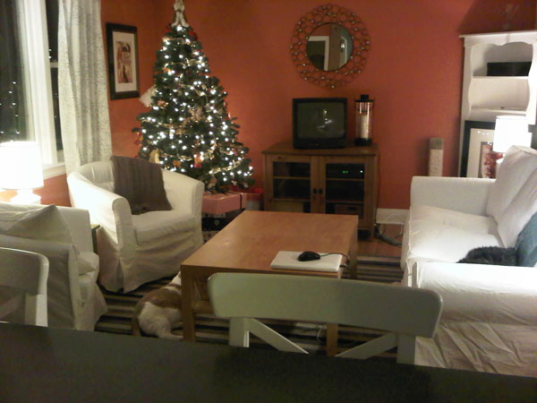
Let’s travel waaay back in time to October 2010. (Insert Wayne and Garth doing their squiggly doodle-oodle-oo… doodle-oodle-oo… flashback thing.) (I tried to find that clip via Youtube btw, just to give you a visual, but alas, normally-dependable Youtube failed me this morning.) (If you find that clip somewhere, please let me know!) Because the house was an absolute disaster for the first few months we lived here (I’m definitely not one of those people who moves in and immediately has everything unpacked. My friend Jess is. Oh how I envy her!) (we still have un-unpacked boxes in the basement, in fact… shhhh… don’t tell…) I don’t have many pics from the living room’s orange days. But here’s one I did find from Christmas right after we moved in…
…ah Christmas. :) Happy sigh.
(Aside: that picture kinda makes me want to rearrange our furniture – I rather liked our living room like this. Hmmm…) (See what happens when you venture into the past? You earn a fun furniture rearranging session!)
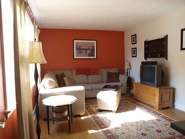
And here’s a (rather sterile-looking) shot from the original house listing…
While the orange wasn’t terrible, per se, it just wasn’t me. At all. I like orange (quite a lot actually!) but just not on my own walls. On your walls though? Awesome! :)
So that’s when I got my paint on. Needless to say, it took a good couple coats of primer to dull our glowing pumpkin walls. But a wee bit of Edgecomb Gray paint later, and I think it was all worth it.
(Please ignore the messy laptop and cords on the little green side table… Let’s call this an au naturel image, taken this morning, sans any staging k?) :)
So there you go! Just a quick little prequel post to show you where my living room all started. It still has a ways to go (SOMETHING needs to go in the far left corner, but I’m still not sure what), but it’s a far calmer space now than it was when we moved in (screaming-orange walls aren’t especially soothing.) Jacob agrees.
Now please excuse me while I go rearrange my furniture. Again.
]]>
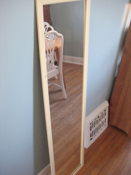
Case in point. I present to you… a mirror. Tada!
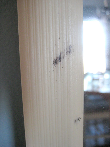
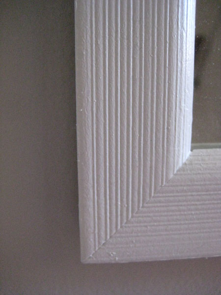
I’ve had this mirror since my early university years (so it’s at least 15 years old) and I think it was a $9.99 Zellers special originally. The frame is definitely some sort of plastic, and over the past decade and a half, it’s done that yellowing thing that white plastic does over time. It’s also been marred by the occasional renegade mascara wand…
But, despite being ugly, there’s otherwise nothing wrong with it. The glass isn’t wonky (you know, when mirrors get to the point where they’re just SLIGHTLY warped and they make your toosh look ginormous? Yep – hate that!) and it’s sturdy and it’s survived about seven moves since my tiny little university apartment days. This mirror is definitely a trooper. (An ugly trooper, but a trooper nonetheless.)
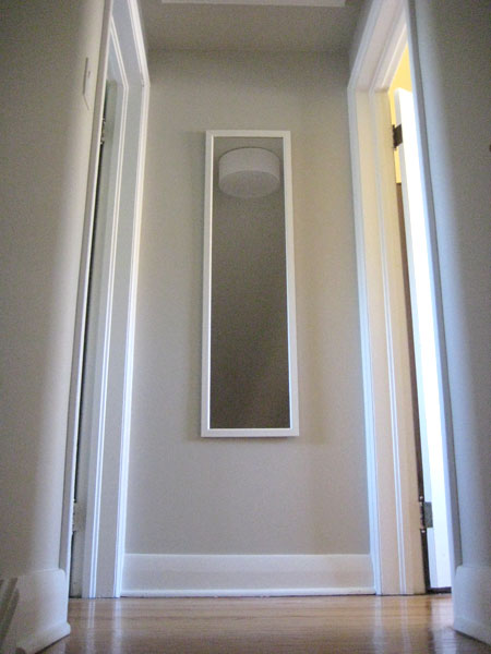
So, my solution? Paint. Of course. Did I bother to scuff ‘er up at all? Nope. A light sanding probably would have been a great idea, but it was an extra step that I didn’t feel like taking for a once-$9 mirror (I’m super lazy like that.) That said, I did indeed prime it with a high adhesion primer (my beloved Zinsser Bulls Eye Primer.) And then a couple coats of Snowfall White paint later (to match my trim and baseboards) and I suddenly have a much nicer looking mirror specimen…
Easy eh? It’s obviously not perfect (I had a moment of dirt-blows-in-fresh-paint-panic while painting the mirror in my backyard – one of the hazards of painting outdoors), but it was free (since I already owned both the paint and the mirror) and it’s absolutely fine for the top of our stairwell (which seems perfectly suited for a full-length mirror!)
So see? You can paint anything, really! Except maybe your grandmother’s hope chest. :)
]]>
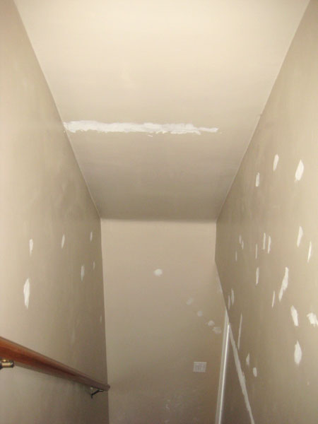
Here’s where we started…
(See all those patches? Yep. Our stairwell was just that disasterous.)
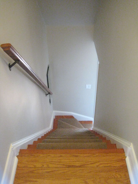
Fast forward a couple of months and a lot of paint (BM Edgecomb Gray on the walls, and Snowfall White on the stringers, trim and doors) and here’s what that same little stairwell looks like now…
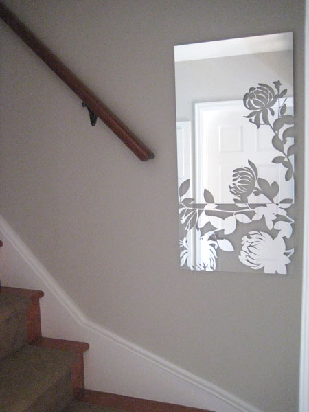
One of my favourite improvements is the mirror at the bottom of the stairs. It’s called Melissa (yep – that’s half the reason why I bought it!) and I found it on clearance at Sears a while back (the other reason why I grabbed it up!) Rona still sells this same mirror at full price (see here), so I’m quite proud of my lovely little bargain. :) It’s a dark, windowless little stairwell and this just seems to brighten the landing up a bit (plus I just think it’s pretty!)
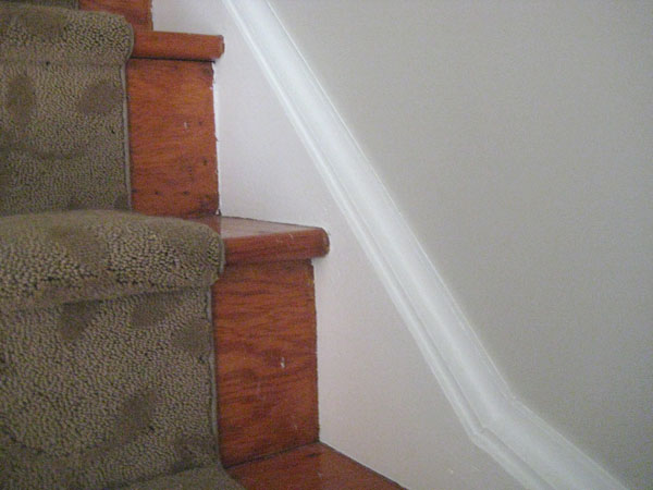
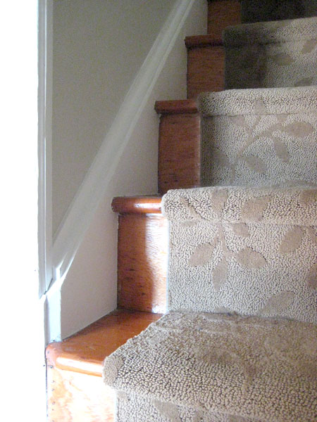
Oooh! And see those lovely stringers near the bottom of the pic? They weren’t always so lovely. That loveliness is the result of a whole lot of filler (there was a huge gap between the stringers and the wall originally that yours truly fixed up with loads of caulking), careful (crazy time consuming!) taping (click here for pics of the groovy green tape stripes I had going for a while) and a lick of paint.
Just looks so much cleaner now. :)
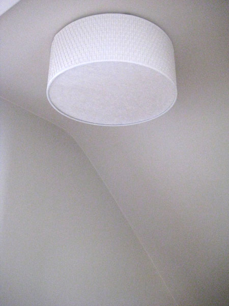
The boob light at the top of the stairs has been replaced by Ikea’s amazing Alang…
(Alang is indeed a-lovely, non?)
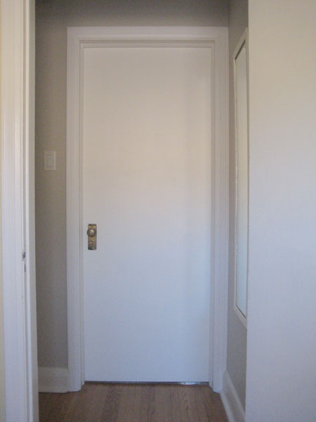
And I painted both the doors to the upstairs bedrooms. They were originally wood-grain and coated in what appeared to be a gazillion layers of 1940s varnish. The white is way better (if you ask me!)
I heart our doorknobs. They’re old and aged and imperfectly perfect.
Lastly we added a mirror at the top of the stairs. Afterall, one must make sure she’s presentable before greeting her public. ;)
And poof! The stairwell is done. Ish. I’d like to eventually replace the thick brown (leaf-patterned) runner with something fun or striped or something like that, but for now it’s in good shape so despite that it’s brown (did I mention that it’s brown? Yep. It’s brown…) it’s staying, for a while at least. And I’d like to add something to that wall at the very bottom of the stairs (a pic from our wedding [almost 4 years ago] perhaps? We should really start printing those at some point…) but that’s not an urgent stairwell upgrade at the moment either.
For now, it’s better! If you didn’t know I’d put weeks (and weeks and weeks) of weekend-work into that little dark stairwell, you’d just think that it’s a fresh clean stairwell. But it’s the projects that you don’t notice that add the most value, I think. At least I hope. :)
]]>
The living room in our last house was a lot larger than our living room now. And so our living room furniture has never really seemed to fit in our new space here. The culprit? Our ginormous Ikea Lack coffetable. While amazingly functional, it was just far too large for our room.
And so began the search for a new place to rest my coffee. :)
Then, one day, while scouring the local Kijiji-pages (er, website) I found a listing for a rather beat-up looking glass-topped coffeetable. Price? $15. My reaction? Sold!
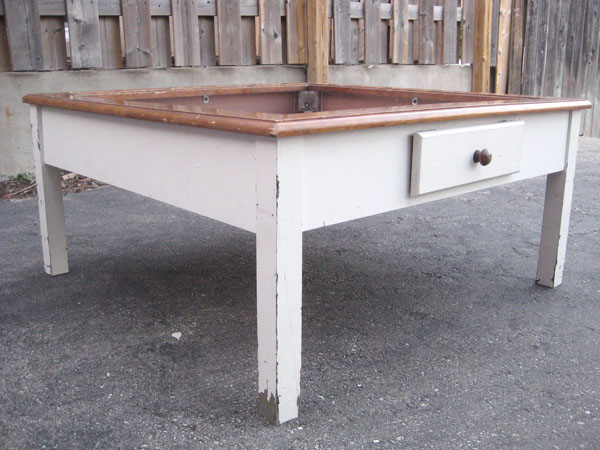
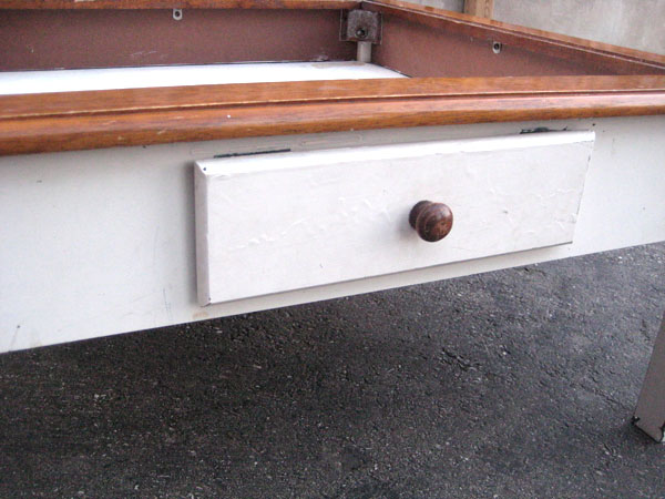
Here’s what the beast looked like when I picked ‘er up.
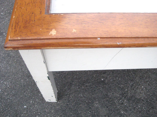
She was scratched. She was dented. She had random patches of forest green peeking out from under her white exterior. She was a sad looking coffeetable indeed.
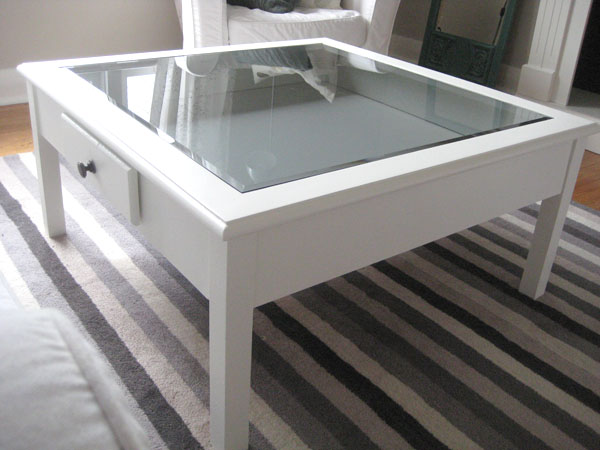
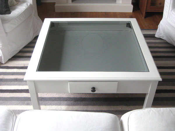
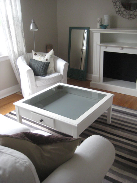
So I pulled out my primer (BullsEye in the blue can is my go-to primer for everything – it rocks) and my Snowfall White paint (all the trim in my house is painted BM Snowfall White, so I seem to always have some on hand) and one weekend later (following the accepted furniture painting rules: sand, prime, paint, admire), I now have a much prettier place to rest my coffee. :)
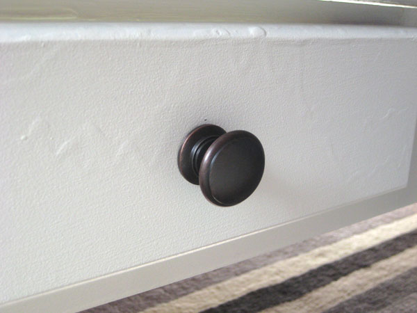
I switched out the old pull (it was wood, it was icky) on the (fake) drawer for an inexpensive ORB pull I picked up at Rona. Much better. :)
Some of the drips from the previous owner’s (rather abysmal) painting job still show through (even though I sanded the dickens out of the table before priming it) but I’ve decided that they add character. And, really, unless you’re taking a ridiculously closeup picture of my pretty new pull, you don’t really notice the drips in person. :)
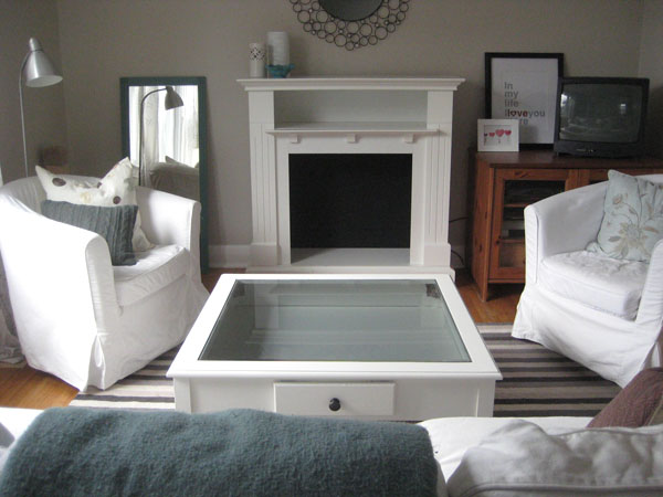
Sadly, in all honesty, I’m not 100% sure (after alllllll that) that this is the right coffee table for our space. While our Ikea table was too long, this one is too… square. And also too big. Again. Sigh. It too seems to take over the entire living room.
And I’m already missing the handy-dandy storage shelf that was under my large Lack Ikea table – it always came to the rescue whenever I needed to quickly move things (remotes, my laptop, random bills, my copy of Blogging for Dummies) out of sight.
And, well, I’m also sort of wishing I would have jumped (just a wee bit) outside of my paint-it-white-and-it’ll-be-alright comfort zone and painted the table dark (since EVERYTHING in our living room is white now. I’m all for uniformity, but this might be a little much.)
BUT, it’s BETTER. For now. At least until I decide if it’ll become a permanent fixture in our room, or if it’s hitting the selling-block once again, or getting another (sigh) coat of paint, this time in deep charcoal or something snazzy like that. Or maybe I’ll just give in and get a larger living room (unlikely, but it could happen!) I’ll letcha know what I decide. :)
]]>


