My fantastic front door plans (prepare yourself – this could be shocking)
So hear me out for a second k? No judgy-judgy… Just trust me on this for a moment. I have an announcement:
I might paint my front door pink.
(Let’s pause briefly while that all sinks in… You ok? K. Let’s continue.)
Yes, I’ve lamented for months now that our house is mauve.
And yes, I’ve previously stated that perhaps a muted plum door would tone down the pinkness of the siding on our house while still looking sophisticated and coordinated.
And yes, I’ve even mentioned (several times) how much I’d really really like to repaint our old mauve house and be rid of the pink altogether.
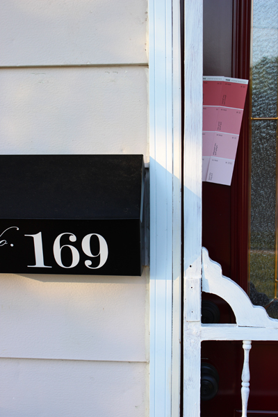
But (this is where my anti-mauve plans go a bit awry), then I noticed this…
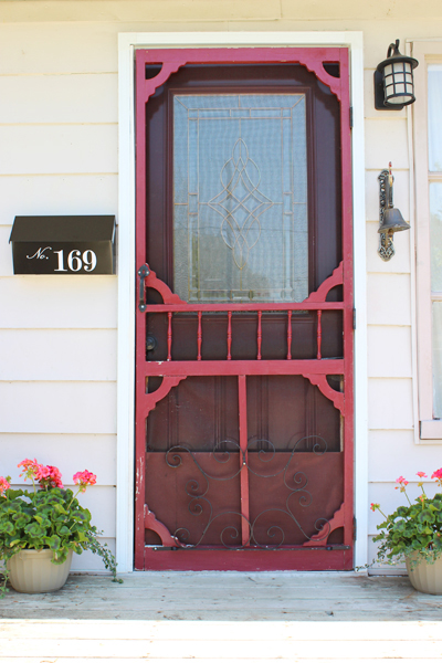
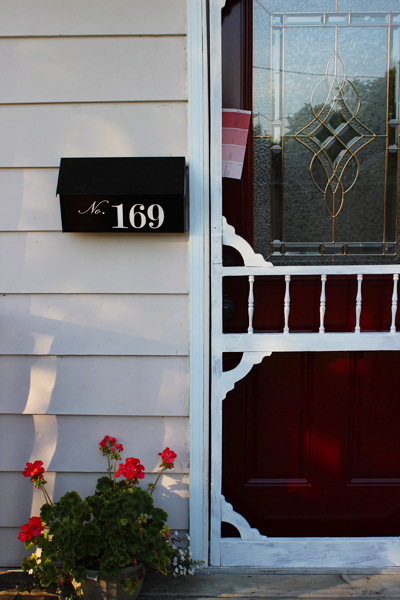
See those geraniums slyly photobombing this pic of my front door (and my beloved new house numbers?) They’re coral. And they’re pretty. And see how nice they look against my (much despised) mauve siding?
Dear Mother Nature: you sneaky fox. You’ve coyly inspired me. Big pat on the back for you, missy. Nicely done. :)
So I might paint my front door a corally-pink. It’s absolutely mind boggling, I know.
And don’t get me wrong: we’re not talking fuchsia here. (Random diatribe: FUCHSIA might, in fact, be the oddest-spelled word in the entire English language. It always takes me at least three or four attempts to type it out correctly. FUSHIA looks right, but it’s not. Fuscia could even be correct, but, strangely, is not. Nope. Fuchsia is indeed one of those words that makes me yearn to have a stern conversation with the good folk at Miriam-Webster and ask them what the heck they were thinking when they decided to add so many miscellaneous letters to a rather simple, two syllable colour.)
(Thank you for letting me rant. Carrying on…)
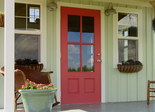
Nope. We’re talking a corally pink. Like this (via ByStephanieLynn)…
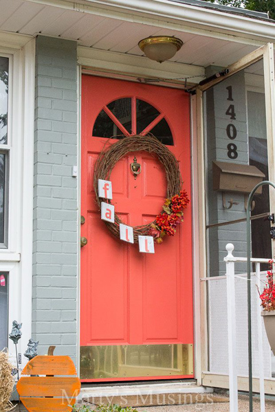
Or like this cheery door (courtesy of Marty’s Musings)…
Or even this (the top paint chip is Benjamin Moore’s Glamour Pink, and I THINK it could work, although it’s a bit more pink-ish than coral-ly.)
Please ignore the partially painted screen door – that’s a whole other project for a whole other post. (But I need it to stop raining first. Once the rain stops, the door will be painted. Until the rain stops, it’ll stay splotchy.) (Sorry neighbours!)
So yes. This is my new plan. A coral door for my mauve house. Who would have thunk it, eh?
Mind you, Sweetie and I haven’t discussed this yet. He might have issues with the words “pink” and “coral”, so I may call it a “muted light reddish-slightly-orange colour.” Or perhaps even just “geranium,” since I’m doubting he’d know which flower I’m describing. Sweetie isn’t much of a flower guy. But give him some rare weird variety of tomato plant and he’s all over that like ants on an apple. :)
Leave a comment
My blue kitchen (aka why test pots exist) (and, consequently, why you should use them)
So I decided the other day that I couldn’t handle these dark/dreary/oh-my-god-who-seriously-paints-their-walls-these-colours? walls any more. With Baby on the way (only nine weeks to go till my due date) (ack!), I had sworn off painting for the next little bit (even though some say you can absolutely paint while preggers) (however I’m super sensitive to smells right now, so painting just didn’t seem to be in the cards for me.) Based on a recommendation from a co-worker (hi Laura!) I brought someone in to paint my living room, dining room, and (yay!) kitchen. It took her less than five hours to paint all three rooms. FIVE HOURS! I was (and still am) in painting-land awe. I’m not sure how she did it (seriously, what she accomplished in five hours would have taken me several weekends!) (maybe I’m just a rather pokey painter?), but suffice it to say that the house feels like a totally new house now. The rooms feel bigger and lighter and cheerier. The ceilings seem so much higher. And I am one mighty happy momma-to-be.
However, let me break in on this little newly painted room love-fest with a bit of a confession: my kitchen was supposed to be gray. A nice, light, slightly bluish airy fairly neutral gray colour.
The Coles Notes version of the story? I got blue.
Like, really blue.
Grumble.
What I was hoping for? A slightly brighter lighter version of the same colour that adorned my happy little 1940s kitchen at our last house. That kitchen was painted in Benjamin Moore’s Stonington Gray, and I loved it. Loooooved it.
Our current kitchen, in our old mauve house, gets far less natural light than our previous sunny little kitchen did. And it’s less open and needed brightening up a bit. So my seemingly obvious solution was to confidently (ie “ruthlessly skipping the whole test-pot phase of painting”) go one paint chip lighter on the same paint-swatch card thingy from my previously adored Stonington Gray colour. Seemed foolproof enough, I thought. And, even when I held the paint chip up in various places around my kitchen, my newly decided upon colour (Wickham Gray) appeared to be a light gray with a teeny tiny smidgen of blue-y green-y muddy undertones mixed in for a bit of wall colour pizazz.
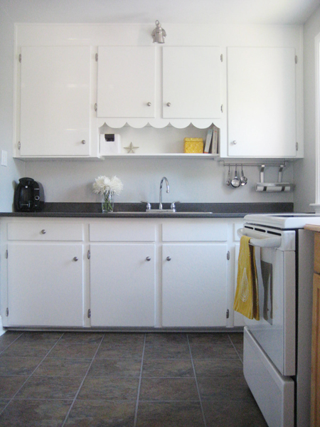
The real-life post-painting result? Apparently Wickham Gray turns blue in my kitchen.
Like, very very blue.
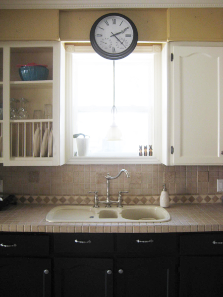
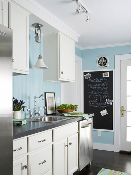
Here’s where we started (all gold-y and dark and such):
And here’s where we are now. Blue blue blue.
Yep. Definitely blue. Super ginormous sigh.
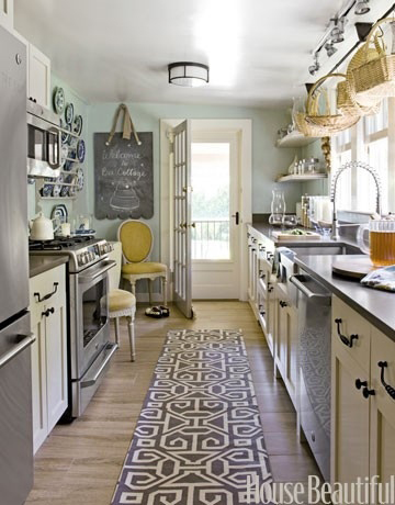
Don’t get me wrong! There are lots of lovely blue kitchens out in the world. In fact, my Pinterest Kitchens board features several blue-hued kitchens that I’ve admired for a while. There’s this one, from House Beautiful (although I searched the House Beautiful site and couldn’t find a link directly to this particular image – sorry!):
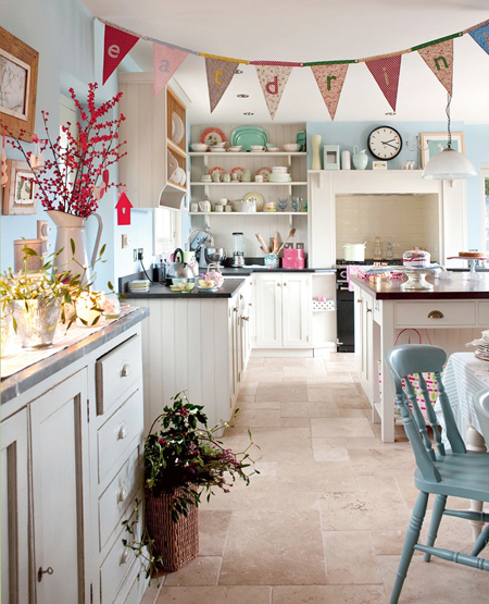
And this super lovely kitchen featured on the Better Homes and Gardens website…
And, my favourite (pretty!), this cheery blue kitchen courtesy of… um, Pinterest source unknown. (I hate those source unknown sorta Pins, don’t you?) (If this is your kitchen, a: I want to move into your house please! and b: let me know!)
So see? I’m not at all against blue kitchens. In fact, I think blue is so fresh and pretty in a kitchen!
But… it’s not what I had planned for my kitchen. And against my currently cream coloured upper cabinets and brown-tiled backsplash and countertops the blue looks a bit… off.
I’m going to live with it for a bit. And maybe (with a little tweaking and accessorizing and such) it’ll grow on me! With Baby on the (ever nearing) (ack!) horizon, and my painting budget tapped for the time being, blue is definitely, if nothing else, better than the muddy gold colour that was there before. And, when I someday get around to painting the kitchen cabinets a whiter crisper shade of white (Benjamin Moore’s Snowfall White, my all-time favourite trim and cupboard colour, to be be exact), I think the blue might actually look quite spectacular.
But, for now… meh. At least it’s not gold.
Leave a comment
Nursery natterings (part two: what we’ve planned so far) (aka: a whole lot of cuteness!)
Little by little we’re starting to put a nursery plan in place. With only fifteen-ish weeks to go until my due date (eek!) (seriously – where did my second trimester go?) we’re at the point where we need to start making decisions and purchases and moving forward with this space that’ll one day be home to someone so completely and utterly adored.
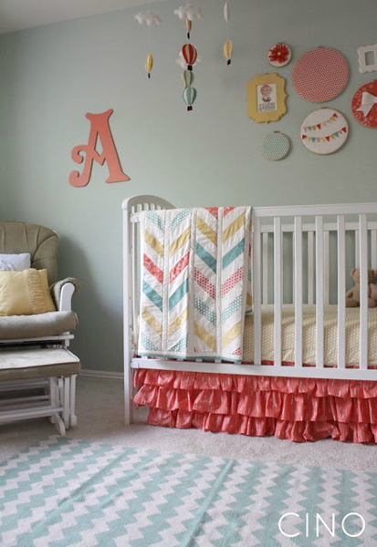
A couple weeks ago, I mentioned that the nursery will be a light teal-ish colour (which I see as very gender neutral – once baby is born we can add a bit of coral and yellow if we have a little lady, or navy and green if the bump is currently housing a little gent.) Here is our (ok, well, my – Sweetie has sorta given me free-reign on this whole nursery decorating project) inspiration pic (from The Farmer’s Nest)…
Happy sigh. Prettiest nursery ever.
And here’s what we I have planned to date…
Rocker
Remember the rocker from our staged quasi-nursery at the last house?
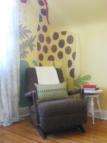
This chair once belonged to my grandparents, and my mom (hi mom!) has sweetly offered to have it reupholstered for our nursery here. The room that’ll be our nursery is quite a tiny little space, and this rocker is small but super comfy. And I love that it once belonged to my grandparents who, while no longer here, were such an important part of my life growing up. Having this rocker in the nursery is a little like having them be part of Baby’s life, and I absolutely love that. :)
Mobile
Have I ever mentioned that I love sheep? I love sheep. Weird? Likely. But there’s something so awesome and peaceful about those grass-munching field-frollicking balls of white fluff that makes me insanely happy. So when I stumbled upon this mobile (courtesy of Etsy-seller GiftsDefine) I was sold.
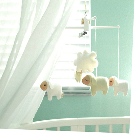
Oh, lamby sweetness. I love everything about it. I haven’t yet hit the purchase button, but I plan to very very soon.
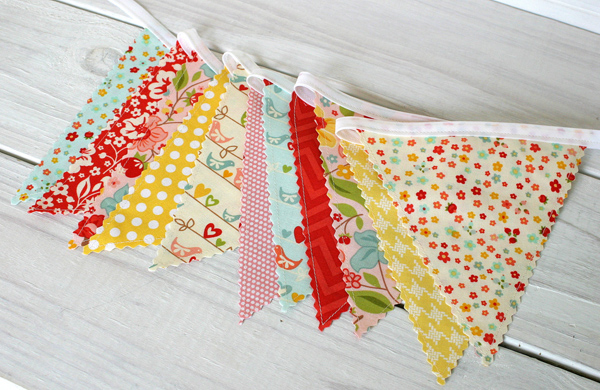
Bunting
Yep! I may fall into the whole mobile-PLUS-bunting (how decadent for baby, eh?) category, mostly because (surprise surprise!) I can’t decide between the two. The mobile will likely float above the crib, and the bunting will likely hang above the change area.
This one is my current fave for a little girl…
And I love this option should we have a little man…
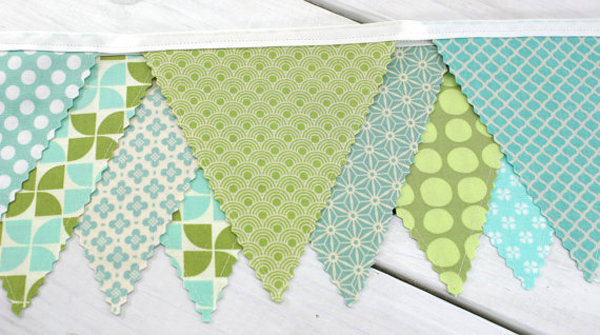
…both from the awesome Etsiers at The Spotted Barn.
Pretty little things
Have you ever noticed that Chapters has the absolute best stuffed animals? They really do. I’ve adored the super soft, squishy stuffed creatures from Chapters since way before Sweetie and I had baby-thoughts.
My favourites are the ridiculously adorable bashful lamb…

And the ever so sweet bashful bunny…

So much cuteness. So much. Like, an immense amount. (I’m seriously swooning over here.) Here’s hoping that Baby loves them as much as his mom does.
And then there’s all the other (far more important) stuff
And then there are the bigger, scarier, expensive-er, non-decorative purchases: the crib, the dresser (that’ll double as a change table), a bookshelf of some sort for stuffies and books and such… THESE are the items that I need to make decisions about soon. Very soon, in fact. I have a couple of friends who’ve had their babies far earlier than their due dates over the last few weeks, and I’m starting to get a wee bit nervous.
Let the nursery decorating frenzy officially begin! :)
Leave a comment
Nursery natterings (part one of… several) (since, well, I’m awful at making decisions) (and also because baby stuff is just so darn cute!)
I am officially 22 weeks pregnant today. Twenty-two! How the heck did that happen? It seems like I just finished a very nauseous weeks 8 through 12, and now, all of a sudden, I’m over half way to the finish line. It’s so exciting! But, honestly, so overwhelming at the same time. There are registries to prepare. There are maternity leaves to schedule. There are no fewer than a gazillion cloth diapering systems to decipher (yep – call us crazy, but we’re going to give the wild and wacky world of cloth diapering a shot!) And there are strollers and baby baths and car seats and boppy pillows and cribs and carriers and all sorts of foreign (to us not-yet initiated future baby-club parents, at least) stuff to research and plan and obsess about.
But my favourite pastime at the moment? Nursery planning. I know: swoon! The colour options. The decor. The accessories. Where the crib will go. Mobile or bunting or both. Sigh. There are so many happy possibilities for the room that will one day contain someone so tiny but so important and so very very loved. With about 18 weeks (insert panic attack HERE) left to go until my official due date, here’s the nursery inspiration pic (from blogger She Walks in Beauty) that I can’t stop looking at…
So peaceful and lovely. I absolutely adore this colour scheme. A-DORE it. We’re still undecided on whether we’ll find out the sex of little Baby in advance of the big day, but this soft teal-based colour scheme fits perfectly for either a little girl or a little dude (in my humble opinion, at least.)
Once baby makes his or her arrival, we can then add in some gender-specific colours to the mix, if we want. Maybe a little navy and/or some bright lime-ish green if the bump turns out to be a boy, like this nursery from Spearmintbaby…

…or some coral-ly pink and yellow (like in this gorgeous nursery from CraftinessIsNotOptional) if I’m currently housing a baby girl.
Either way, I can’t wait to get started. Can’t wait! And that’s probably where Part Two of this (likely drawn out due to indecisiveness) nursery natterings series will go. Regardless of everything else that ends up in the nursery (and all the decisions yet to be made), teal is one of my absolute favourite colours. I’m hoping that Baby (boy or girl) will really like it too. :)
Leave a comment
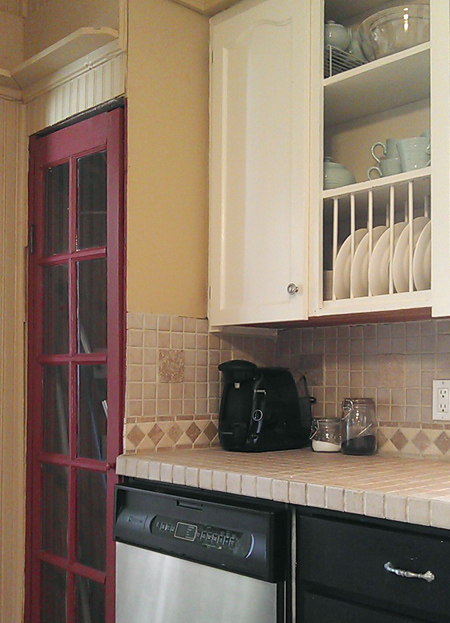
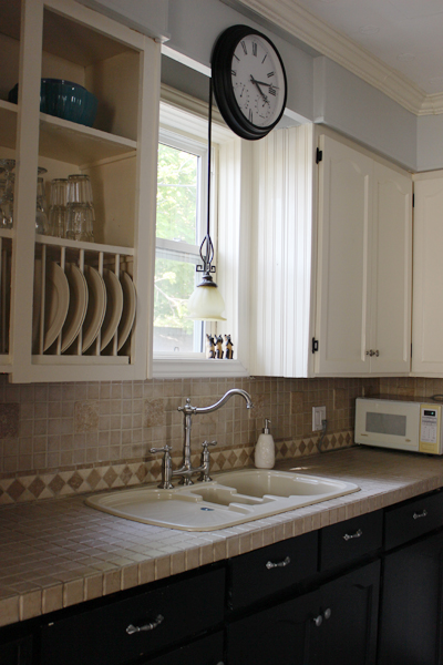
Brightening up a rather dark little kitchen (sad-looking semblance of a valence: be gone!) (next: let’s talk lighting)
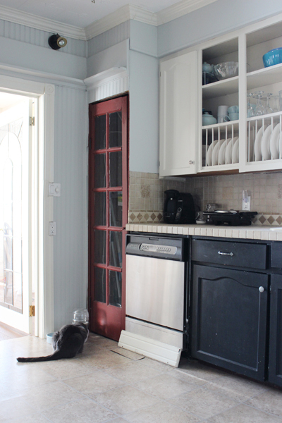
Despite that I really love bright and sunny kitchens, the kitchen at the old mauve house is neither bright nor sunny. The kitchen window is north-facing (meaning it never catches any real sunlight) and our (inherited) wall colour is rather drab and dark (but kitchen-painting is a ways down on our list of required renos at the moment, so drab and dark will sadly stay put until “paint kitchen” comes up in the renovating queue.)
One thing that has helped increase the kitchen brightness-factor a tad? Removing THIS…

Yep. That awkward repurposed-window-but-half-valence-thingy came down recently. Not entirely because we wanted to take it down. But rather because it needed to move in order to access the window so that we could thoroughly weatherproof (since our kitchen window is definitely drafty and quite a pane.) (Get it? Pane? Pain?) (Groan… K. Carrying on…)
Initially, Sweetie didn’t like the kitchen window sans the odd-looking-not-really-a-valence, but I asked him to live with it for a while. The result? The look has grown on us both. Much more light floods into the kitchen now, and the window just looks less… odd.

Our new problem? The light over the sink. I’ve never been a huge fan of this light (or of any of the lights in this house, truth be told) (once budget permits, they’re allll getting a good swapping.) However without the quasi-valence in place, the light definitely looks odd and hangs too far down. And the yellow-hued shade makes it a wee more traditional than I’d prefer. And it’s honestly just not us.

After a little online big box store searching, I’ve narrowed the new over-the-sink light options down to a few contenders.
My absolute fave? This one from Lowes…

Pretty, no? I adore this light. To get all technical, it’s the Allen + Roth 12-in Bronze Edison-Style Pendant Light with Clear Shade. And it’s LOVELY. The chain makes the light feel… (searching for the correct words…) (let’s go with…) airy-er than it would if the light was hanging from dark solid rods. And the shape is vintage-ey, but not old-looking. It’s modern, but antique-ish.
Does that all even make sense? Likely not.
Regardless, I love this fixture and desperately want this for my kitchen. There are a couple slight hiccups, however. It’s quite large at 12 inches in diameter. I searched all over Internet-land to see whether Allen & Roth make a slightly smaller version (the dreaded “mini-pendant”, if you will) and, sadly, they do not. Secondly, 75% of the reviews for this fixture have mentioned that the amount of light it casts (with it’s maximum 60W Edison bulb) isn’t particularly great for task lighting (and doing dishes and cleaning vegetables and the other mundane things that I do around the kitchen sink definitely seem to be task-lighting sort of tasks.) Could I outfit this light with a normal run-of-the-mill clear incandescent bulb and have it look just as pretty? Maybe? I’m not sure. But it’s also the most expensive light of the lot I’m considering. At $128 it’s quite beyond my “lovely little light in the kitchen window” budget.
But I love it. A whole lot. So it’s staying on my list.
Much smaller, and also available from the good folk at Allen + Roth via Lowes is this one…

Sweetie likes this one better than the first, and, from a cost standpoint it’s mucho cheapo-er (at only $49 bucks.) But there’s that whole low-wattage Edison light issue again. And it’s very square. And there’s already a lot of squareness in my kitchen. I think I’m gravitating more toward a little spherical illumination.
Which lead me to THIS light…

Which is pretty. SO pretty! I squealed just a wee bit when I stumbled across this fixture – the green glass is just so incredibly lovely and will look amazing in my kitchen one day (once all my painting projects are all finished up.) (Eventually.) The problem? (Because there’s ALWAYS a problem?) It’s only available at Lowes.com. Or at Lowes stores in the states, I’m assuming. And I am most definitely sitting here typing away from my Canadian home, with limited access to an American Lowes store. Sigh. And, with a maximum allowance for a 40W bulb, this light would be even dimmer and less kitchen-task-friendly than the others (I keep reminding myself of that – it keeps me from getting super sad that it’s unobtainable without a jaunt across the border.)
So where does this all leave me? It leaves me mighty light-less. Sorta. The existing light works for now (and until we find another far prettier one for the space.) But now that I’ve found a few almost perfect options, I want to find the one.
More lighting obsessing to follow, I’m sure. (Sorry about that.)
Leave a comment