I took a risk (surprised? Me too!)
Remember when I chatted a bit about painting my bedroom (here)? That seemingly simple project took weeks. WEEKS. Truthfully, months. Not because it was a particularly difficult project. In fact, due to the coved ceilings and (rather obnoxious and eventually to be removed) faux fireplace and the various doors/windows in the room, there wasn’t a great deal of actual wall-space to be painted. And, the delay wasn’t due to my (admittedly notorious) indecisiveness either. I boldly chose a paint colour lickity-split-ishly and rushed out to buy the paint before I could question my colour choice (since, once paint is purchased, you’re committed) (because if you buy paint from the good Mr Benjamin Moore like I do, painting is a bit of a financial commitment.)
Nope. The delay was caused by this…
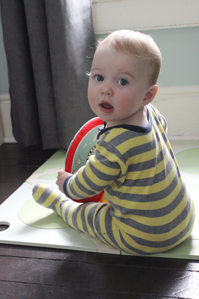
Yup. An adorable squishy active smiley drooly nine month old.
Best reason for a delay ever. :)
However, the lack of painting progress seriously started to wear on me a bit. You see, that same ridiculously cute little man isn’t a particularly predictable napper. Sometimes he naps for a glorious two hours. Sometimes he barely shuts his lovely long-lashed eyelids and – poof! – he’s well-rested and ready to play again. This lack of predictability made it super difficult to get much done on the painting front. The days where I’d predict a lengthy nap were the days that I’d dip my virgin paintbrush into the paint and – bing! – he’d wake up. On the days that I assumed he’d take a quick little cat nap, he’d sleep for hours.
Yup. It’s hard to paint with a baby.
So, defeatedly, I called in the reinforcements: my parents. Mom (happily!) looked after Squishy while dad and I tackled the paint job (thanks mom and dad!) And I’m thrilled to have this project done. Thrilled! And I’m (almost) equally happy with the results!
Here’s what I started with…
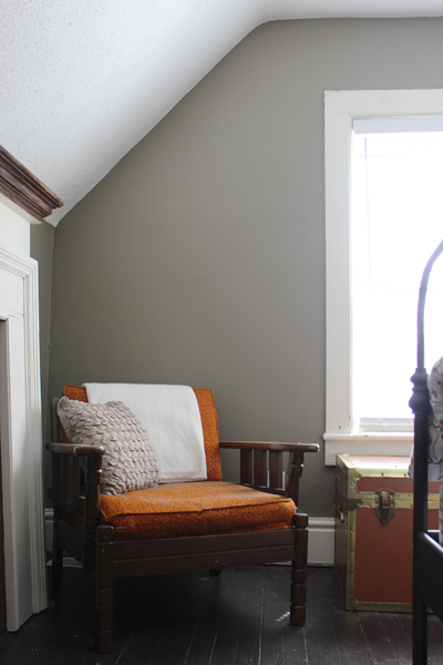
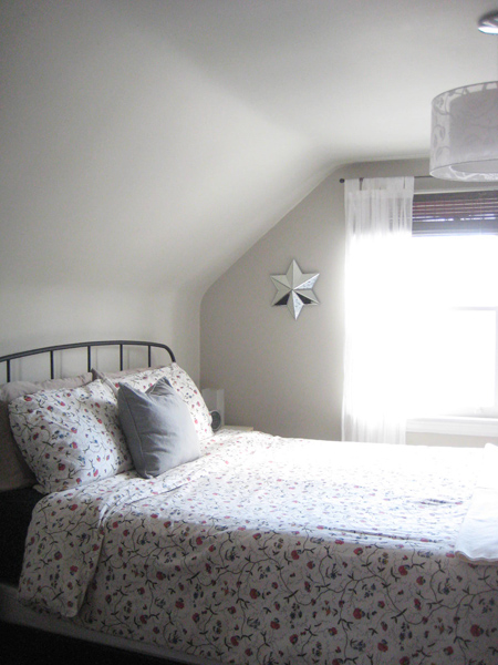
And here’s the room lovelied-up with a wee bit of BM Copley Gray…
A full gallery of after shots is pending (there are curtains to go up and a mirror to hang and a few other to-do’s that I’d like to to-do before officially announcing the room DONE) but for now the painting part of this bedroom mini-reno project is complete (can I get a big ol’ yay for progress?) (Yup – YAY!)
What’s that you say? You thought I’d decided on Revere Pewter? I thought I had too. But it just seemed a little too predictable. I painted our bedroom at our last humble abode, our happy little 1940′s house, in Revere Pewter and I loved it, but I wanted to try something different. I’ve been eye-ing up Copley Gray for a while now, and I decided to take the slightly bolder paint-colour plunge.
So am I happy? Mostly. Admittedly, it’s greener on my walls than I’d hoped. At some points in the day, depending on the light, one might even call it (cringe…) sage. But at other times (and, really, most times) it’s a lovely gray/brown/green that is super cozy and warm and rustic (can a colour be rustic? If so, this one is definitely rustic.) And it’s far (far!) better than the poop-ish brown that adorned the walls when we bought this house, so I’m a happy girl for now.
And if, in a few years, I decide to repaint, hopefully Little Squish will be old enough to help? Or at least stay occupied for a bit while mommy paints?
Wishful thinking, I know. :)
Leave a comment
My triumphant (albeit slow moving) return to painting (aka the colour in our bedroom is driving me bonkers)
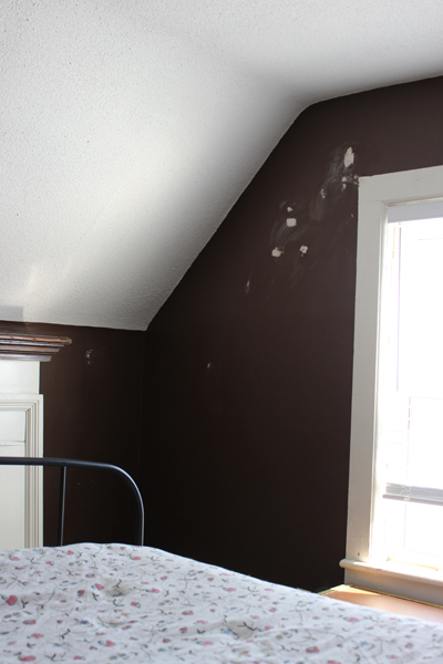
When we first came to look at this old mauve-coloured house nearly two years ago, I walked away thinking that the master bedroom was painted black. In fact, it’s not black. It’s brown. But it’s a dark-ish brown and the blinds were continually drawn in this room during showings (theory: the home owners were really vampires), and the colour appeared even darker and more awful than it actually is (although it is, indeed, pretty awful.)
For your viewing pleasure (or, perhaps, disbelief), here’s what our master bedroom looked like the first time we saw it…
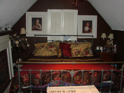
Ack, eh? Yes. Ack indeed. Flowers and nic-nacs and tiny lamps with tiny lampshades and stuff everywhere. Ev-ver-ry-where. Once again, I think it’s worth noting that we bought a house with rooms that looked like that. We’re very very very brave, my Sweetie and me.
(And yes, the two pictures hanging above the bed are indeed hung at different heights. Because lazer level be damned, willy-nilly picture hanging is how the previous house owners rolled. Those crazy loveable crooked-picture-hanging vampire-esque rebels.)
Of course, when Sweetie and I moved in, all that stuff (thankfully!) went away (and, miraculously, the room suddenly looked a gazillion times larger.) But that didn’t change the fact that the room is brown.
Icky brown, to be exact.
Here’s another look at that wall colour, minus all the clutter and with a wee bit of natural light…

Well hello there, ridiculously cute little man! :) Behind all that squishy adorableness are my ugly brown walls. A (temporarily) comfy black cat is also lounging somewhere back there. In fact, this picture was taken mere moments before I had to intervene in feline/infant interactions and declare “No, we don’t chew on the cat.” (A statement I never ever thought I’d have to make prior to having a baby.)
So what colour am I going with? Alas, I’m not being particularly original or daring with this project. Instead I’m falling back on the reliable, always lovely, Revere Pewter. I painted our bedroom at our beloved little 1940′s house this colour and I loved it.
It’s peaceful. It’s serene. It’s an actual colour and dark enough to be impactful, but not so much so that it’s overwhelming. Some have called Revere Pewter the perfect paint colour. I call it lovely and soft and well-suited for a bedroom. (And, particularly, for my bedroom.)
Now all I have to do is find the time to paint this aforementioned bedroom. With a small boy who doesn’t nap predictably (or, oftentimes, for very long), this might be a project best suited for the evening hours (once that same small sweet little man is fast asleep for the night.) Assuming, of course, that I can stay awake long enough to attack those ugly brown walls with my trusted paintbrush.
But, ahhhhh… Yup. It feels good to return to home renos, even if I now move a whole lot more slowly than before. Slow progress of any sort is still progress nonetheless. :)
Leave a comment
A quick closet makeover (another “slap some paint on it and it’ll look so much better” sort of project) (aka: paint fixes everything)
Some people have scary basements. I had a scary closet. (Well, I have a scary basement too, but that’s a whole other story for a whole other blog post.) How scary was our bedroom closet? It looked like this when we moved in…
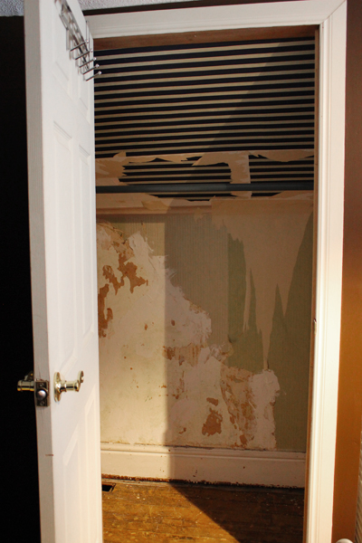
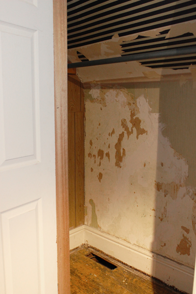
Ack. Nightmarish, eh? Yup. Absolutely terrifying.
And since “make closet pretty” wasn’t first and foremost (or even seventh and semi-important) on my big ol’ home reno to do list, it stayed that way for the past ten months. Empty. Ugly. Mocking me. Daring me to step inside (which I would never ever ever do due to the aforementioned scariness factor.)
So where were all of our clothes? In the nursery closet of course. (See where this is leading?) But, with Baby on the way in a few short weeks (yep, you guessed it), it was time to clear out that closet. Meaning that it was also time for us to face the scariness once and for all and make our bedroom closet a much more hospitable, much less horror movie-esque little place.
So what did I do?
I painted it.
And by that I mean that I really quickly and lazily painted it, using leftover Edgecomb Gray paint that I already had on hand. Did I remove the wallpaper from the walls? Nope. Did I sand down the drywall compound patching job that Sweetie did (since originally there were plaster cracks on the back wall of the closet that made it look even more terrifying?) Nope. Did I prime or prep or do anything to make the ugly innards of my closet more humane-looking? Nope. I just slapped some paint on those closet walls and called it a day.
And it didn’t turn out so bad. Behold the after…
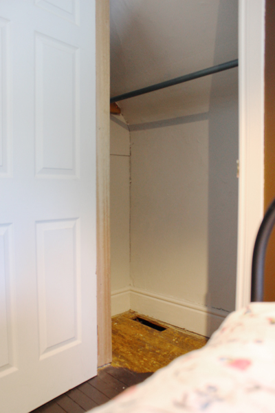
I even tossed a quick coat of paint on the baseboards. Same colour as the walls. We’re not talking anything fancy here (it is a closet, afterall.)
Yep. A quick coat of paint and suddenly the closet ain’t so scary any more.
(I mean, I wouldn’t want to hang out and read a book in there, of course, but it’s way better.)
So there. That’s my scary-closet-turned-not-quite-as-scary-due-to-Baby’s-impending-arrival story for you. Since I’m guessing that Baby will need its own closet.
You know, for cute little onesies and pretty dresses (if Baby is a girl) or tiny overalls (if this wiggly little belly-mover is a boy) and stuff. :)
Leave a comment
My fantastic front door plans (prepare yourself – this could be shocking)
So hear me out for a second k? No judgy-judgy… Just trust me on this for a moment. I have an announcement:
I might paint my front door pink.
(Let’s pause briefly while that all sinks in… You ok? K. Let’s continue.)
Yes, I’ve lamented for months now that our house is mauve.
And yes, I’ve previously stated that perhaps a muted plum door would tone down the pinkness of the siding on our house while still looking sophisticated and coordinated.
And yes, I’ve even mentioned (several times) how much I’d really really like to repaint our old mauve house and be rid of the pink altogether.
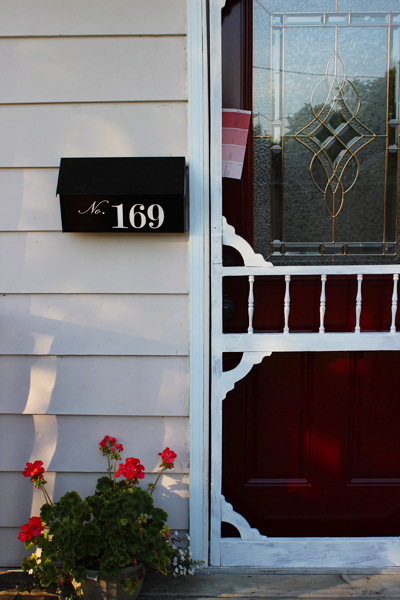
But (this is where my anti-mauve plans go a bit awry), then I noticed this…
See those geraniums slyly photobombing this pic of my front door (and my beloved new house numbers?) They’re coral. And they’re pretty. And see how nice they look against my (much despised) mauve siding?
Dear Mother Nature: you sneaky fox. You’ve coyly inspired me. Big pat on the back for you, missy. Nicely done. :)
So I might paint my front door a corally-pink. It’s absolutely mind boggling, I know.
And don’t get me wrong: we’re not talking fuchsia here. (Random diatribe: FUCHSIA might, in fact, be the oddest-spelled word in the entire English language. It always takes me at least three or four attempts to type it out correctly. FUSHIA looks right, but it’s not. Fuscia could even be correct, but, strangely, is not. Nope. Fuchsia is indeed one of those words that makes me yearn to have a stern conversation with the good folk at Miriam-Webster and ask them what the heck they were thinking when they decided to add so many miscellaneous letters to a rather simple, two syllable colour.)
(Thank you for letting me rant. Carrying on…)
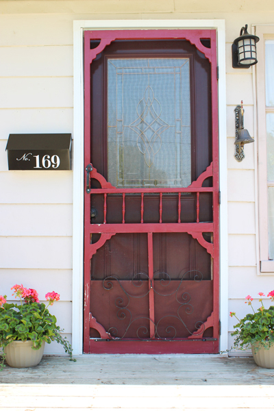
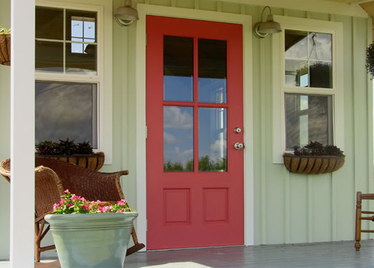
Nope. We’re talking a corally pink. Like this (via ByStephanieLynn)…
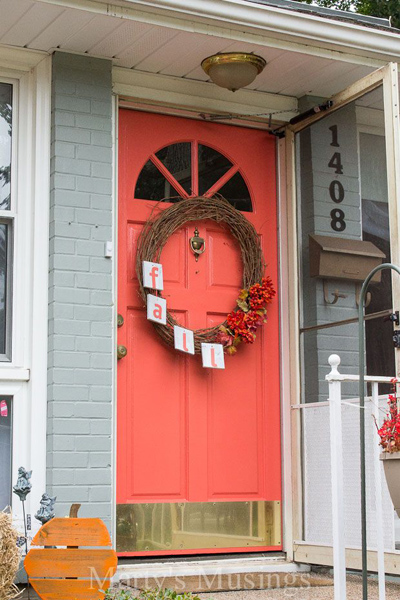
Or like this cheery door (courtesy of Marty’s Musings)…
Or even this (the top paint chip is Benjamin Moore’s Glamour Pink, and I THINK it could work, although it’s a bit more pink-ish than coral-ly.)
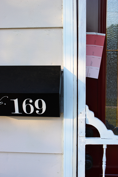
Please ignore the partially painted screen door – that’s a whole other project for a whole other post. (But I need it to stop raining first. Once the rain stops, the door will be painted. Until the rain stops, it’ll stay splotchy.) (Sorry neighbours!)
So yes. This is my new plan. A coral door for my mauve house. Who would have thunk it, eh?
Mind you, Sweetie and I haven’t discussed this yet. He might have issues with the words “pink” and “coral”, so I may call it a “muted light reddish-slightly-orange colour.” Or perhaps even just “geranium,” since I’m doubting he’d know which flower I’m describing. Sweetie isn’t much of a flower guy. But give him some rare weird variety of tomato plant and he’s all over that like ants on an apple. :)
Leave a comment
My blue kitchen (aka why test pots exist) (and, consequently, why you should use them)
So I decided the other day that I couldn’t handle these dark/dreary/oh-my-god-who-seriously-paints-their-walls-these-colours? walls any more. With Baby on the way (only nine weeks to go till my due date) (ack!), I had sworn off painting for the next little bit (even though some say you can absolutely paint while preggers) (however I’m super sensitive to smells right now, so painting just didn’t seem to be in the cards for me.) Based on a recommendation from a co-worker (hi Laura!) I brought someone in to paint my living room, dining room, and (yay!) kitchen. It took her less than five hours to paint all three rooms. FIVE HOURS! I was (and still am) in painting-land awe. I’m not sure how she did it (seriously, what she accomplished in five hours would have taken me several weekends!) (maybe I’m just a rather pokey painter?), but suffice it to say that the house feels like a totally new house now. The rooms feel bigger and lighter and cheerier. The ceilings seem so much higher. And I am one mighty happy momma-to-be.
However, let me break in on this little newly painted room love-fest with a bit of a confession: my kitchen was supposed to be gray. A nice, light, slightly bluish airy fairly neutral gray colour.
The Coles Notes version of the story? I got blue.
Like, really blue.
Grumble.
What I was hoping for? A slightly brighter lighter version of the same colour that adorned my happy little 1940s kitchen at our last house. That kitchen was painted in Benjamin Moore’s Stonington Gray, and I loved it. Loooooved it.
Our current kitchen, in our old mauve house, gets far less natural light than our previous sunny little kitchen did. And it’s less open and needed brightening up a bit. So my seemingly obvious solution was to confidently (ie “ruthlessly skipping the whole test-pot phase of painting”) go one paint chip lighter on the same paint-swatch card thingy from my previously adored Stonington Gray colour. Seemed foolproof enough, I thought. And, even when I held the paint chip up in various places around my kitchen, my newly decided upon colour (Wickham Gray) appeared to be a light gray with a teeny tiny smidgen of blue-y green-y muddy undertones mixed in for a bit of wall colour pizazz.
The real-life post-painting result? Apparently Wickham Gray turns blue in my kitchen.
Like, very very blue.
Here’s where we started (all gold-y and dark and such):
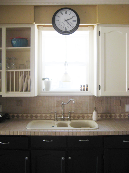
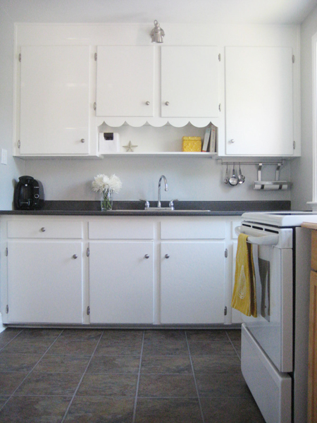
And here’s where we are now. Blue blue blue.
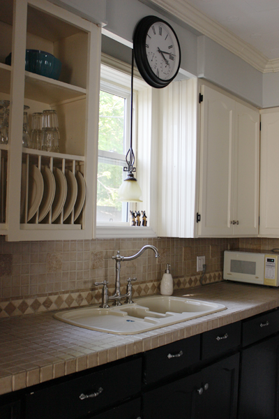
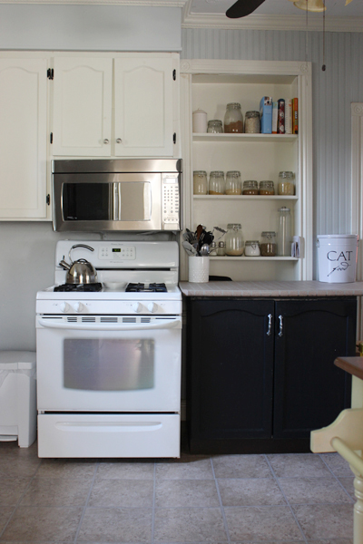
Yep. Definitely blue. Super ginormous sigh.
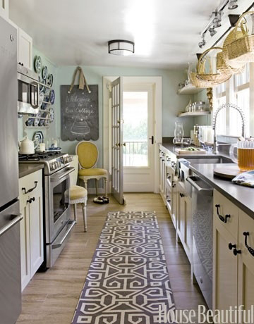
Don’t get me wrong! There are lots of lovely blue kitchens out in the world. In fact, my Pinterest Kitchens board features several blue-hued kitchens that I’ve admired for a while. There’s this one, from House Beautiful (although I searched the House Beautiful site and couldn’t find a link directly to this particular image – sorry!):
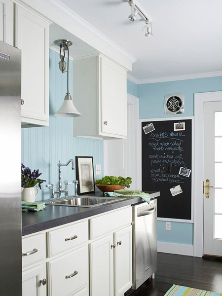
And this super lovely kitchen featured on the Better Homes and Gardens website…
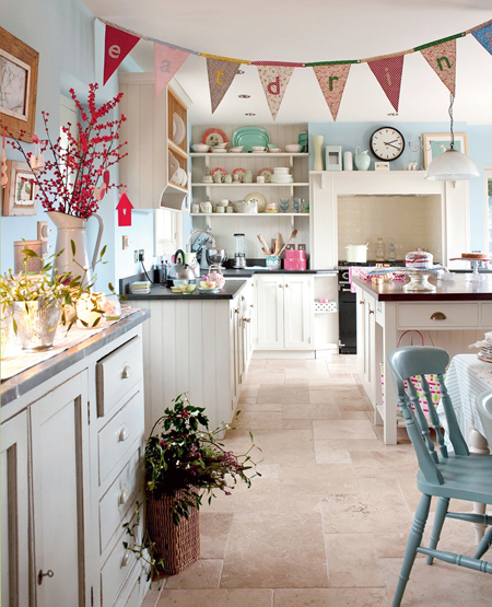
And, my favourite (pretty!), this cheery blue kitchen courtesy of… um, Pinterest source unknown. (I hate those source unknown sorta Pins, don’t you?) (If this is your kitchen, a: I want to move into your house please! and b: let me know!)
So see? I’m not at all against blue kitchens. In fact, I think blue is so fresh and pretty in a kitchen!
But… it’s not what I had planned for my kitchen. And against my currently cream coloured upper cabinets and brown-tiled backsplash and countertops the blue looks a bit… off.
I’m going to live with it for a bit. And maybe (with a little tweaking and accessorizing and such) it’ll grow on me! With Baby on the (ever nearing) (ack!) horizon, and my painting budget tapped for the time being, blue is definitely, if nothing else, better than the muddy gold colour that was there before. And, when I someday get around to painting the kitchen cabinets a whiter crisper shade of white (Benjamin Moore’s Snowfall White, my all-time favourite trim and cupboard colour, to be be exact), I think the blue might actually look quite spectacular.
But, for now… meh. At least it’s not gold.
Leave a comment